Task 1
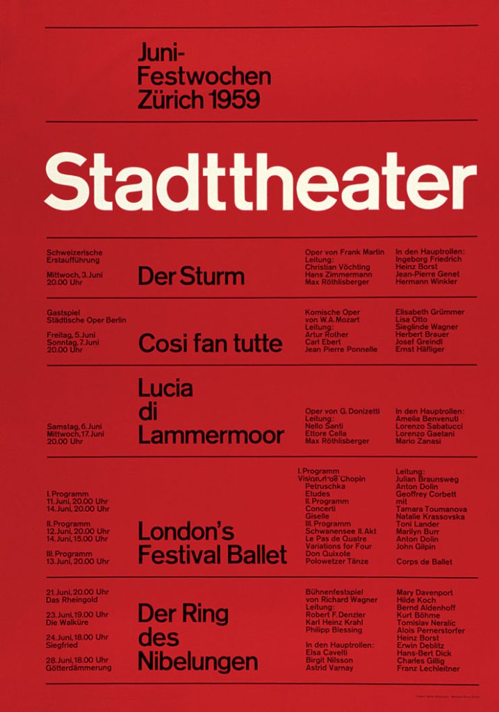
Example 1: Josef Müller-Brockmann
The post-war period marked a pivotal moment in the development of graphic design and visual communication. Following the Second World War, Europe experienced widespread migration and the growth of multilingual societies, creating a need for a universal visual language. Josef Müller-Brockmann emerged as a leading figure in this movement and a key proponent of the International Typographic Style. His work emphasised clarity, objectivity, and accessibility through the use of structured grid systems, asymmetrical layouts, and sans-serif typography.
The Stadttheater poster (1959) exemplifies this approach. Its mathematically constructed grid, combined with the use of Akzidenz-Grotesk, reflects a deliberate move away from decorative or emotionally driven design. Instead, Müller-Brockmann prioritised hierarchy, spacing, and legibility to ensure that information could be understood instantly, regardless of the viewer’s linguistic or cultural background. This was not purely an aesthetic decision but an ideological one aimed at improving communication.
In a post-war society where trust in media had been undermined, this grid-based approach served a broader social purpose. By organising information clearly and consistently, it reduced confusion and promoted equal access to knowledge. The International Typographic Style therefore functioned not only as a design movement, but as a tool for rebuilding public trust and supporting democratic communication in shared civic spaces.
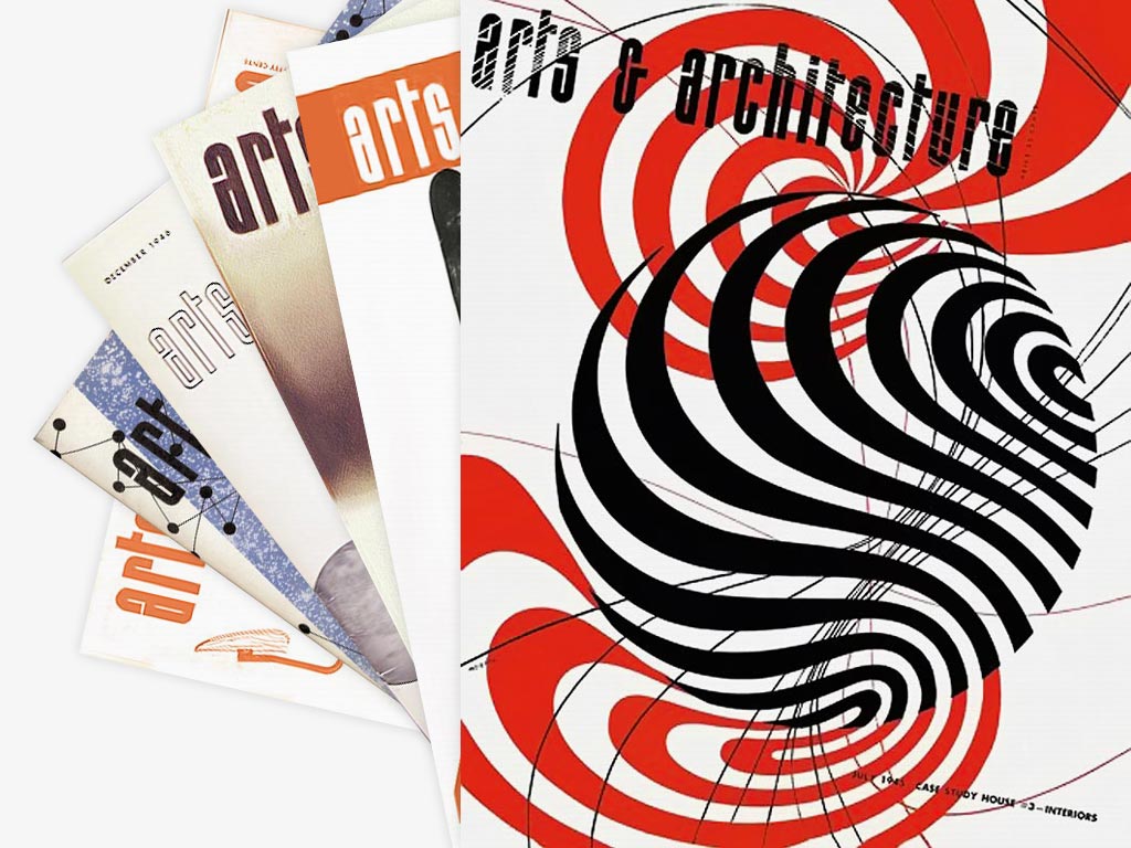
Example 2: Herbert Matter
Herbert Matter was a pivotal post-war graphic designer who combined modernist typography with photography to create clear and engaging visual communication. Influenced by both the Bauhaus and Swiss modernism, Matter integrated type and image as a unified system rather than treating them as separate elements. This approach allowed complex cultural and civic information to be communicated efficiently while remaining visually impactful within a rapidly changing, multilingual society.
Matter is particularly known for his posters promoting travel and culture, including his work for Arts and Architecture magazine in the 1940s and 1950s (see Figure 2). In these designs, photography is paired with bold, geometric typography to convey messages quickly to a broad audience. In the post-war context, photography was widely perceived as a truthful and objective medium, making it especially effective in rebuilding public trust after years of propaganda and visual manipulation. By combining photographic imagery with structured typography, Matter ensured that information was both credible and immediately accessible.
The societal impact of Matter’s work lies in its contribution to public awareness and mass communication. His designs encouraged participation in cultural and civic life, supporting tourism, education, and shared identity during a period of reconstruction. Through the integration of type and image, Matter demonstrated how graphic design could function as a social tool, improving communication and fostering engagement beyond purely commercial aims.
Task 2
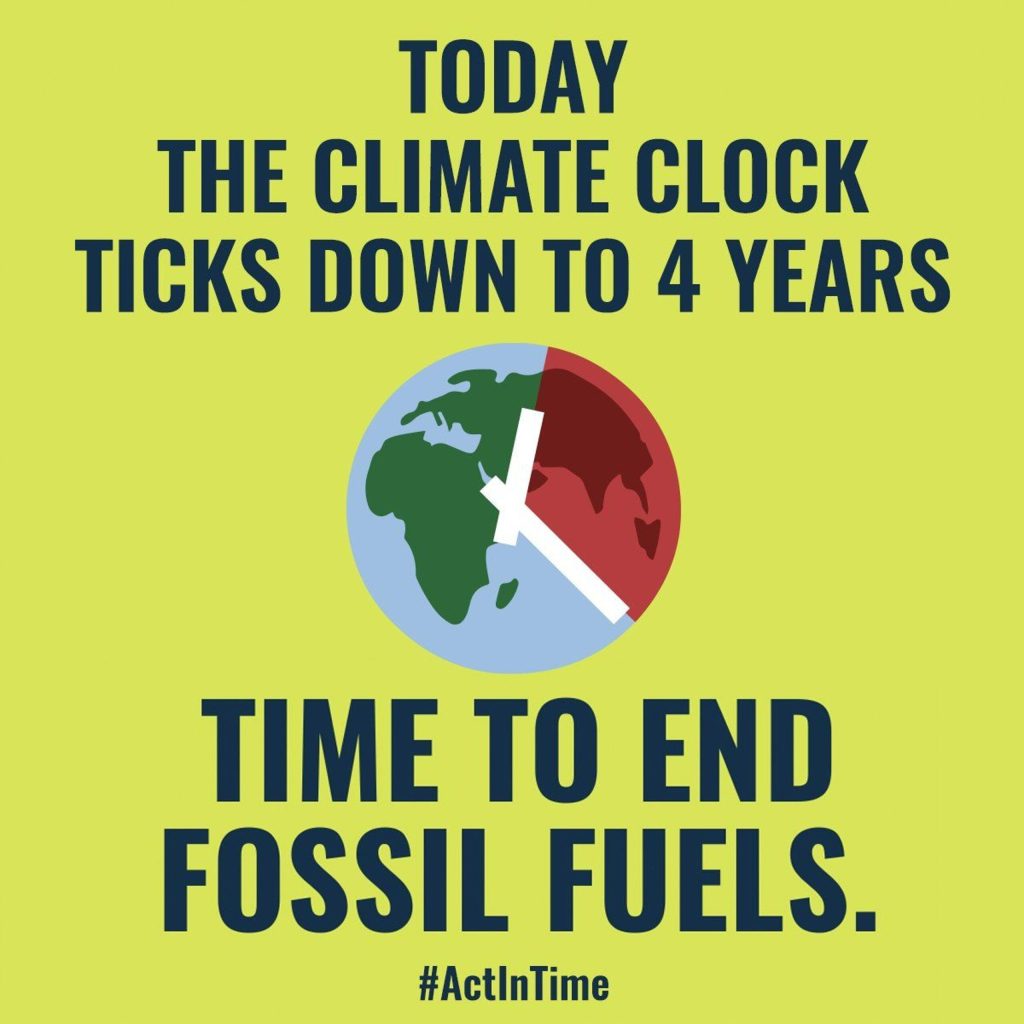
The Climate Clock:
The Climate Clock is a high-impact contemporary campaign launched in September 2020 that uses dynamic data visualisation to communicate the urgency of climate change. First installed as a large-scale public artwork in Union Square, New York, it quickly gained global visibility through widespread media coverage and adoption in cities including London and Glasgow. The design employs a dual-narrative system: a red “deadline” counts down the time remaining to limit global warming to 1.5°C, while a green “lifeline” tracks progress through positive indicators such as the expansion of renewable energy.
By drawing on peer-reviewed data from the IPCC, the Climate Clock grounds its message in scientific authority while amplifying grassroots activism. Its design moves beyond traditional static communication by encouraging active participation. Through open-source digital widgets and DIY maker kits, individuals and organisations can embed the clock into websites, public spaces, and local campaigns. This transforms the project from a singular installation into a distributed, global communication system.
This shift reflects a broader evolution in design practice. Rather than presenting distant warnings, the Climate Clock frames climate change as an immediate and measurable challenge. By combining real-time data with accessible design, it not only informs but also mobilises, demonstrating how contemporary visual communication can coordinate collective awareness and action on a global scale.
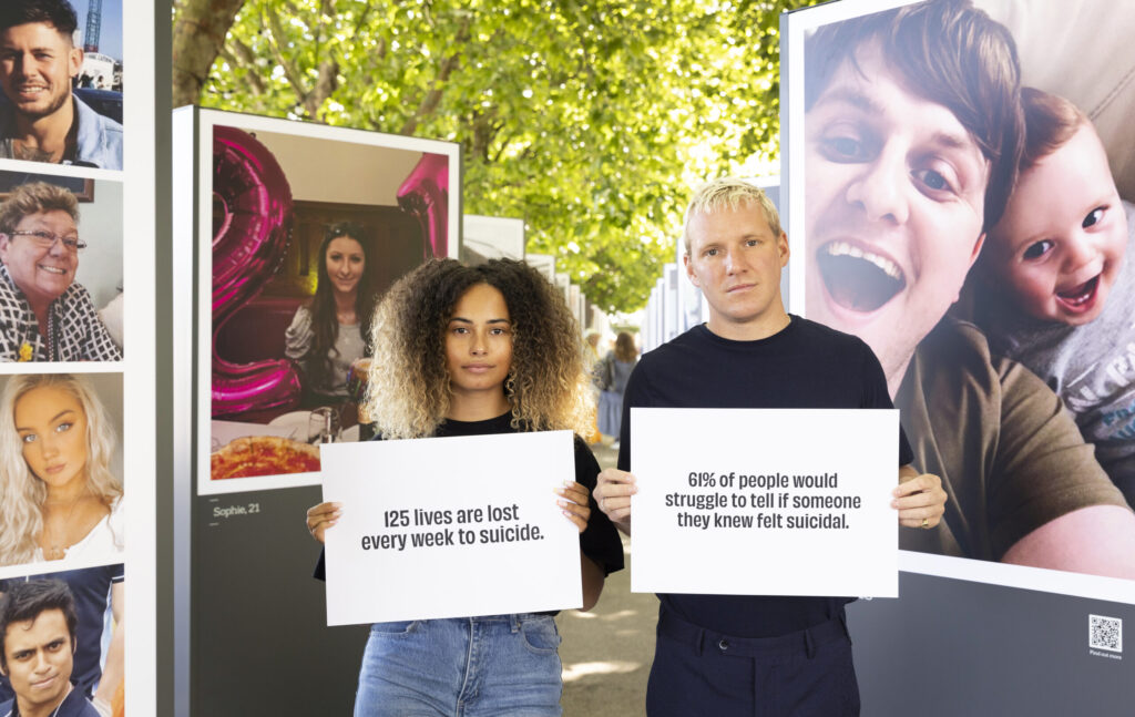
The Last Photo (CALM)
In the contemporary digital age, graphic communication must compete for attention in highly saturated online spaces. The campaign “The Last Photo,” launched in 2022 by the charity CALM (Campaign Against Living Miserably), demonstrates how design interventions can shift cultural mindsets, influence perception, and tackle urgent societal taboos.
The visual strategy relies on a jarring juxtaposition of fifty high-resolution, vibrant, and smiling portraits of individuals, framed by stark, minimalist typography (see Figure 4). These graphics were displayed as massive outdoor installations at London’s South Bank, intentionally mimicking upbeat fashion or lifestyle advertisements. The psychological impact of the campaign stems from this “visual bait-and-switch.” By using bright, warm colours and candid photography, it lures the viewer into a sense of normalcy before the “reveal” discloses that these were the final photos taken of people before they died by suicide.
The societal impact of this graphic approach was immense, generating over 1.6 billion media impressions and becoming the most shared suicide prevention campaign in UK history. Evidence of its success is found in the 400% increase in donations and the surge in digital engagement via QR codes integrated into the physical displays. By rejecting the “dark and moody” clichés of traditional mental health awareness, the campaign’s graphics provided scientific legitimacy to the fact that the suicidal crisis is often invisible. This shift in visual storytelling successfully humanized the tragic statistic of 125 weekly deaths, transforming a complex social issue into a tangible, high-visibility call for collective vigilance, proving how technological and physical hybrid design can positively impact our lives.
References:
Sgustok Design (n.d.) Josef Müller-Brockmann Posters. Available online: https://sgustokdesign.com/josef-muller-brockmann-posters [Accessed 13 Feb. 2026].
Herbert Matter Estate (n.d.) Herbert Matter Timeline. Available online: https://herbertmatter.org/welcome/timeline#012 [Accessed 13 Feb. 2026].
The Sanctuary for Independent Media (2024) Climate Clock Shows 5 Years Left to Prevent Climate Chaos. Available online: https://www.mediasanctuary.org/stories/2024/climate-clock-shows-5-years-left-to-prevent-climate-chaos/ [Accessed 15 Feb. 2026].
Adam&eveDDB (2022) The Last Photo. Available online: https://adamandeveddb.com/work/the-last-photo/ [Accessed 15 Feb. 2026].