Research & Context
For this project brief, I wanted to explore a subject I rarely engage with: politics. However, I am very interested in the history of graphic design’s impact on political views and how it shapes narratives within the subject. Some of my favourite historical designs are based on Swiss style grids and stripped-down typographic elements, particularly the works of Josef Müller-Brockmann and his post-war Stadttheater poster. The use of block colours alongside a clean grid system and sans-serif typography aligns with the concept of clear, objective, and functional communication.
In researching this area, I analysed political posters from various decades to the present day. I observed strong similarities between contemporary political graphics and the structural elements of post-war Swiss design. Contemporary designers continue to strip away complex illustrations in Favor of strong typographic hierarchy, asymmetrical layouts, and bold, elemental colour palettes to convey political messages directly.
Using grid-based systems and typography allows political communication to be understood quickly and clearly in public spaces. By avoiding emotional manipulation or excessive illustration, this approach offers an objective way to present data and civic information. This historic connection demonstrates how Swiss design principles continue to influence modern political narratives, helping designers communicate urgent societal messages efficiently.
Contextual Development
To begin the conceptual development for the campaign, I utilized the lateral thinking technique to generate ideas using random words, ensuring the concepts remained relatable to a broad audience. My first exploration focused on community participation. I developed a moodboard combining the structural elements of post-war Swiss design such as strong typographic hierarchy and asymmetrical grids with modern, bold colour palettes. I experimented with sans-serif typefaces to create punchy, direct messaging. I sketched initial layouts, testing how to integrate minimal visual elements with bold typography to convey the campaign’s core message without visual clutter.
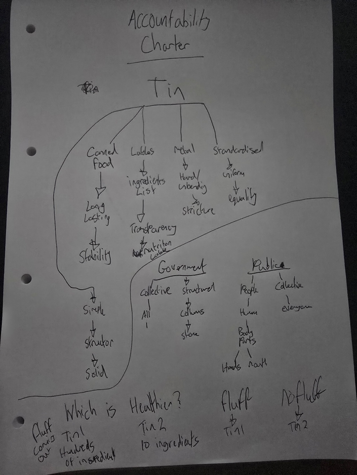
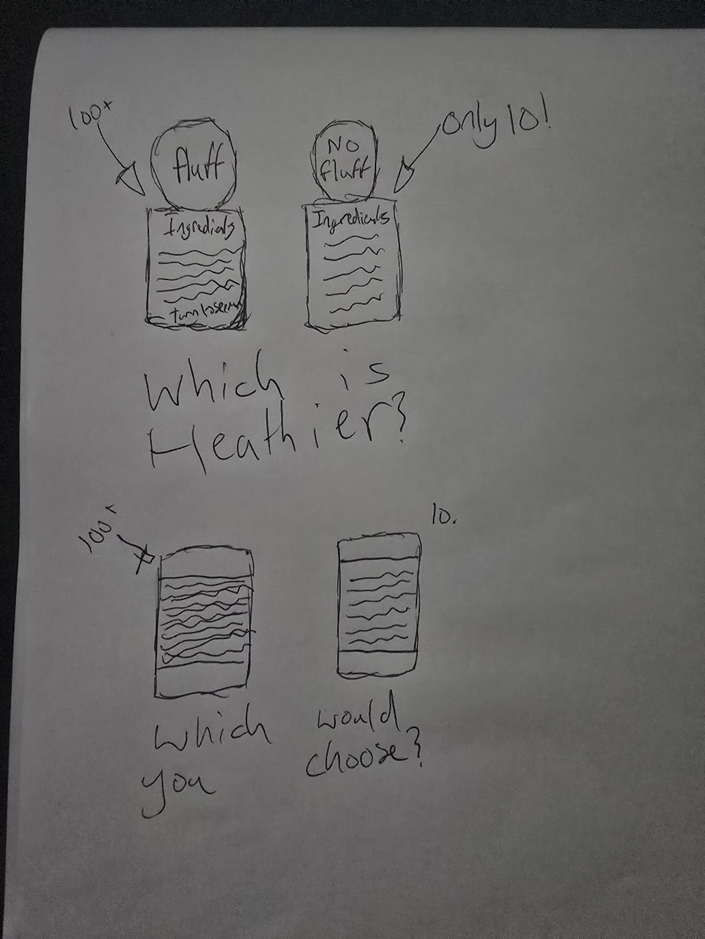
Following this, I repeated the process to generate a second concept, shifting the focus to sports and physical activity. Because sports have a broad, universal appeal, this approach allowed me to design for a much wider, more inclusive demographic. I explored dynamic layouts using clean, structured grid systems inspired by Josef Müller-Brockmann, paired with energetic block colours to reflect movement and activity.
By combining historical Swiss design techniques with contemporary type choices, I aimed to make the sports-focused messaging highly legible and engaging for public spaces. Sketching these concepts helped me refine the balance between image and text, ensuring that the hierarchy guides the viewer’s eye efficiently. This iterative process of brainstorming, moodboarding, and sketching allowed me to evaluate how effectively the design communicates the benefits of activity while maintaining a clean, modern aesthetic.
Experimentation & Prototyping
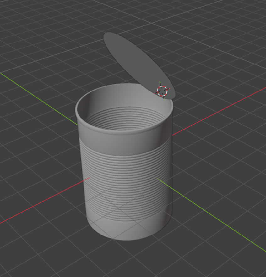
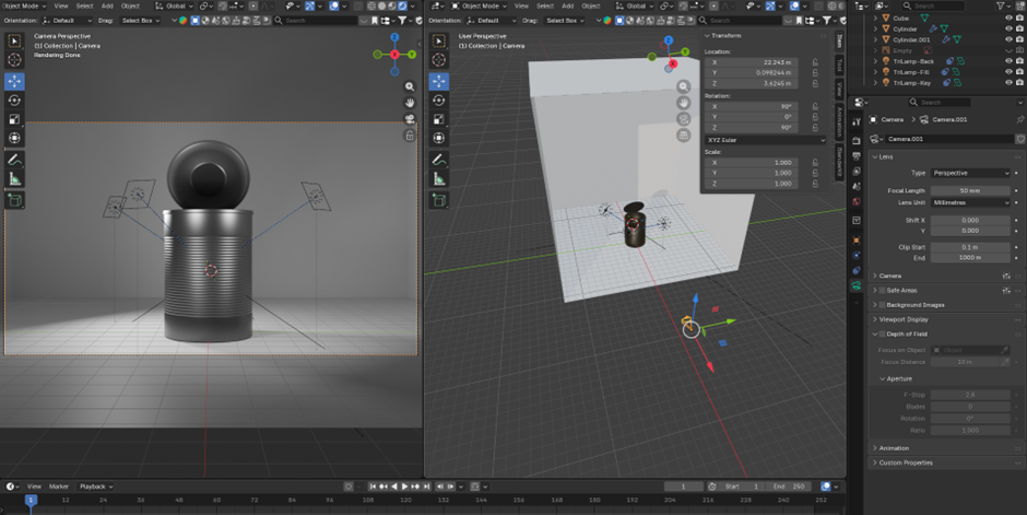
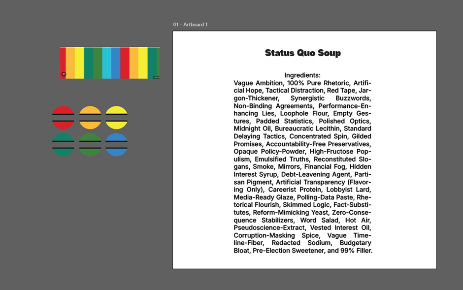
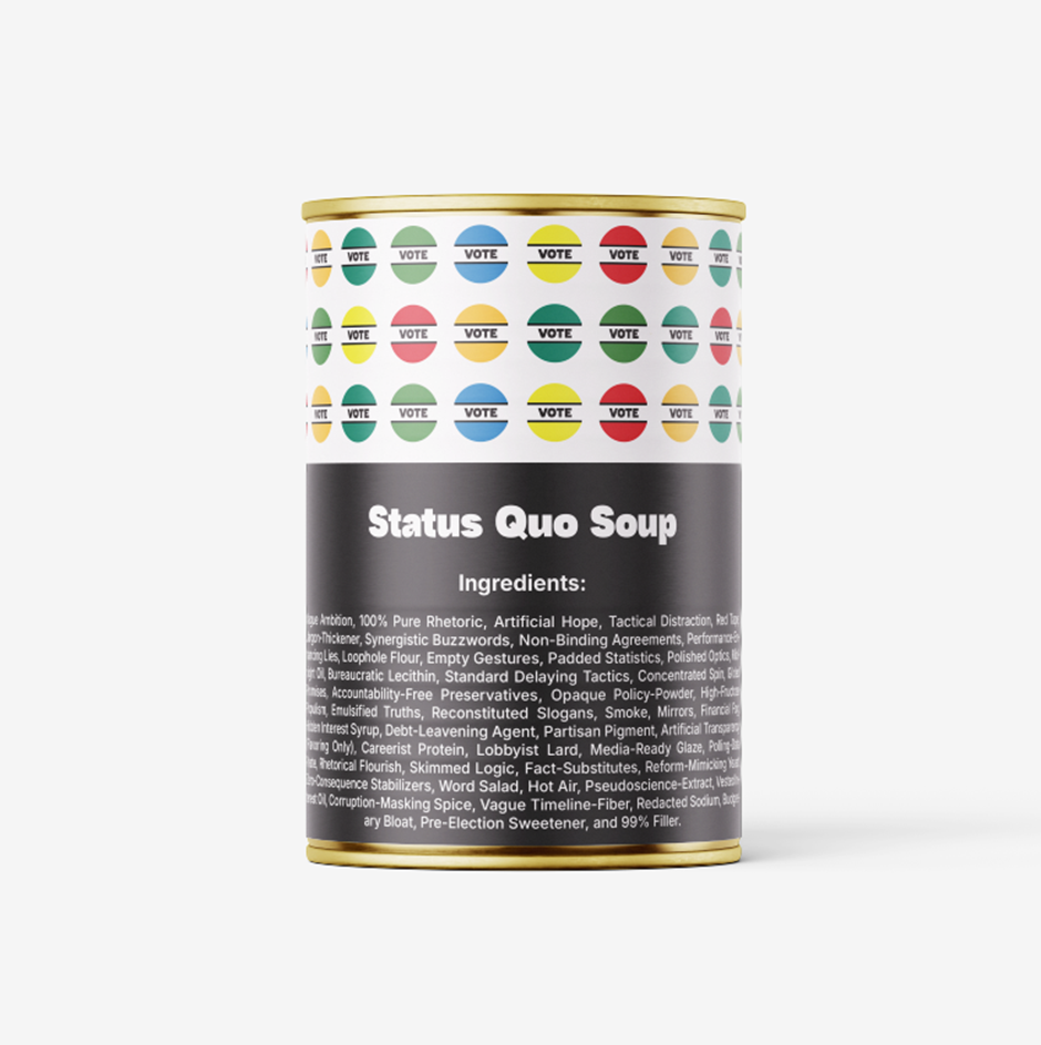
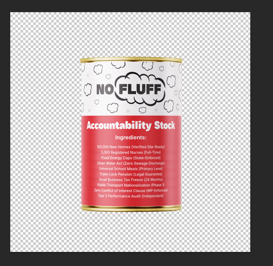
I began the prototyping phase by developing a 3D model of a can to generate accurate visual mockups for the main poster design. Following this, I used Adobe Illustrator to design the food tin can label, carefully considering colour contrast and hierarchy to establish the visual tone of the campaign. After developing several iterations, I decided to break the composition down further to achieve greater simplicity and visual impact. I leaned into the concept of essential, stripped-back items, utilizing straightforward keywords to anchor the campaign’s cohesion across multiple touchpoints.
A central element of this cohesion is the phrase “NO FLUFF,” which appears across all posters and the website to deliver a direct, unapologetic message to the public. I applied this minimalist typographic approach to a second design featuring a red card penalty, which is used metaphorically to represent political accountability. Utilizing a structured grid layout system in Adobe InDesign was crucial to achieving the Swiss design style identified during my initial research.
To ensure the material was fit for purpose, I printed the posters at scale to test the legibility and visual hierarchy within a real-world, physical public environment. Finally, I designed a corresponding website layout that uses the same minimal colour palette and typographic rules. This digital prototype functions as an online forum for public discourse, allowing everyday citizens and local officials to discuss political accountability and decisions. This iterative process ensured that the final design remains cohesive, functional, and highly accessible across both print and digital media.

User Testing & Feedback
During the creation of the initial poster prototypes, I gathered feedback from fellow students and peers to evaluate the effectiveness and visual clarity of the designs. The initial testing revealed that while the concept was clear, the typography on the tin can designs lacked immediate readability when viewed from a distance. To address this, I developed multiple iterations, focusing heavily on typographic hierarchy and spatial relationships. By analysing the layout of essential food cans from existing markets, I restructured the design to ensure the text was clean, legible, and logically positioned.
The feedback also highlighted the need for a stronger, more unified visual hierarchy across the entire campaign. To refine this, I established a strict rule: use the primary imagery to drive the narrative, followed immediately by the campaign’s core tag, “NO FLUFF.” To maintain the Swiss-style principles of clarity and neutrality, each poster is restricted to a maximum of four colours and uses a single, consistent sans-serif typeface throughout.
This testing process clearly separated the successful elements from the ineffective ones. The feedback proved that limiting visual noise allowed the core message to resonate more strongly with the audience. Testing and adjusting the layout based on peer responses ensured that the prototypes were not only aesthetically cohesive but also functioned successfully as clear, accessible communication tools in public spaces.
Informed Design Decisions & Direction
This section outlines the final design decisions, rationale, and technical preparation required to realize the project. By taking cues from the structural principles of Swiss modernism and applying them to contemporary visual communication, the project establishes a framework for clear, objective public information.
The rationale for the grid and layout decisions ensures consistency with the Swiss style grids analysed in the research phase, meaning all print and digital assets rely on a strict modular grid. The type size and placement are determined by a proportional scale, ensuring that the primary visual or message takes precedence over secondary elements. By limiting the colour palette to a maximum of four colours and using a single sans-serif typeface, the layout eliminates visual clutter. This approach ensures that the message remains accessible and unambiguous across large-scale public displays.
To ensure the designs function correctly in real-world environments, technical specifications have been standardized for production. The colour profile utilizes a CMYK setup for print media, including the posters and tin labels, and sRGB for the digital website layout to ensure consistency across all mediums. Output formats include the preparation of vector files using Illustrator for scalable print production and responsive user interface components for the web interface. Utilizing Adobe InDesign for the final poster designs. Mockups allowed for real-scale testing to ensure legibility from a distance of two meters in a public environment, using Photoshop
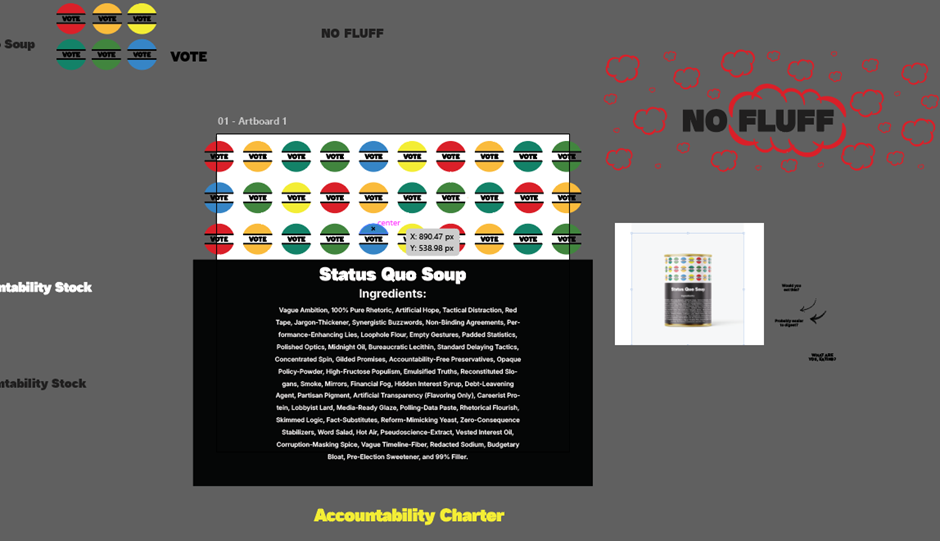
The integration of the “NO FLUFF” narrative serves as the focal point of the entire campaign. The decision to use straightforward, bold terminology creates a direct line of communication with the audience, avoiding unnecessary decorative elements and ensuring maximum clarity.