Task 1
Example 1: Josef Müller-Brockmann
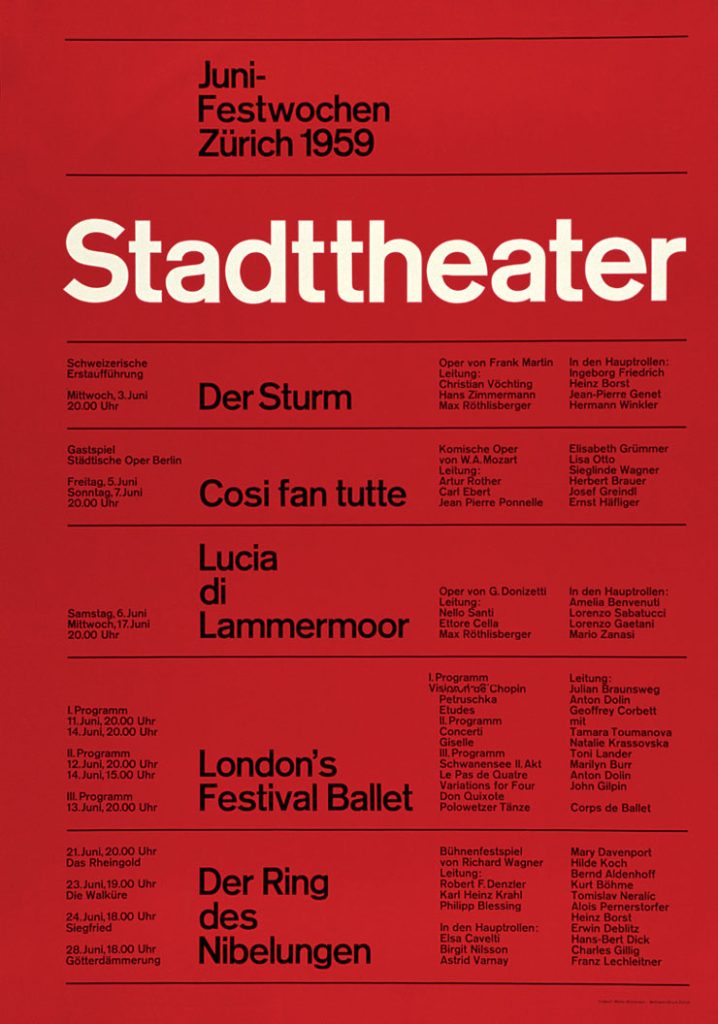
Josef Müller-Brockmann was a leading figure in postwar graphic design and a key proponent of the International Typographic Style. His work focused on the use of strict grid systems, asymmetrical layouts, and sans-serif typography to communicate information clearly and objectively. These design principles were not purely aesthetic but were intended to improve public understanding and accessibility in a post-war society. During the post-war period, Europe experienced widespread migration, displacement, and the growth of multilingual populations. Müller-Brockmann’s grid-based systems were deliberately designed to be language-neutral, allowing information to be understood quickly regardless of linguistic background. By prioritising hierarchy, spacing, and legibility, his designs reduced confusion and improved the effectiveness of public communication in shared civic spaces.
The International Typographic Style supported social equality by placing clarity and access to information above personal expression or decorative elements. Müller-Brockmann rejected emotionally driven or propagandistic visuals, instead promoting design as a neutral and honest tool for communication. This approach reflected broader post-war efforts to rebuild trust in public information and democratic systems following the manipulation of media during wartime.
Example 2: Herbert Matter
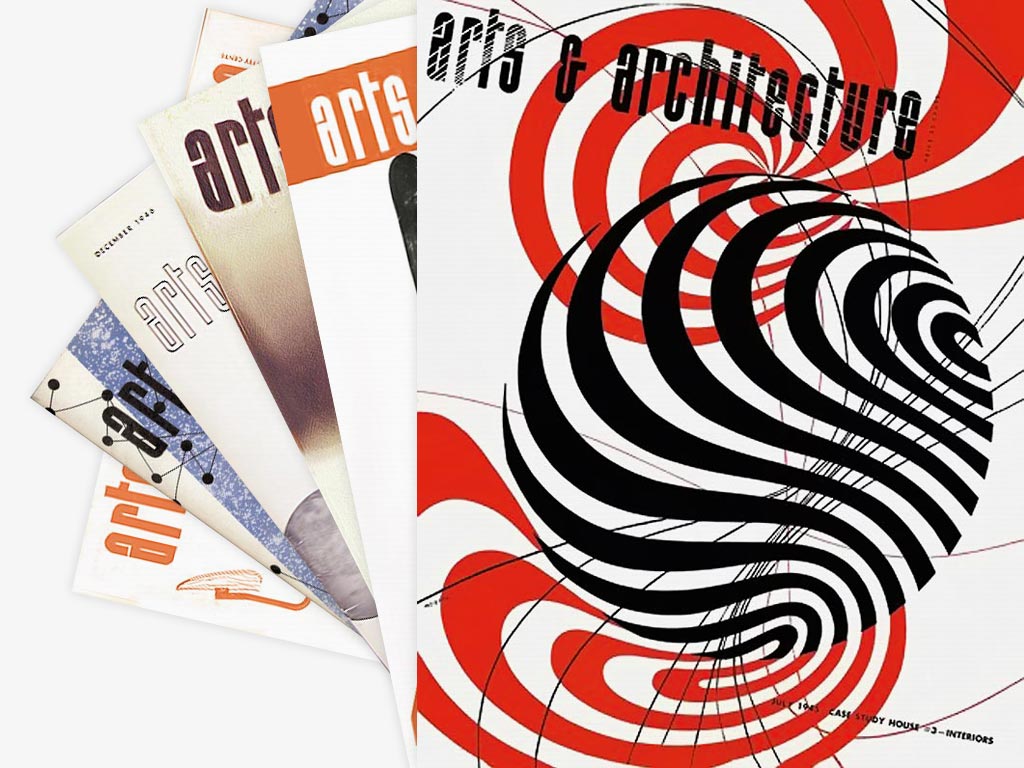
Herbert Matter was a post-war graphic designer who combined modernist typography with photography and graphic elements to create clear and engaging visual communication. Influenced by both the Bauhaus and Swiss modernism, Matter’s work integrated type and image as a single system rather than treating them as separate elements. This approach allowed information to be communicated efficiently while remaining visually impactful. Matter is particularly known for his posters promoting travel, culture, and public engagement, where photography was used alongside bold typography to convey messages quickly to a broad audience. In the post-war context, photography was viewed as a truthful and modern medium, making it effective for rebuilding public trust after years of propaganda and visual manipulation. By pairing photographic imagery with structured typography, Matter ensured messages were both credible and accessible.
The societal impact of Matter’s work lies in its role in public awareness and mass communication. His designs encouraged public participation in cultural and civic life, supporting tourism, education, and shared national identity during a period of social rebuilding. Through the balanced use of type and image, Matter demonstrated how graphic design could function as a social tool, improving communication and engagement in post-war society rather than serving purely commercial purposes.
Task 2
The Climate Clock:
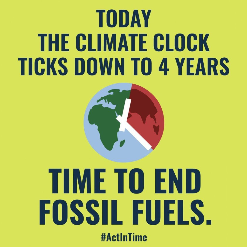
The Climate Clock is a high-impact contemporary campaign launched in September 2020 that utilises dynamic data visualisation to create a global sense of urgency. Originally a massive public art installation in New York’s Union Square, its reach expanded globally through viral media coverage and adoption by cities like London and Glasgow. The design effectively uses a dual-narrative colour scheme: a red “Deadline” counts down the time remaining to limit global warming to 1.5 degrees Celsius. While a green “lifeline” tracks positive milestones, such as the growth of renewable energy.
By utilising peer-reviewed data from the IPCC, the campaign provides “scientific legitimacy” to grassroots activism, pressuring policymakers to #ActInTime. Unlike historical static posters, the Climate Clock promotes engagement through its open-source “digital widget” and “DIY Maker Kits”. This allows anyone from students to web developers to embed the clock into their own digital spaces, turning a passive message into a participatory movement. Critically, this shift from individual warnings (like the 1980s AIDS poster) to a systemic, real-time countdown demonstrates how modern design can synchronise global action by framing climate change as an immediate, solvable predicament rather than an abstract future threat.
The Last Photo (CALM)
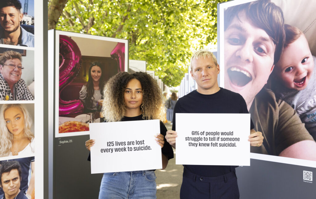
The “The Last Photo” campaign, launched in 2022 by the charity CALM (Campaign Against Living Miserably), is a masterclass in disruptive graphic design. Its visual strategy relies on a jarring juxtaposition: 50 high-resolution, vibrant portraits of people laughing and smiling, which are then framed by stark, minimalist typography. These “happy” graphics were displayed as massive outdoor installations at London’s South Bank, intentionally mimicking upbeat fashion or lifestyle advertisements. The psychological impact of the campaign stems from this “visual bait-and-switch”; by using bright, warm colours and candid photography, it lures the viewer into a sense of normalcy before the “reveal” discloses that these were the final photos taken of people before they died by suicide.
The societal impact of this specific graphic approach was immense, generating over 1.6 billion media impressions and becoming the most shared suicide prevention campaign in UK history. Evidence of its success is found in the 400% increase in donations and the surge in digital engagement via QR codes integrated into the physical displays. By rejecting the “dark and moody” clichés of traditional mental health awareness, the campaign’s graphics provided “scientific legitimacy” to the fact that suicidal crisis is often invisible. This shift in visual storytelling successfully humanised the tragic statistic of 125 weekly deaths, transforming a complex social issue into a tangible, high-visibility call for collective vigilance.
References:
Sgustok Design (n.d.) Josef Müller-Brockmann Posters. Available online: https://sgustokdesign.com/josef-muller-brockmann-posters [Accessed 13 Feb. 2026].
Herbert Matter Estate (n.d.) Herbert Matter Timeline. Available online: https://herbertmatter.org/welcome/timeline#012 [Accessed 13 Feb. 2026].
The Sanctuary for Independent Media (2024) Climate Clock Shows 5 Years Left to Prevent Climate Chaos. Available online: https://www.mediasanctuary.org/stories/2024/climate-clock-shows-5-years-left-to-prevent-climate-chaos/ [Accessed 15 Feb. 2026].
Adam&eveDDB (2022) The Last Photo. Available online: https://adamandeveddb.com/work/the-last-photo/ [Accessed 15 Feb. 2026].