Mobile Companion App
https://www.figma.com/design/Lx7dDMlA1ctWYLtWW84XbE/Marvel-App?node-id=0%3A1&t=RvKesblXhLrvhI6B-1
Design and Research
In the endeavour to develop an application, my aim was to maintain simplicity as a core design principle. With this objective in mind, I opted to conceptualize a movie and series streaming platform tailored specifically to enthusiasts of the Marvel Cinematic Universe (MCU). The target demographic for this application encompasses individuals seeking seamless access to MCU content, irrespective of their familiarity level with the franchise.
The pivotal aspect of the app’s design lies in its provision of diverse viewing options, affording users the liberty to consume content in their preferred sequence while also presenting a semblance of orderliness. In formulating this approach, I conducted a comprehensive analysis of existing streaming platforms, discerning recurrent features such as carousel layouts and promotional highlights of select titles, which are subject to periodic rotation. These platforms typically adhere to a design scheme characterized by the utilization of muted hues and legible typography, factors conducive to user comfort and ease of navigation.
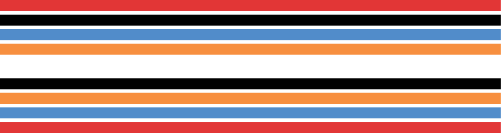
One noteworthy consideration observed in the design paradigms of established streaming services is the preference for darker colour schemes. This predilection is rooted in an astute understanding of user behaviour, recognizing that movie viewing often occurs in dimly lit environments. Consequently, the avoidance of bright screen interfaces in such settings mitigates discomfort and enhances the overall viewing experience. Acknowledging the efficacy of this approach, I endeavoured to adopt a similar aesthetic sensibility in the conceptualization of my application.
In essence, the decision to emulate established design conventions stems from their proven efficacy in catering to user preferences and optimizing usability. By incorporating elements such as familiar layout structures and visually accommodating colour palettes, the resultant application endeavours to furnish MCU enthusiasts with an intuitive and immersive viewing platform. Thus, while drawing inspiration from existing models, the overarching objective remains the creation of a bespoke streaming experience tailored to the discerning tastes of MCU aficionados.
User Flow and U.I Wireframing
The adherence to simplicity in design principles is evident throughout the transition from wireframe to the finalized application and website iterations. This commitment to simplicity is epitomized by the judicious utilization of dedicated buttons, a strategic measure aimed at minimizing clutter and streamlining user interactions. Notably, the incorporation of a home button icon sourced from the Iconify plugin, alongside the inclusion of a random button adjacent to the ‘Play all’ functionality, underscores a deliberate effort to prioritize functionality without compromising visual coherence.
In consonance with the overarching theme of simplicity, deliberate design choices were made to maintain a visually uncluttered interface. Central to this approach is the positioning of the main logo at the apex of the page, serving as a focal point for user engagement. Augmenting this central feature are the strategic placement of rectangular elements, rendered in colours synonymous with the Marvel brnad palette as informed by the provided mood board. These geometric elements not only contribute to aesthetic cohesion but also serve a functional purpose, guiding the user’s visual journey and directing attention towards the core functionalities of the application and website. By adhering to a minimalist design ethos and leveraging visual cues such as the placement of buttons and strategic use of colour, the resultant interface engenders a sense of clarity and user-centricity. Thus, the deliberate simplicity in design choices not only enhances the visual appeal of the application and website but also fosters an intuitive user experience conducive to sustained engagement and user satisfaction.
UI Prototyping for Mobile Application
At each juncture of the iterative process involved in crafting the application and website within the Figma platform, meticulous attention was devoted to scrutinizing every facet to ensure seamless functionality. However, this endeavour was not without its challenges, as the inherent limitations of Figma as a design tool necessitated creative problem-solving strategies. One notable obstacle encountered during the development phase pertained to the implementation of a carousel feature intended to dynamically showcase images of movies. Despite exhaustive attempts to rectify this issue, spanning several hours of troubleshooting, a satisfactory resolution remained elusive.
Confronted with the impasse, a strategic decision was made to pivot from the initial concept of an automated carousel and instead prioritize user autonomy by affording them full control over content selection. This adaptive approach, while diverging from the original vision, ensured the preservation of functionality while circumventing the technical constraints encountered within the Figma environment.
Despite encountering hurdles, it is worth noting the invaluable utility of Figma’s built-in prototype software, which facilitated real-time testing of the application and website within a simulated browser environment. This feature not only expedited the validation process but also provided a tangible means of assessing user interaction and functionality in a dynamic context. In summation, while the development journey was punctuated by challenges necessitating improvisation and adaptation, the utilization of Figma as a design tool proved instrumental in realizing a functional and user-centric product. Through perseverance and innovative problem-solving, the envisioned application and website were successfully materialized, albeit through a process characterized by iterative refinement and creative flexibility.
Adapting Your Design for Web Development
In endeavouring to maintain parity between the website and the application in terms of simplicity and functionality, a cohesive design approach was adopted, wherein previously established components were seamlessly integrated across both platforms. This harmonization extended to the application of consistent design principles, ensuring visual coherence and a unified user experience. Leveraging the same foundational elements and design ethos, the website was structured with analogous pages albeit configured to accommodate the typical display dimensions of 1920 by 1080 pixels, reflective of prevalent device resolutions.
By adhering to this standardized layout, compatibility with most devices was ensured, thereby optimizing accessibility and user engagement across diverse platforms. Moreover, the adoption of this resolution-centric approach mitigated concerns regarding image quality degradation, as all elements retained sharpness and clarity without succumbing to pixelation, a critical consideration given the ubiquity of displays in contemporary digital environments.
Recognizing the variability inherent in display specifications, deliberate measures were implemented to accommodate deviations from the standard 1080p resolution. Generous spacing between elements was incorporated into the website’s design, affording flexibility and adaptability to accommodate diverse display types and resolutions. This strategic utilization of spacing not only enhances visual appeal but also fosters optimal legibility and usability across a spectrum of devices, thereby ensuring a seamless browsing experience for users irrespective of their chosen platform.
In essence, the website’s design philosophy mirrors that of its counterpart application, prioritizing simplicity, functionality, and visual consistency. Through the judicious application of design principles and a meticulous attention to detail, the resultant website stands as a testament to the efficacy of a unified approach in realizing a cohesive digital experience tailored to the needs and preferences of its users.
Stuff I created in Adobe Illustrator
Links to sites where I got information from