Developing a Metamorphosis Animation for an Energy Drink Brand Targeting Consumers Over 60
Creating a metamorphosis concept for an energy drink brand aimed at consumers over 60 presented a unique challenge. My initial idea focused on maintaining a consistent theme for this age group by incorporating elements inspired by the 1960s aesthetic. The original concept involved a camera zooming into an orange on a kitchen unit, which would feature a can-style pull tab. When the tab was pulled, the camera would pull back to reveal the energy drink can. However, after receiving feedback, it became clear that a more innovative approach to the metamorphosis was needed.
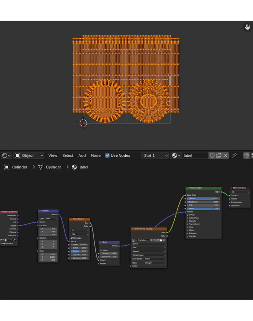
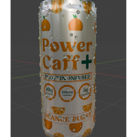
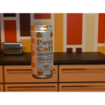
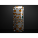
To develop the can, I began working in Blender to model its shape and applied a design I had previously created in Illustrator. This required multiple adjustments to the can wrap to ensure that the UV texture aligned correctly with the can’s surface. To enhance realism, I created a shader node to simulate the metallic appearance of an aluminium can.
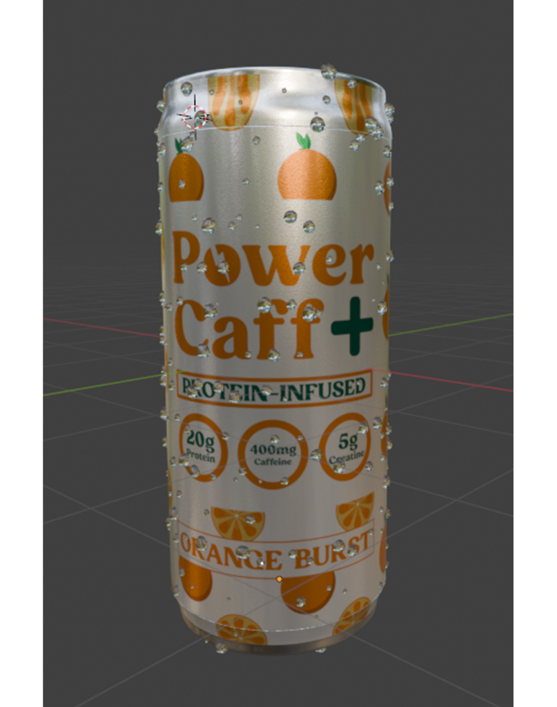
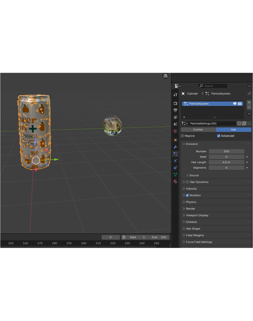
The addition of water droplets to the can posed another challenge. Many available tutorials were designed for different Blender versions and were therefore incompatible with my setup. However, I resolved this issue by using Blender’s particle system to morph hair particles into water droplets, which created a convincing condensation effect.
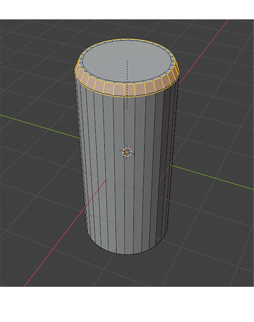
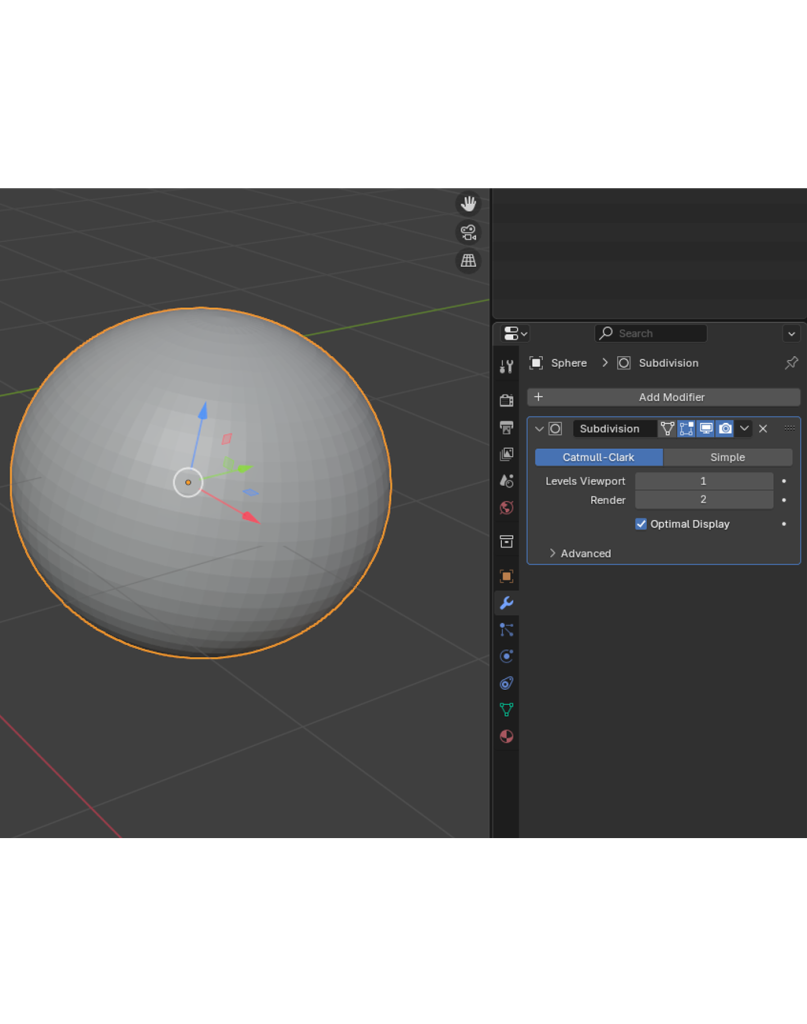
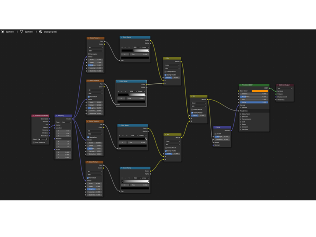
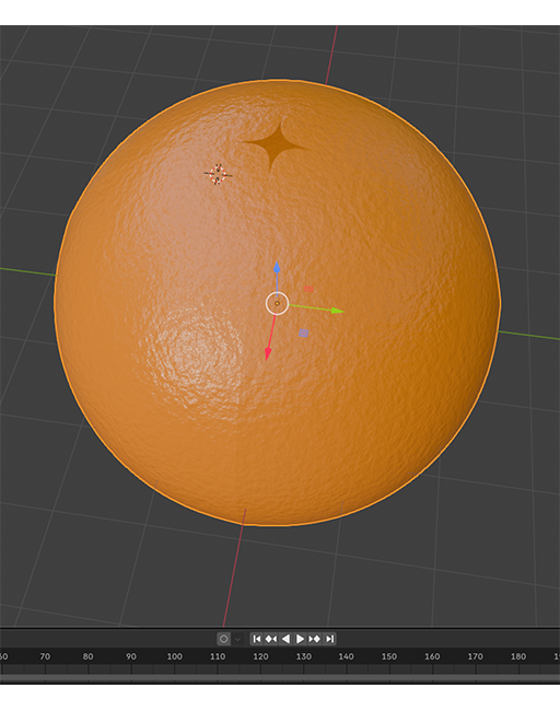
Next, I constructed the orange by starting with a sphere mesh object in a new Blender file. I applied a subdivision modifier to increase the number of faces and improve surface smoothness. To create the texture, I set up a shader node that added the characteristic dimples and colour variations of an orange. I then defined the segmentation by selecting and separating four lines on the surface where the orange needed to split during the animation.
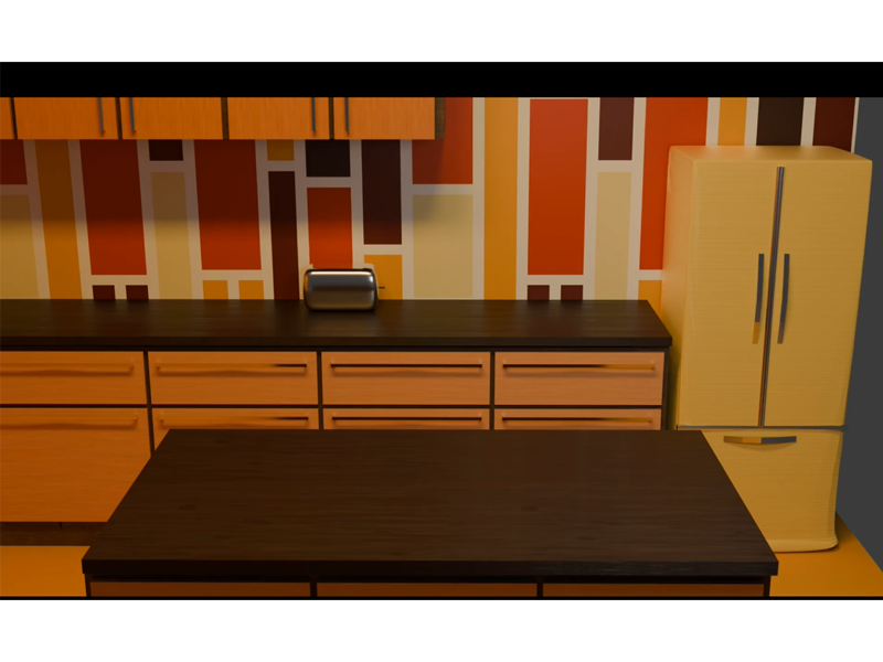
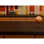
To situate the scene within a 1960s context, I designed a simplified kitchen background based on visual references from the era. Since I planned to adjust the F-stop to introduce background blur, the level of detail in the kitchen model was intentionally kept minimal.
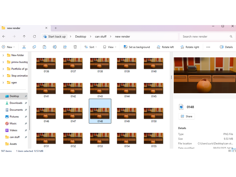
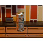
For the animation process, I integrated all objects into the scene and used Blender’s keyframing system to animate the sequence. The animation began with the orange rolling into the frame, peeling open to reveal the energy drink can as the metamorphosis moment. Rendering involved setting up a folder to export each frame as a .png file, which took approximately six hours. Subsequently, I created a new scene in Blender to adjust the final part of the ad, which required an additional hour of rendering.
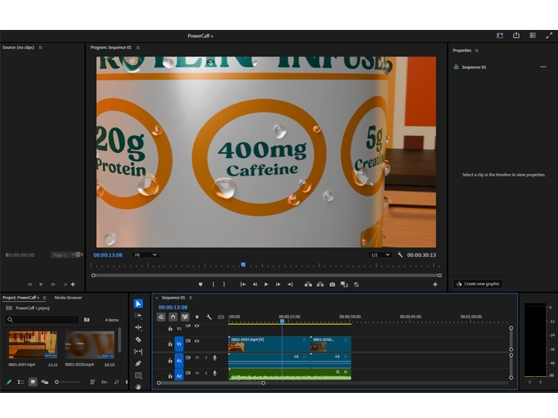
To compile the video, I used Blender’s video editing tools to combine the two rendered clips. I then imported the video into Adobe’s editing software, where I added music and finalised the ad at the required 24fps (frames per second) and 30-second duration.
Developing the animation storyboard
To begin the project, I researched 1960s-era beer commercials and identified a recurring pattern in their style and delivery. These advertisements were typically straightforward, focusing on direct product messaging rather than abstract concepts that required the viewer to decipher hidden meanings. This observation guided my decision to adopt a similar approach for the energy drink advertisement—emphasizing clarity and product visibility over complex storytelling. The goal was to create an ad that would resonate with an older demographic by using a nostalgic 1960s aesthetic while maintaining a simple, product-focused message.
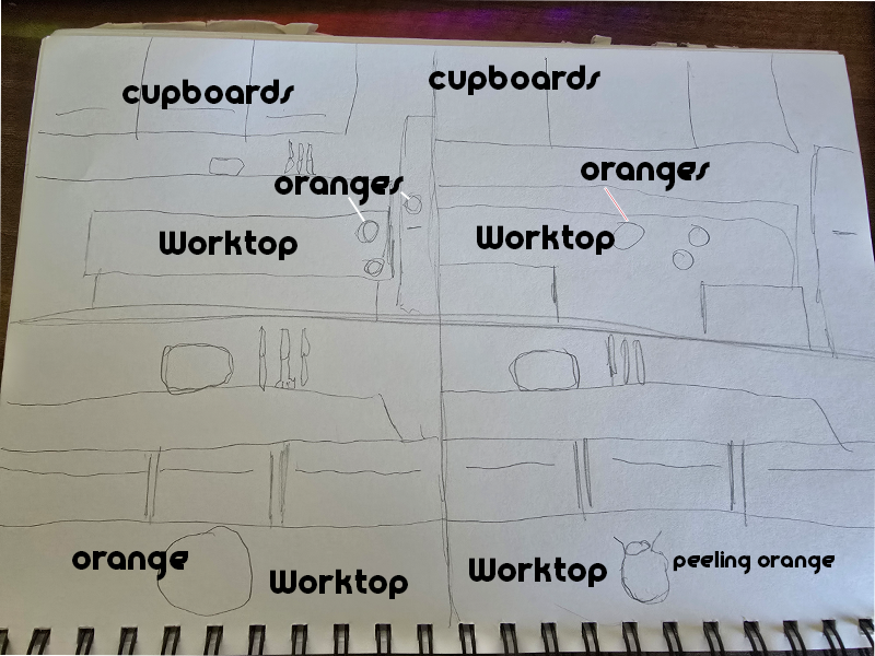
The initial design phase began with sketching a 1960s-style kitchen. I aimed to create a setting that was visually consistent with the era, including a central island countertop as the focal point. The scene was intentionally left uncluttered to reflect the minimalist design trends of the 1960s and to keep the viewer’s attention on the unfolding metamorphosis. The first key animation involved three oranges flying in from the right side of the frame. Including multiple oranges helped fill the scene and prevent it from appearing too sparse or visually unbalanced.
The central orange then moved into the middle of the frame as the camera adjusted its position to establish the next phase of the animation. At this point, the metamorphosis was introduced by having the orange peel back to reveal an energy drink can. This was achieved through careful animation of the orange segments splitting and curling away from the can. The can then emerged, rotating to display the product’s design and key benefits. To ensure the transformation appeared smooth and natural, I used Blender’s keyframing system to control the movement and rotation of the objects.
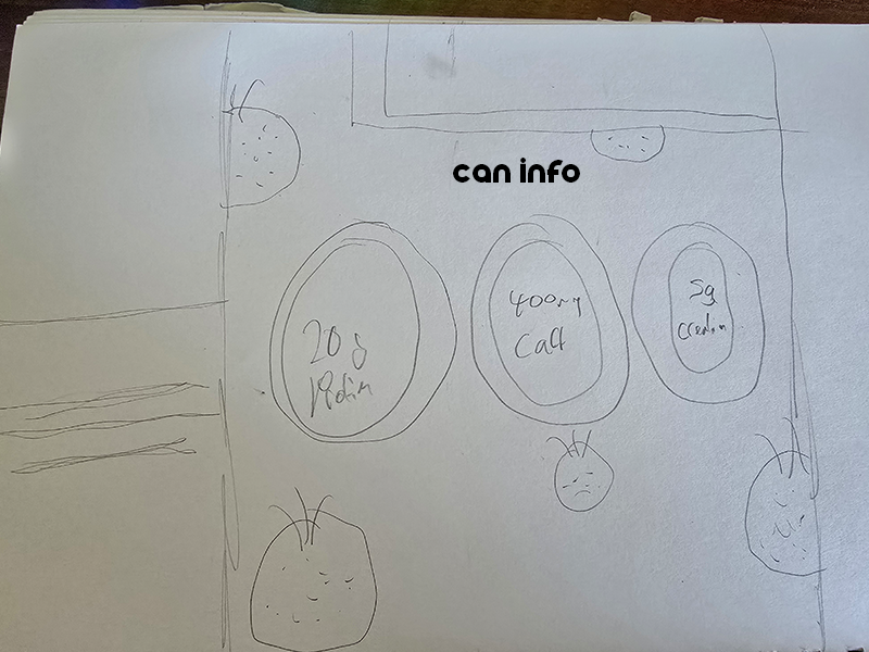
To highlight the product’s benefits, I programmed the camera to zoom in on the can’s key information points: protein, caffeine, and creatine content. This moment was designed to reinforce the health and performance advantages of the drink while ensuring the information was presented in a clear and digestible format. I planned to complement this visual focus with a voiceover that would further emphasise these benefits, aligning with the straightforward, informative style of 1960s advertisements.
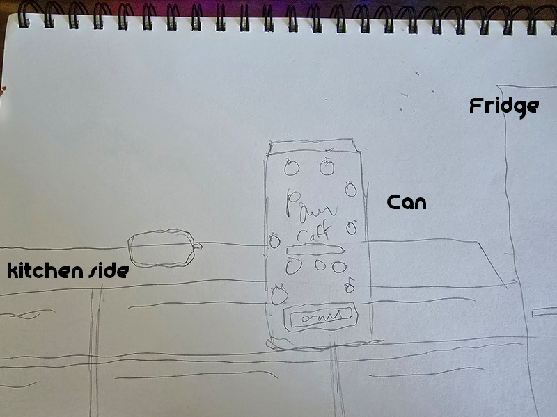
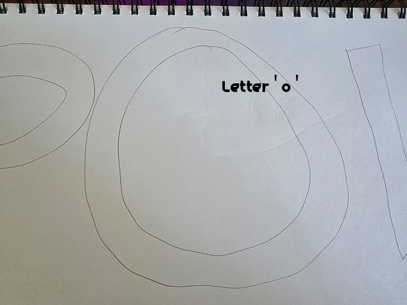
To transition to the final scene, I created a zoom-out effect centred on the ‘O’ in the product’s logo. This transition served as a natural breakpoint while maintaining a sense of continuity within the ad. The camera then spun back into a new, darker scene, where the product was isolated against a contrasting background to heighten its visual prominence.
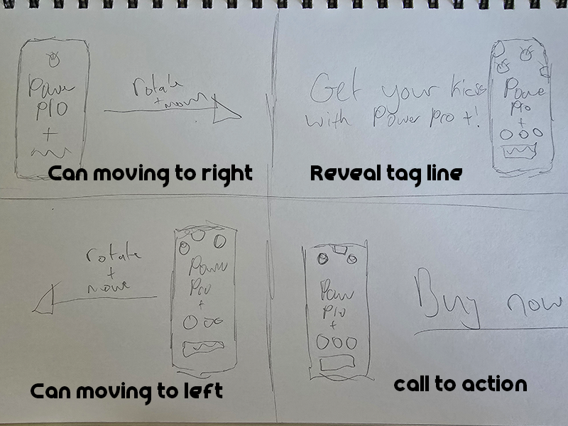
The concluding segment involved the can rotating and moving to the right side of the screen while the tagline “Get your kicks with PowerCaff +” appeared in bold text. This tagline was designed to reflect the 1960s influence while communicating the product’s energetic appeal. The animation then concluded with the can shifting to the left side of the frame as the final text, “BUY NOW!”, appeared to create a clear call to action.
Visual Design Treatment – How I Will Incorporate Edward Tufte’s Five Theories into My Work
Edward Tufte’s five key theories on visual design—data-ink ratio, chartjunk, small multiples, layering and separation, and integration of evidence—provide a framework for creating clear, engaging, and informative visual communication. In developing my metamorphosis animation for an energy drink advertisement targeted at an older demographic, I carefully considered how to apply these principles to enhance clarity, focus, and impact.
Data-Ink Ratio
Tufte’s principle of maximizing data-ink ratio focuses on reducing non-essential visual elements to highlight meaningful content. In my animation, I will apply this by maintaining a minimalist design that avoids unnecessary distractions. The background will feature a simple 1960s-style kitchen with a central island as the focal point. The orange and energy drink can will serve as the primary visual elements, ensuring that viewers focus on the metamorphosis and product details without distraction. By minimizing background complexity, I will direct attention to the key transformation moment.
Chart junk
To avoid chart junk, I will eliminate any decorative elements that do not add value or could confuse the viewer. The energy drink can’s design will remain clean and straightforward, displaying only the essential product information: protein, caffeine, and creatine content. The colour palette will reflect the 1960s theme while maintaining consistency and visual clarity. For the animation’s transitions, I will keep them smooth and simple to avoid overwhelming the viewer with unnecessary motion.
Small Multiples
Tufte’s theory of small multiples emphasizes the use of repetition to create pattern recognition and enhance understanding. In my animation, I plan to introduce three identical oranges flying into the frame at the start. This repetition will establish a consistent visual rhythm while reinforcing the natural, fruit-based theme of the product. The consistent appearance of the oranges will create visual harmony and guide the viewer’s eye toward the main transformation event.
Layering and Separation
Layering and separation will help establish visual hierarchy and depth within the scene. I will position the background kitchen on a separate plane from the orange and the energy drink can. Adjusting the F-stop to blur the background will create depth, ensuring that the product remains the focal point. This approach will enhance the viewer’s ability to distinguish between background and foreground elements, creating a more immersive experience.
Integration of Evidence
To integrate evidence effectively, I will synchronize the product’s key benefits with the metamorphosis moment. As the can emerges from the peeled orange, the camera will zoom in on the product’s nutritional details. The benefits—protein, caffeine, and creatine—will appear directly on the can, reinforced by a voice-over. This alignment of visual and verbal information will ensure the message is delivered clearly and memorably.
By applying Tufte’s five principles, the animation will maintain clarity, focus, and engagement while reinforcing the product’s benefits and nostalgic theme. This structured approach ensures that the ad remains visually appealing and easy to understand for the target audience.
Final Design – How Did I Incorporate Tufte’s Five Theories Into My Work
After completing the animation, I successfully applied Edward Tufte’s five visual design principles to enhance the clarity and impact of the energy drink advertisement. These principles ensured that the visual communication remained focused, direct, and engaging, while reinforcing the product’s benefits and 1960s-inspired theme.
Data-Ink Ratio
I maximized the data-ink ratio by maintaining a clean and minimalistic design. The kitchen background was intentionally simple, featuring a central island and a limited colour palette to reflect the 1960s aesthetic without overwhelming the viewer. The orange and energy drink can remain the primary focus, ensuring that the metamorphosis moment was clear and easy to follow. The background blur, achieved through adjusting the F-stop, further enhanced this focus.
Chart junk
To avoid chart junk, I kept the energy drink can’s design sleek and straightforward. The can displayed only essential product details—protein, caffeine, and creatine—using clean typography and a limited colour palette. I avoided adding complex patterns or excessive textures that could confuse the viewer. The animation’s transitions were kept simple and smooth, ensuring that the focus remained on the product and its benefits.
Small Multiples
The use of small multiples was integrated through the introduction of three oranges at the start of the animation. This repetition created a balanced and consistent visual rhythm while reinforcing the natural theme of the product. The main orange’s movement toward the centre frame established a natural flow toward the metamorphosis moment, guiding the viewer’s focus.
Layering and Separation
Layering and separation were achieved by organizing the background, orange, and can on distinct planes. The background kitchen was placed on a separate layer and blurred using a shallow depth of field, ensuring that the product remained the focal point. The orange and can were positioned in the foreground, creating a clear distinction between background and key objects.
Integration of Evidence
I successfully integrated evidence by synchronizing the emergence of the can with the display of key product benefits. As the orange peeled back to reveal the can, the camera zoomed in on the can’s nutritional details. The protein, caffeine, and creatine content were displayed directly on the can’s surface, supported by a voice-over reinforcing these benefits. This ensured the information was conveyed visually and verbally in a cohesive manner.
By applying Tufte’s principles, the final animation maintained a clear visual hierarchy, minimized distractions, and effectively communicated the product’s benefits. The combination of clean design, consistent repetition, and clear layering ensured that the metamorphosis moment was impactful and easy to understand. This structured approach resulted in a professional and engaging advertisement that aligns with the nostalgic 1960s theme while delivering the product’s message effectively.
NeoSounds – Music library for creators (2023) [Felipe Adorno Vassao – And Now This (music for content creators)]. YouTube video, 2 December. Available at: https://www.youtube.com/watch?v=y6fQfRyIEB0 (Accessed: 20 March 2025).