In this blog entry, we will be focusing on the font chosen in this online airlift magazine. The font used is a thick and solid italic Sans Serif style font, which contributes to its clean design. As airsoft is a mil-sim (military simulation), we tend to view the military as serious; they are concise, strict, and clean. Thus, the nice, thick, and white font becomes the main focus of this magazine, making it clear where the hierarchy is placed.
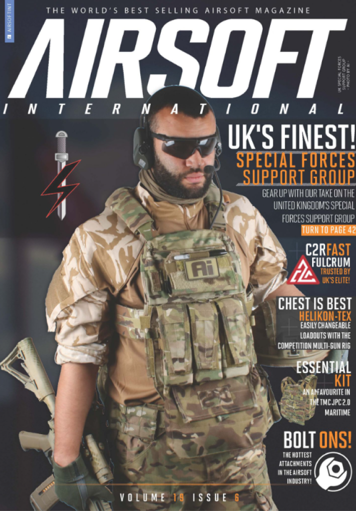
In the secondary font, they continue to use a sans-serif font but have removed the italics as the font size decreases, indicating its status as secondary content for the reader. This adjustment helps maintain neatness and readability, which are crucial aspects in aligning with the intended style of this magazine. The target audience comprises individuals interested in military-based information, as many enthusiasts approach this subject matter seriously. This deliberate choice of font is highly effective in preserving the magazine’s seriousness for dedicated airsoft enthusiasts. Although it still keeps the playfulness by the use of italics.
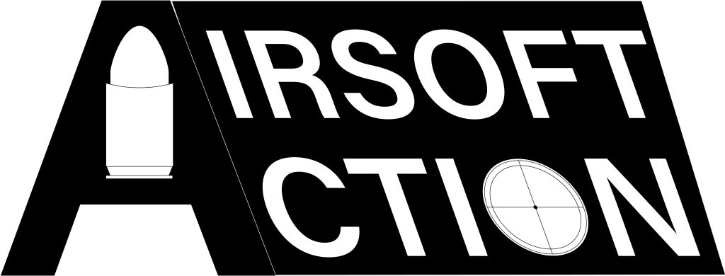
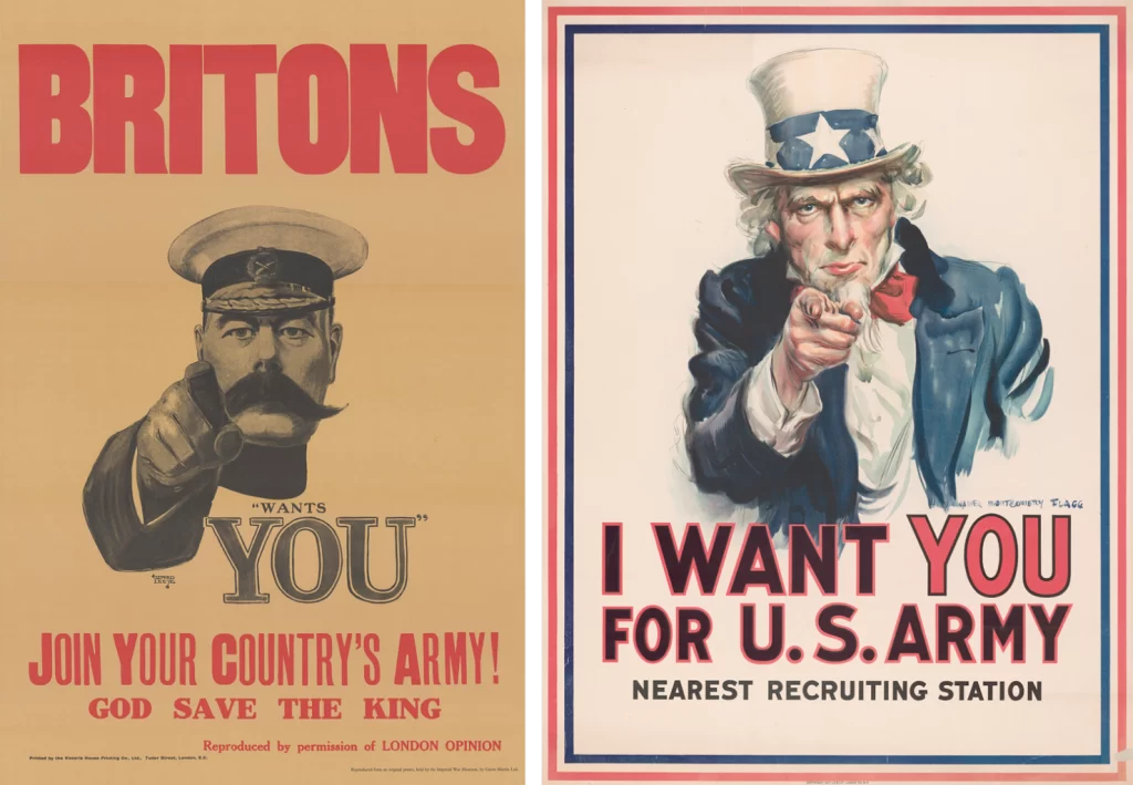
If we look at the old wartime posters, they both use Sans Serif, but none are italicized as they want it to be bold and in-your-face to show how serious they are. Again, there is a lot of emphasis on the ‘YOU’ part of the writing to bring attention that they are speaking directly to the reader. In the first image from the magazine, ‘AIRSOFT’ is the largest word to emphasize that it is all about Airsoft.
For the reasons stated, I believe it to be a good example of typography. It is clear and concise, just as intended, to give that serious look while still keeping it playful with the use of italic.
Image sources/references:
Paul,[No surname shown] (2023) Airsoft International, issue 6 volume 19, front page https://www.ai-mag.com/new-issue-out-now-3/ [Accessed 04/10/2023]
P, Kennedy (2016-2022) ‘I want you!’ The story of James Montgomery Flagg’s Iconic Poster. https://illustrationchronicles.com/i-want-you-the-story-of-james-montgomery-flagg-s-iconic-poster [Accessed 07/10/2023]
No Author. (2023) https://www.airsoftaction.net/issue-152-august-2023/ [Accessed 07/10/2023]
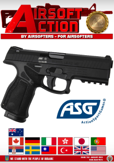
For this next magazine, the font style chosen is once again a sans-serif font. This one has sharper edges, but it also feels cumbersome. It has been underlined as a method to bring the text forward and create a hierarchy within the header. However, this underlining is unnecessary due to the size of the text itself. The excessive use of red also contributes to a tacky appearance, detracting from the clean aesthetic associated with airsoft. An attempt has been made to incorporate a gun in the background as part of the header, but it does not harmonize well. In contrast, the font used in the logo beneath the central gun does a slightly better job. The white sans-serif style font provides cleaner shapes and could potentially integrate the gun into the logo seamlessly.
Remaking the Action Airsoft logo
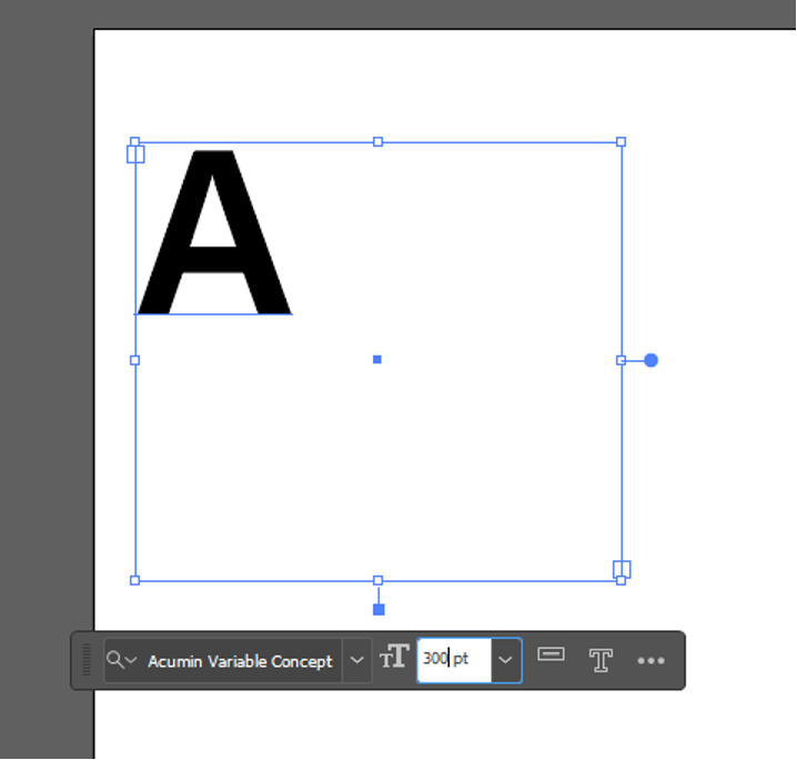
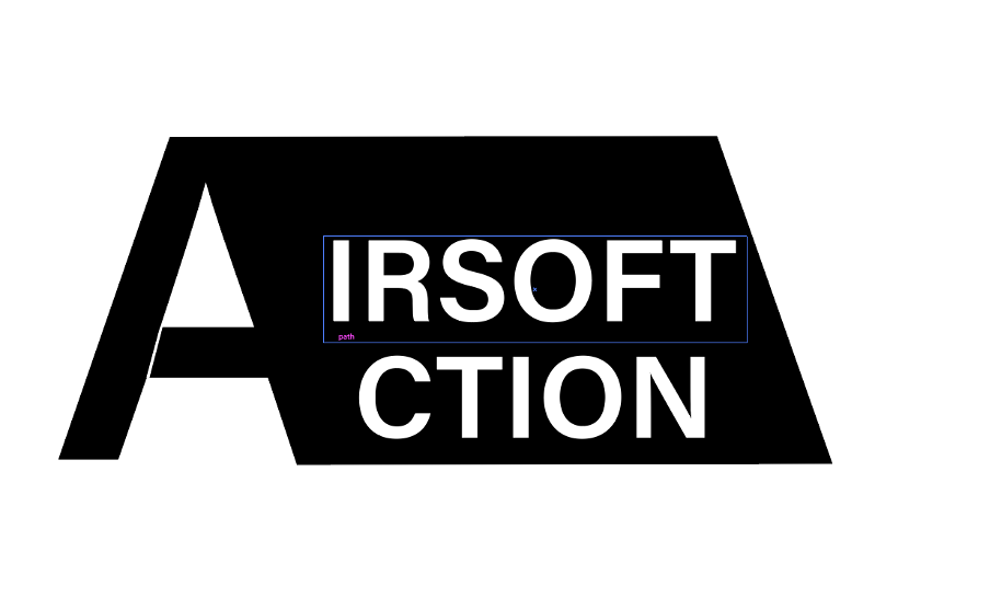
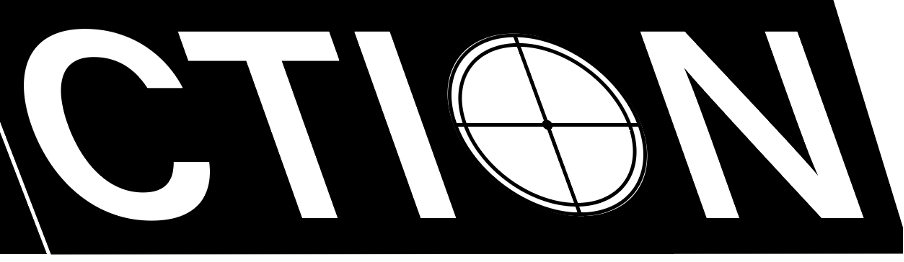
In the process of redesigning this typography logo, the aim was to retain key elements, such as utilizing the prominent ‘A’ as a drop cap and employing the sans-serif font, Acumin Variable Concept. The decision was made to opt for a minimalistic black and white colour scheme to ensure a clean aesthetic. A white outline was added to the ‘A’ to distinguish it from the other words. Additionally, a bullet symbol inside the ‘A’ was incorporated to convey the concept related to firearms, while the word ‘Action’ featured a crosshair, enhancing the logo’s sniper rifle association. The design evolution is illustrated through the provided screen captures, culminating in the final version presented below.