Typographical Logo

For the next typographical name logo, I integrated the initials ‘C’ for Curtis, ‘A’ for Ashley, and ‘M’ for Mohammed, achieving a synthesis of all three names. The design adopts a more linear and refined approach, evoking a corporate sensibility while infusing playfulness through gradient colours transitioning seamlessly from blue to purple, reflecting personal preferences. The backdrop features bordered gradients progressing from green to yellow, strategically interlaced with whites for a delicate luminosity. This nuanced adjustment prevents excessive contrast, ensuring subtle separation between foreground and background elements, contributing to visual harmony.
Letterforms were meticulously derived from rectangular shapes, strategically cut and segmented to convey a futuristic aesthetic. Rounded edges were introduced to maintain an overall clean and sophisticated appearance, blending contemporary design elements with timeless refinement. This typographic composition strikes a delicate balance between a corporate aesthetic and individualized expression, fusing professionalism with personal flair. Evidenced in gradient choices and letterform manipulation, it encapsulates a visual narrative that resonates with both the formal and personal facets of my identity.
Typographical Logo 2
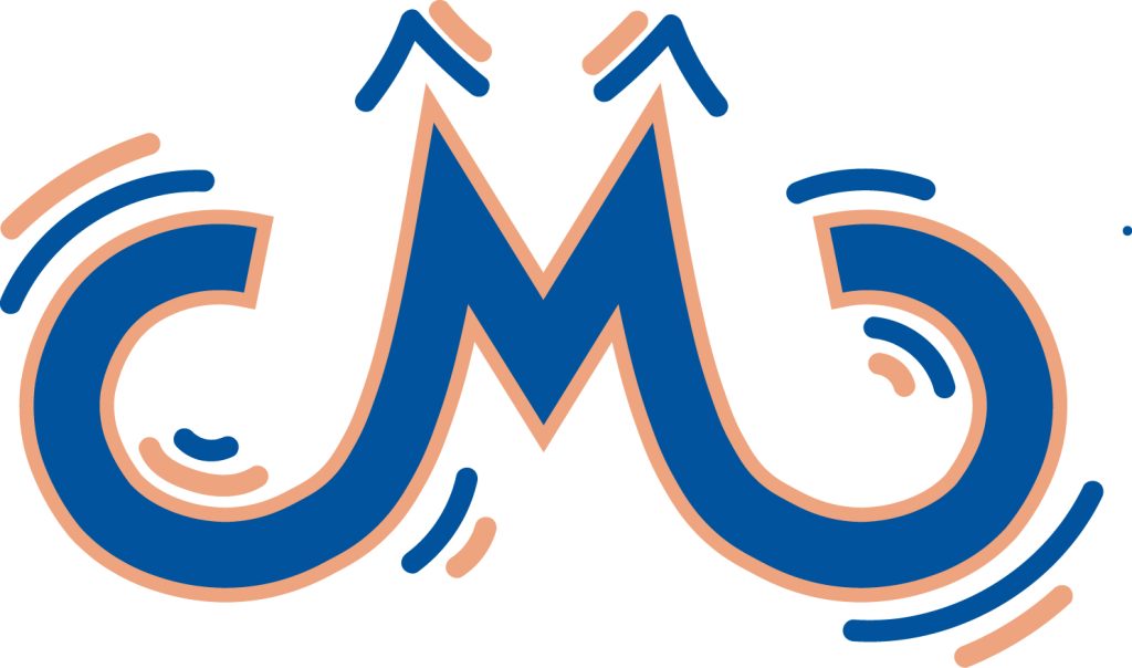
In crafting the initial typographical logo, I chose to feature my nickname ‘CMO,’ representative of Curtis Mohammed. Commencing with a hand-drawn approach, I utilized a single line to create the lettering. To enhance stylization, I equalized the ‘C’ and ‘O’ dimensions, elevating the ‘M’ for varied height levels while maintaining alignment. The ‘O’ underwent modification, detached from the primary design, and integrated with a flipped and duplicated ‘C’ for symmetry. An offset line was introduced to augment volume, reflecting my robust physique. Subsequently, movement lines were incorporated to convey dynamic energy, mirroring my propensity for constant activity. The chosen colour scheme comprises a peach outline complemented by a robust blue core, selected for their distinct contrast. This typographic design not only encapsulates my personal identity but also visually communicates aspects of my physicality and energetic nature. Finally, the reason for only using my nickname is because my full name is too long, and it keeps my logo looking short and clean.
Conceptual Name Logo 1
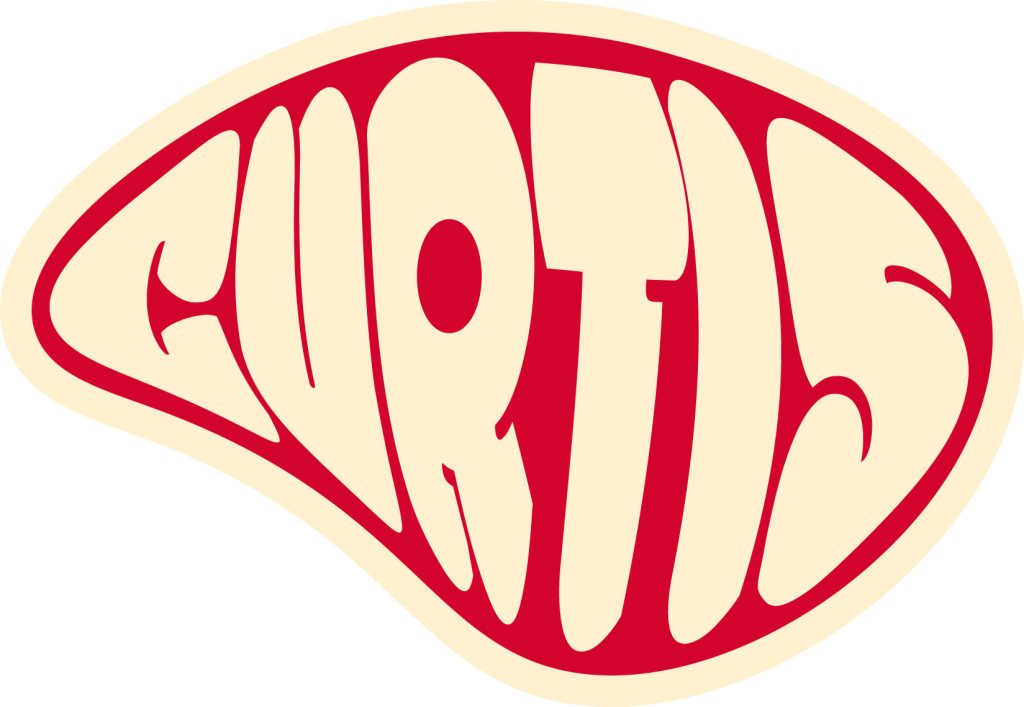
In 2021, my exploration of the carnivore diet prompted a critical analysis of nutritional studies. Adhering to the diet resulted in a significant 3-month weight loss of nearly 5 stone. The conceptual design emphasizes meat, reflecting a longstanding personal conviction. The design incorporates a manipulated oval shape, a customized Gill Sans font for uniqueness, and a colour palette representing meat characteristics. Notably, the yellow/white colours signify fat marbling, red represents hemoglobin, and a red circle within the ‘R’ denotes the bone’s position. Additionally, the typography within the meat employs bold letters, symbolizing a correlation between fat and boldness. This innovative typographic choice adds nuanced depth to the design, highlighting the interplay between bold lettering and the presence of fat in the meat, offering a subtle yet meaningful visual element to the overall concept.
Conceptual Name Logo 2
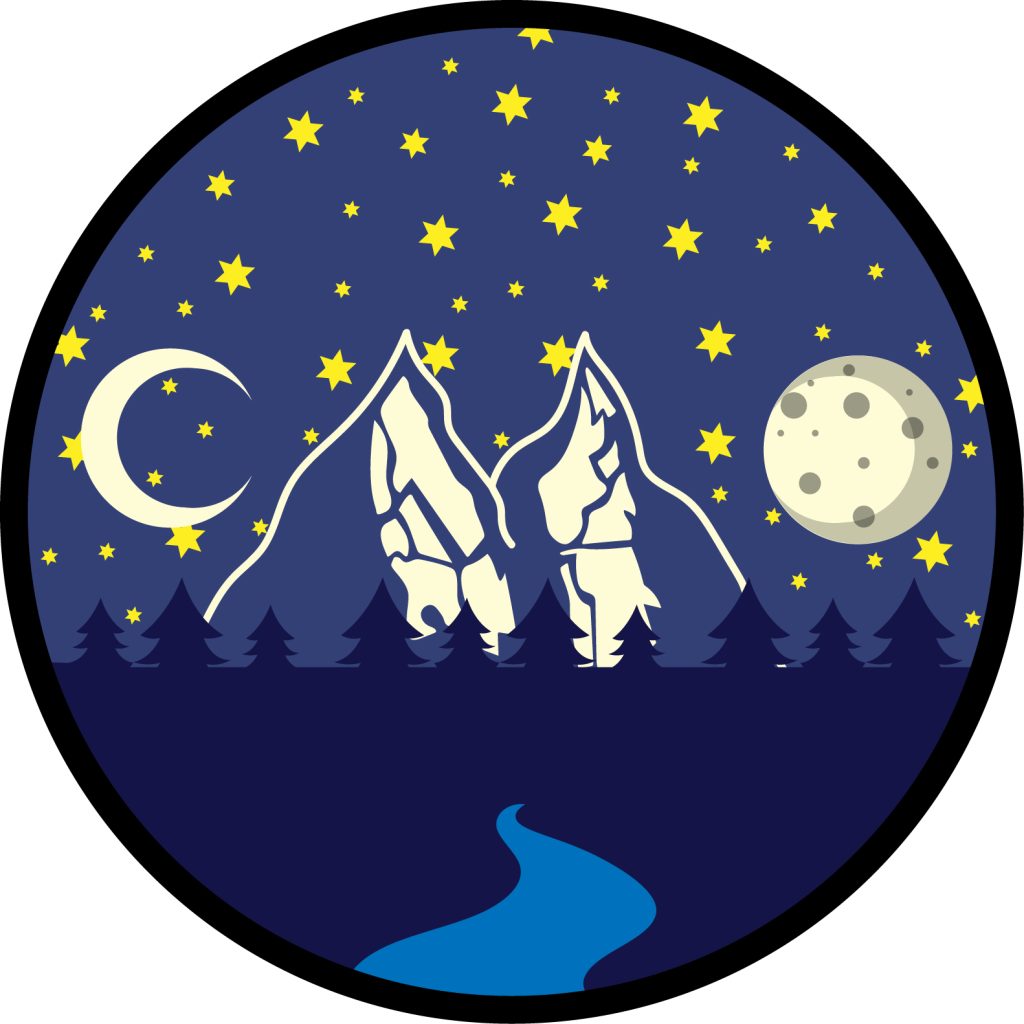
The second conceptual design ingeniously incorporates symbolic elements to represent ‘Curtis’: a crescent ‘C’ signifying the initial, a mountain evoking ‘Mohammed,’ and a full moon embodying the surname. The colour palette thoughtfully utilizes moonlight to accentuate both celestial and topographical features. Yellow hues symbolize stars, drawing inspiration from contemplative stargazing experiences, while the dark blue tones elegantly silhouette trees. The lighter blues delicately evoke the subtly illuminated night sky. The addition of a river gracefully fills the vacant space, enhancing the overall aesthetic appeal. A black border, characterized by thick lines, imparts a distinctive badge-like quality to the design.
This composition effectively communicates a thematic interest in nature and the night sky, reflecting a profound connection to the cosmos and the tranquillity derived from celestial contemplation. It encapsulates not only personal identity but also an aesthetic appreciation within a visually cohesive framework, creating a harmonious synthesis of individuality and artistic expression.
Illustrator Portrait 1
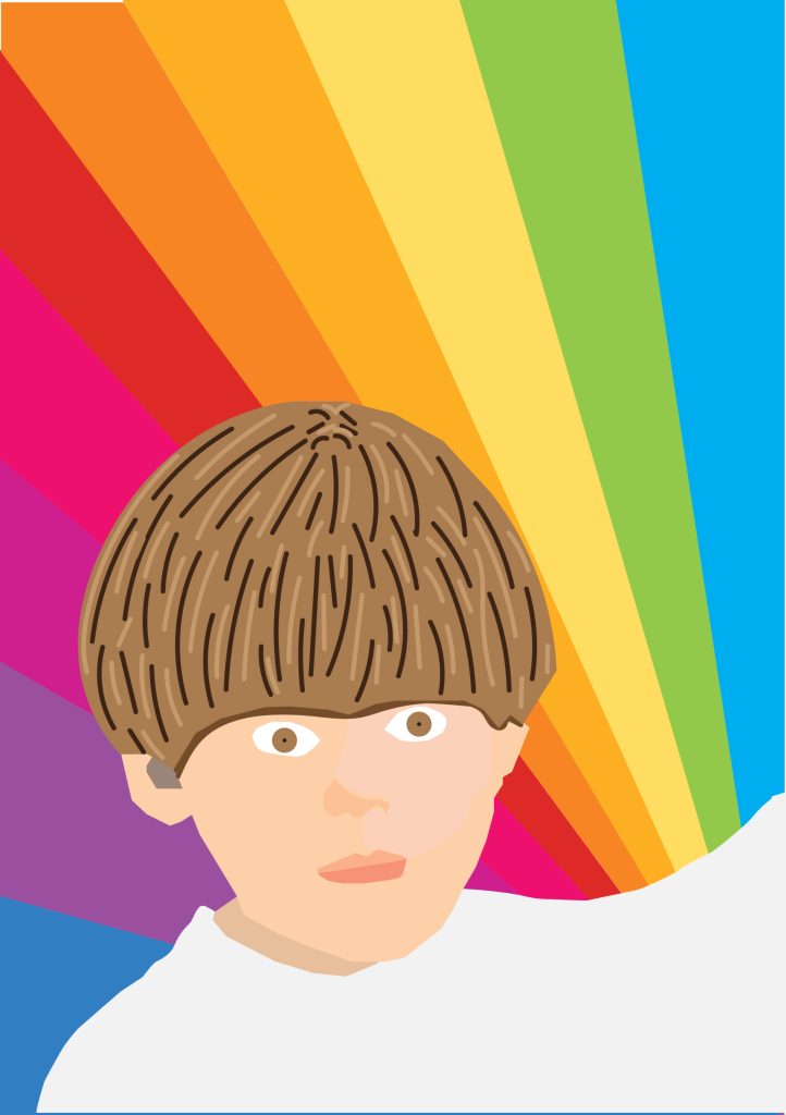
In crafting the second portrait illustration, I selected a childhood photograph of myself, importing it into Adobe Illustrator for meticulous tracing. While delineating the image, my aim was to maintain a refined design, opting for simplicity over intricate detailing. This choice was deliberate, reflecting the carefree stage of my youth when life was unburdened and positive. To enhance the visual narrative, I incorporated a rainbow as the background, not only to eliminate white space but also to symbolize the whimsical nature of childhood imagination. The significance of this photograph lies in the portrayal of my youthful self-sporting a fashionable bowl-cut hairstyle, which was inexplicably popular during that era. This artistic rendition encapsulates the innocence and joyful spirit of a carefree childhood, encapsulating a moment in time within the confines of an aesthetically pleasing composition.
Illustrator Portrait 2
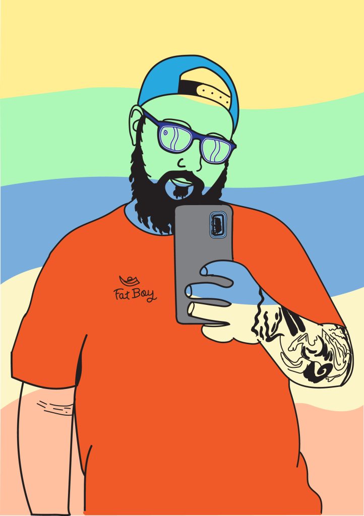
In my initial self-portrait Illustrator edit, I selected a photograph taken during a transformative phase in my life, capturing a period of improved well-being and self-esteem following significant weight loss. The use of light, wavy background colours serves as a symbolic representation of emerging from a metaphorical darkness. Employing manual tracing, I outlined my body and key features in black, creating a visual hierarchy that emphasizes aspects I appreciate about myself. Notably, the T-shirt I wore was adorned with a hand-drawn design from my own brand, ‘Fat Boy Apparel.’ This holds particular significance as it marks the inception of my graphic design journey, sparked by the creation of the brand’s logo. This experience played a pivotal role in solidifying my interest in the realm of graphic design, providing a sense of purpose and direction that had previously eluded me.
This self-portrait not only captures a personal transformation but also serves as a visual narrative of my journey into graphic design, reflecting the symbiotic relationship between personal experiences and professional aspirations.
Photoshop Portrait 1
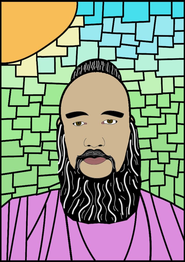
In constructing the Photoshop portrait, I captured a contemporary selfie showcasing my present appearance, characterized by the prominent beard that has become integral to my identity. The conceptualization involved employing a stained-glass effect, a deliberate choice reflecting the cautious approach I now adopt as an adult in navigating various facets of life. This stylistic decision underscores the need for careful consideration in my actions. Despite the inherent caution, the choice of soft-toned, light colours in the stained-glass effect serves to convey my profound appreciation for life and its manifold offerings. The incorporation of shades mirroring the lush green of grass transitioning to the vibrant blue of the sky, bathed in the radiance of a sun, maintains fidelity to natural hues, grounding the artistic representation in authenticity and capturing the essence of life’s vivid spectrum.
Photoshop Portrait 2
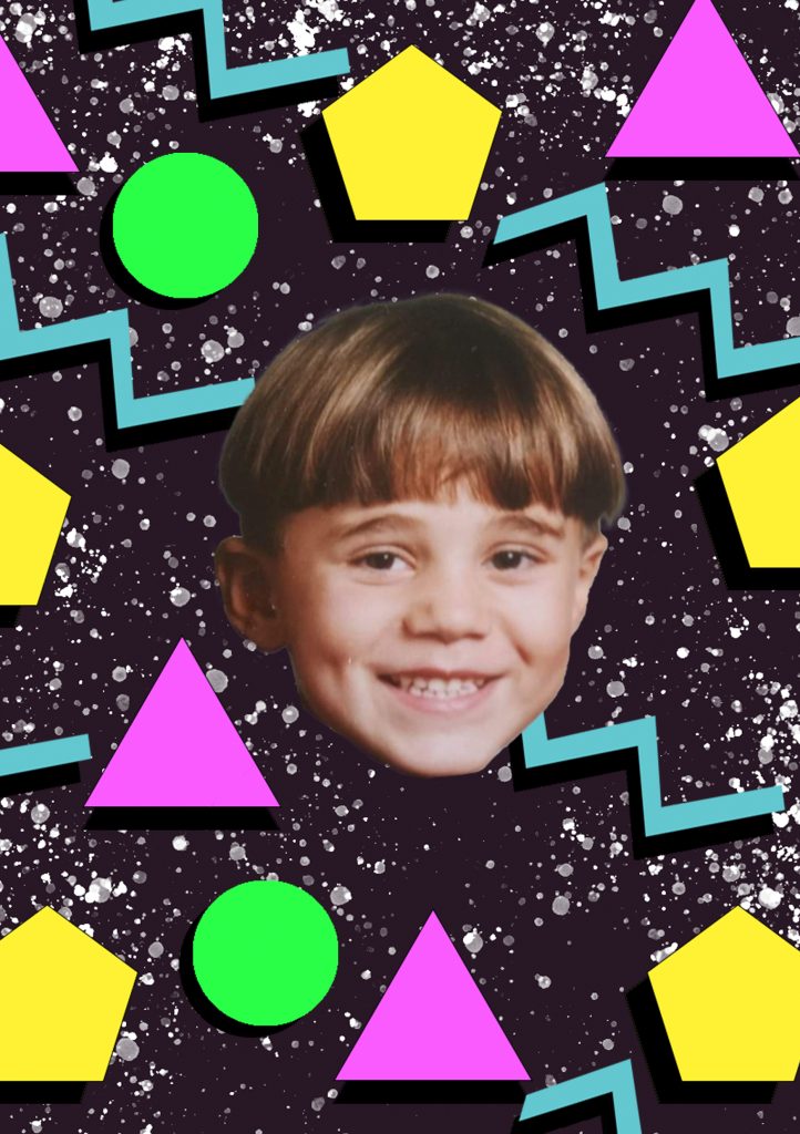
In crafting the second Photoshop-altered portrait, I revisited a childhood image of myself, characterized by the iconic bowl cut hairstyle that epitomized the 90s aesthetic. This reinterpretation aimed to evoke the essence of the 1990s by incorporating diverse basic shapes and vibrant pop colours, emblematic of the prevalent design trends of that era. The photograph, featuring a beaming smile, serves as a poignant reflection of the exuberance I exuded during that phase of my life—a carefree and spirited child embracing the full spectrum of experiences life offered. To enhance the nostalgic ambiance, I employed a custom brush to generate a space-themed backdrop, subtly reminiscent of static from a television screen. This stylistic choice pays homage to my formative years spent engrossed in television shows characterized by captivating shapes and colours, providing a visual narrative that encapsulates the exuberance and vibrancy of a bygone era.
Self Promotional Poster
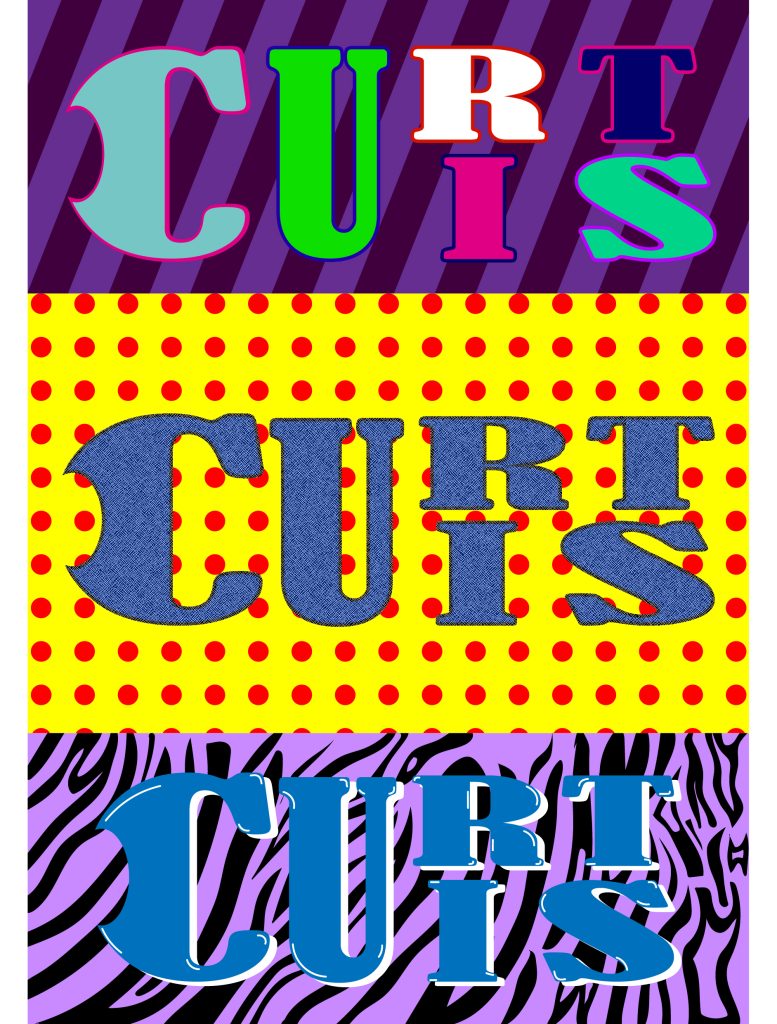
In conceptualizing my promotional posters, I endeavoured to authentically capture the essence of the 1990s, a period I hold dear as one of the greatest moments in design, film, music, and technology. This era holds particular importance for me, serving as a foundational influence on my current perspective on modern art. The typography underwent a transformation, adapting to a snug rectangular format across three variations. One variant featured a self-created denim texture, paying homage to the profound influence denim had on 90s fashion. The colour palette drew inspiration from the vivid, punchy hues characteristic of the era’s multi-coloured clothing. The backgrounds were meticulously crafted with various shapes and patterns, ranging from polka dots to a purple tiger-skin motif. These patterns, hand-drawn and vectorized, pay homage to the tactile and visually eclectic textures prevalent during that distinctive era. By infusing my promotional posters with the nostalgia and design innovations of the 1990s, I aim to convey the timeless appeal of this period and underscore its lasting impact on my current artistic sensibilities.
Self Promotional Poster 2
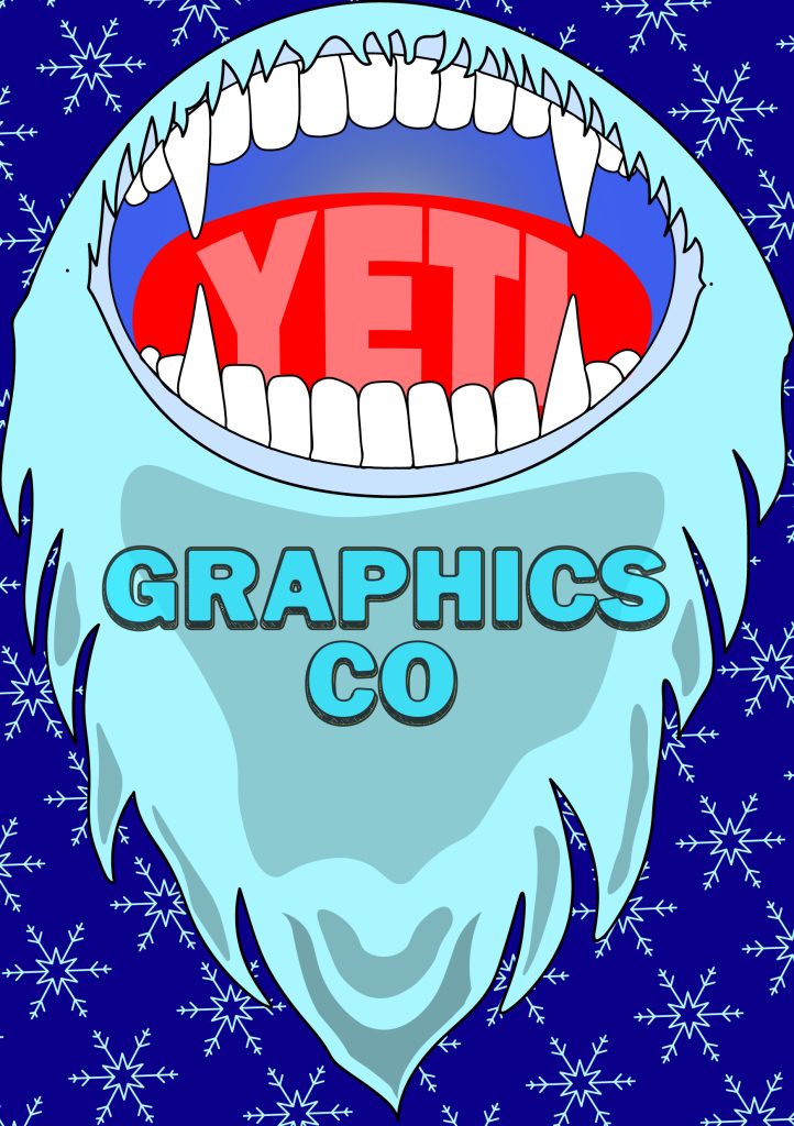
In the final iteration of the promotional poster, my intent was to depict my professional evolution. I opted to symbolize this progression through my latest personal identity, known to friends and family as “Yeti.” Integrating my name within the Yeti’s tongue served to establish a visual hierarchy, supplemented by the inclusion of ‘Graphics Co.’ This phrase signifies my aspiration to establish and operate a graphics design company, providing me with the autonomy to pursue personal priorities. The envisioned company ownership aligns with my desire to liberate myself from the competitive nature of professional life, allowing me to prioritize aspects of personal significance. The choice of colours is deliberate, reflecting my envisioned destination—a snowy expanse in Norway, where I anticipate establishing a homestead. This location, depicted through clear blue skies and snow-covered mountains, encapsulates my envisioned work and living environment. The subtle background of snowflakes symbolically reinforces this aspiration, emphasizing a harmonious coexistence with nature while pursuing professional fulfilment.