Brand Guide
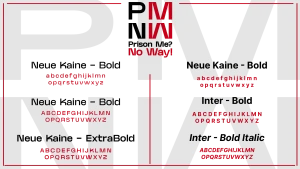
To effectively communicate the mission of ‘Prison Me? No Way!’, I adhered to a strict and cohesive design strategy. This approach included limiting the overall aesthetic to three core colours, two complementary fonts, and the use of straight, clean lines. These decisions were made to align with the professional tone of the organisation while ensuring the design remains accessible and engaging for its audience. As a non-profit organisation focused on reducing youth crime and creating pathways for success, it is vital that the design reflects the seriousness of their objectives. The simplicity and consistency of these visual elements help convey their message clearly and authoritatively.
The redesign process presented significant challenges, particularly in striking a balance between professionalism and approachability. The primary audience for this initiative includes school-aged children, which necessitates a design that resonates with them without diluting the organisation’s serious undertone. Navigating this tension was not straightforward; however, the updated design successfully integrates these dual objectives. By combining modern and youthful visual elements with a professional framework, the new design feels both credible and relatable.
One of the most critical issues identified during the redesign was the previous website’s overwhelming amount of information. The original site contained excessive and, in some cases, redundant content, which detracted from its overall usability and effectiveness. To address this, I streamlined the website into a single-page format. This approach ensures that all essential information is accessible through intuitive scrolling, which not only improves navigation but also enhances user engagement. This design choice prioritises clarity and avoids the cognitive overload that the previous version risked imposing on its users.
To further optimise the website’s functionality, I introduced two distinct call-to-action (CTA) buttons. The first button encourages visitors to sign up for additional information, facilitating engagement and ongoing communication with the target audience. The second CTA is dedicated to booking services for the organisation’s mobile van initiative. The emphasis on the van stems from its unique ability to provide a tangible, immersive experience for children and teenagers. By simulating the realities of prison life, the van offers a level of realism that is both impactful and memorable. This hands-on approach resonates deeply with the target demographic, making it an invaluable tool in delivering the organisation’s message. Overall, the redesign seeks to modernise and refocus the visual identity of ‘Prison Me? No Way!’ in a manner that aligns with its mission and core values. The use of minimalistic design principles, coupled with a streamlined user interface, enhances the organisation’s ability to communicate effectively with its audience. By addressing the key issues of content overload and visual inconsistency, the new design provides a foundation for future growth and engagement. This project has also deepened my understanding of balancing ethical design practices with audience-specific considerations, ensuring the outcome is both impactful and sustainable.
Multichannel Marketing Campaign
For the rebrand, I aimed to create a cohesive and adaptable design that could function seamlessly across multiple platforms. Simplicity was a key consideration, as it ensures the branding remains clear and effective, no matter where it is applied. To achieve this, I focused on three primary platforms: Instagram, the organisation’s website, and a newsletter template designed for regular updates. These elements were chosen for their relevance and accessibility, allowing the campaign to reach a diverse audience in an impactful way.
Instagram Post Design
For Instagram, I prioritised simplicity and visual impact. To create an engaging post, I designed a bus stop mock-up featuring the new logo, accompanied by testimonials from staff and students who have benefited from the organisation’s initiatives. To enhance interactivity, I included a functional custom QR code that directs users to the organisation’s website. This integration of physical and digital elements encourages engagement by providing an easy way for viewers to learn more.
To add a dynamic and memorable quality to the post, I used Adobe After Effects to simulate a blinking backlight effect. This subtle animation not only draws attention but also creates an eerie and thought-provoking atmosphere, which aligns with the organisation’s mission of raising awareness about the consequences of crime. This creative touch helps the post stand out on Instagram’s highly visual platform, increasing the likelihood of user interaction and shares.
Website Enhancements
The website redesign was another critical aspect of the rebranding process. Using Figma, I implemented a scrolling feature to modernise the site and provide a more immersive user experience. Scrolling designs add depth and interactivity, making the website feel more engaging and less static.
At the bottom of the homepage, I incorporated a mock-up of the reinvented van, prominently displaying the new logo and key information about the organisation. This addition serves as both a visual focal point and a practical tool for viewers who may encounter the van in their community. By including the website URL and contact details on the mock-up, I ensured that the van itself becomes a mobile advertisement, increasing awareness and accessibility for those interested in learning more.
https://youtube.com/shorts/p8NcATXbfpw
https://www.figma.com/design/eP2CqgWoIYULuOqOnRuuzH/PMNW-Website-Final?t=bEwb6RnFLXv7fOWz-1
Newsletter Template
The newsletter was designed to be versatile, capable of being adapted for weekly or monthly updates. Its clean layout and consistent branding ensure it aligns with the overall campaign, fostering trust and familiarity among recipients. Newsletters are a cost-effective way for non-profit organisations to maintain regular communication with their audience, providing updates on initiatives, events, and success stories.
Poster
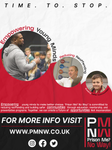
The poster features a clean and modern layout that immediately captures attention. The use of circular frames to highlight key images, such as a mentor addressing young people, a professional discussion, and a child’s optimistic expression, reinforces the core themes of empowerment, education, and safer communities. These circles are integrated with dynamic typography, where phrases like “Empowering Young Minds” and “Reducing Reoffending” curve around the images, creating movement and guiding the viewer’s eye naturally across the poster.
The colour palette—dominated by red, black, and white—is both bold and purposeful. Red symbolises urgency and action, aligning with the seriousness of the organisation’s mission to reduce reoffending and promote positive change. Black adds a sense of professionalism and authority, while white space ensures clarity and readability.
Impact and Importance
These design elements collectively contribute to building trust and recognition for the organisation. For a non-profit like Prison Me? No Way!, this is crucial, given their limited funding and reliance on community and institutional support. By maintaining a consistent and professional image across all platforms, the campaign can reach a wider audience while strengthening its credibility.
The rebrands focus on interactivity, visual appeal, and accessibility ensures that it resonates with its target audience, including schools, colleges, and young people. These efforts not only increase engagement but also enhance the organisation’s ability to deliver its message effectively, supporting its mission to educate and empower youth.
Mockups and examples
As a non-profit organisation that promotes ideas and awareness rather than selling physical products, it is important to consider how branding can be applied effectively to support their mission. Branding elements should focus on engaging the target audience, building trust, and increasing visibility without compromising the organisation’s professional image. For this reason, I explored practical and meaningful applications of the new branding guidelines to create a consistent and recognisable presence across different mediums.
Branded Materials for Staff and Outreach
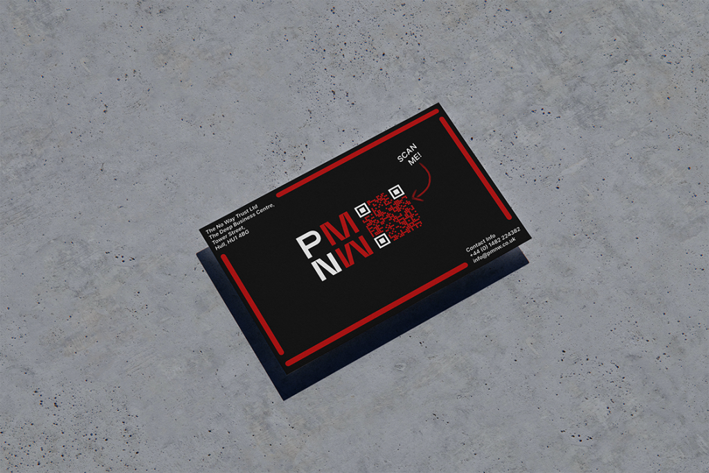
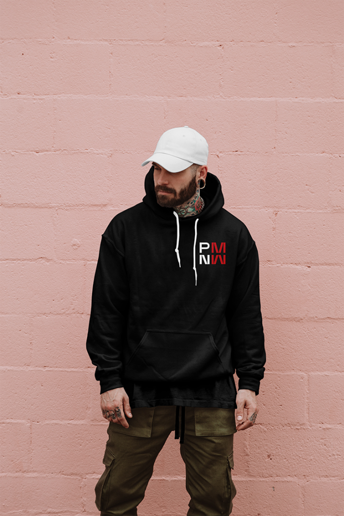
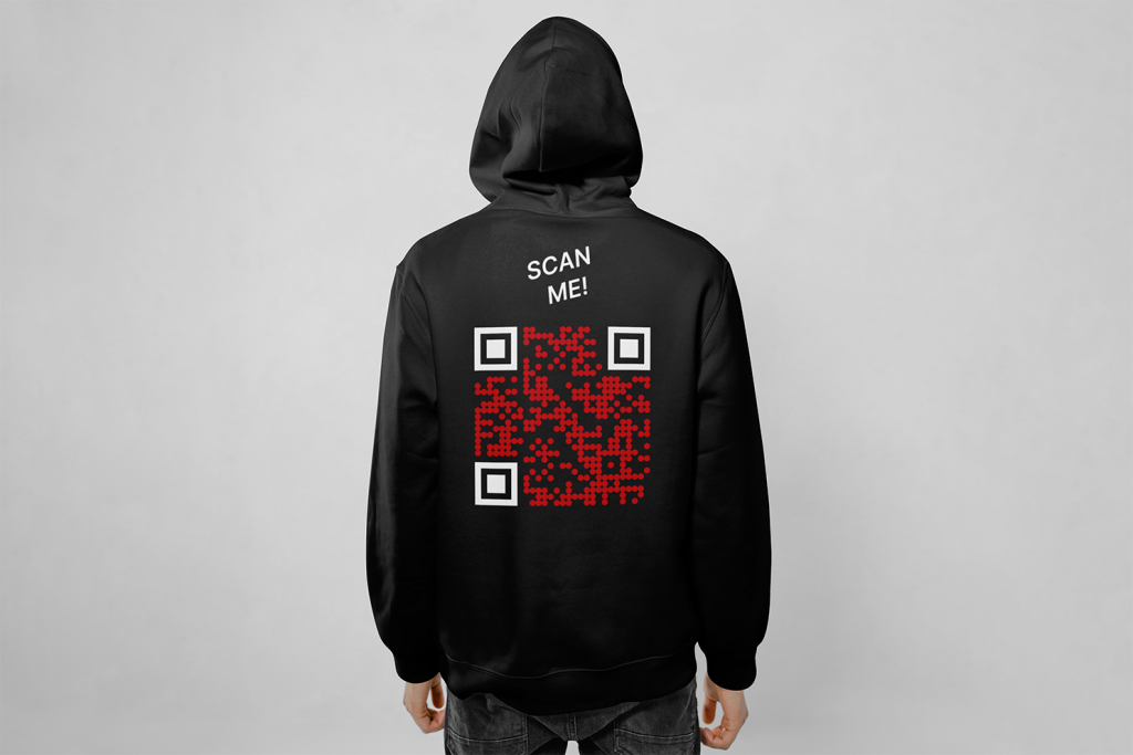
To maintain a professional yet approachable image, branded clothing for staff, such as t-shirts or jackets, can be used during events and outreach activities. These not only reinforce the organisation’s identity but also make staff easily identifiable, fostering trust among participants and attendees. Additionally, business cards are an effective tool for networking and spreading awareness. They provide a tangible reminder of the organisation and can include essential information such as a QR code linking directly to the website or social media platforms.
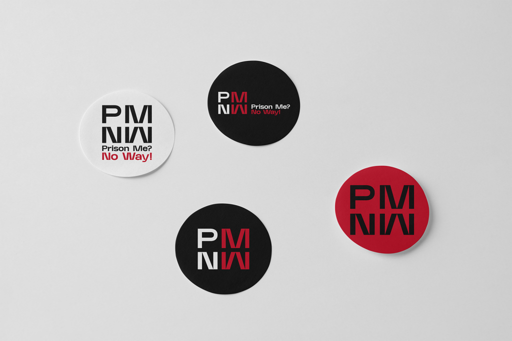
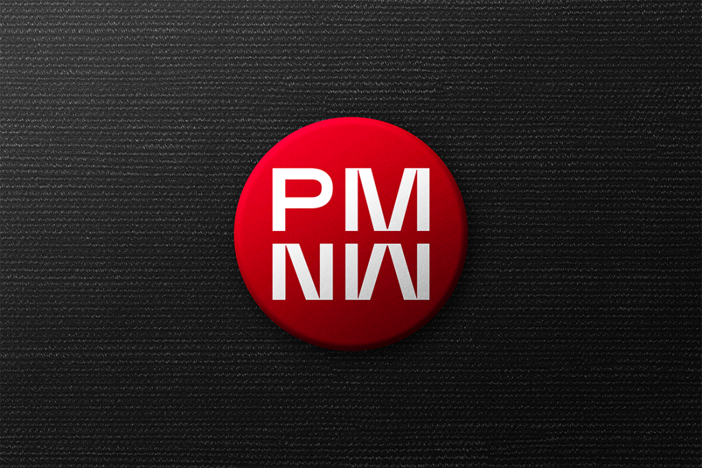
For younger audiences, I proposed using badges or stickers featuring the organisation’s logo and key messages. These items are cost-effective and appealing to children and teenagers, encouraging them to engage with the organisation in a light-hearted yet memorable way. They also serve as conversation starters, potentially prompting discussions between students, parents, and teachers about the organisation’s mission and activities.
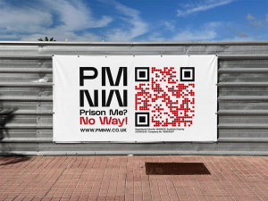
Advertising Through Billboards
Outdoor advertising, such as smaller billboards, offers a unique opportunity to reach a wider audience. However, placement is crucial for maximising retention and engagement. Billboards positioned in high-traffic pedestrian areas, such as near schools, parks, or public transportation hubs, are more effective than those placed along busy roads. Pedestrians have more time to stop, read the message, and engage with the content, such as scanning a QR code.
In contrast, billboards placed in drivers’ lines of vision are less effective for this campaign. Drivers are unlikely to have the time or ability to engage with the advertisement meaningfully, particularly in today’s fast-paced environment. By strategically situating advertisements in locations where the target audience can absorb and act upon the information, the campaign increases its chances of making a lasting impact.
Consistency and Professionalism
All these elements adhere to the new branding guidelines, ensuring a professional and cohesive image across all platforms. Consistency is key in building trust and recognition, particularly for non-profits that rely heavily on public perception and support. By applying the same colour scheme, typography, and logo across clothing, print materials, and advertising, the organisation establishes a unified identity that reinforces its credibility and mission.
The Importance of Adaptability
In today’s fast-paced world, where people are constantly bombarded with information, it is essential to create materials that are both attention-grabbing and easy to process. The use of QR codes, for instance, allows for quick access to additional information, catering to the audience’s preference for convenience. By offering multiple ways to interact with the organisation’s message whether through a billboard, a sticker, or a conversation sparked by branded clothing the campaign maximises its reach and impact. This approach ensures that the organisation not only raises awareness but also leaves a lasting impression on its audience. By combining professionalism with creative engagement strategies, the campaign helps the non-profit achieve its mission in a way that is both sustainable and impactful.

Mockup References.
mrmockup.com for outdoor billbord, hoodies both front and back, stickers, business card and van. www.mrmockup.com (02/01/2025)
Pixelbuddah Studio for the badge https://pixelbuddha.net/mockups/3245-badge-mockup Accessed (03/01/025)
QR Code was made using qr.io Accessed (22/12/2024)
Photos used from Prison Me No Way’s Facebook page Accessed (15/12/2024)