Creating branding guidelines for Teamwork Tactics
In developing my branding guidelines, the aim was to craft a design that exudes simplicity and sophistication, conveying the essence that this project seamlessly blends elements of enjoyment and corporate professionalism.
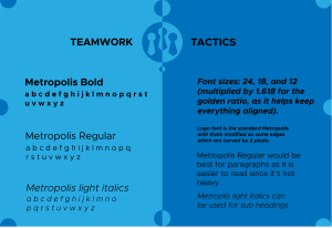
Metropolis, as a versatile font offering variations in bold, regular, and light italics, emerges as the linchpin for achieving optimal readability. Each iteration of the font is strategically employed throughout the document, serving to delineate different sections and enhance the overall visual appeal. This intentional approach to font choice reflects an understanding of the varied demands that different content types impose and positions the document as a dynamic and engaging piece of communication. The commitment to precision extends beyond the realm of aesthetics to the mathematical underpinnings of the document. Font sizes, adhering to the golden ratio, become more than mere dimensions; they are calculated elements that contribute to a typographical hierarchy. The resulting composition is not only visually appealing but also exudes an inherent sense of order and structure. This meticulous attention to detail ensures that the document is not only a conveyance of information but also a testament to the commitment to excellence.
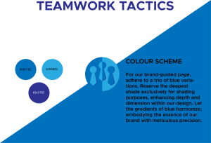
The colour palette, drawn from the company’s logo, is a strategic integration that transcends mere aesthetics. Comprising three distinct shades of blue, this selection serves a dual purpose. Firstly, it reinforces the corporate identity, creating a visual continuity that echoes the company’s brand. Secondly, it establishes a connection with the airsoft theme, particularly relevant in the context of winter combat scenarios. The intentional use of three colours introduces a dynamic element, ensuring diversity without sacrificing the document’s cohesive visual appeal. This thoughtful incorporation of colour signifies a commitment to relevance and resonance, creating a document that speaks directly to the interests and experiences of the target audience.
The layout decisions are equally deliberate, shaped by an awareness of the nature of both military and corporate enterprises. Basic shapes are employed not as mere design elements but as symbolic representations of precision and order, attributes paramount in both military and corporate contexts. Beyond aesthetics, this choice simplifies the branding process, providing a structured framework for document creation that aligns seamlessly with the values and expectations of the intended audience.
In summation, this meticulously designed document transcends the conventional boundaries of informational materials. Every element, from font choices to colour palettes and layout decisions, is a purposeful articulation of the company’s identity and values. This document is not merely a conveyance of information; it is a visual manifestation of professionalism, clarity, and adaptability—a testament to the commitment to excellence that defines both the company and the corporate entities it seeks to engage.
Online conceptual logo creation
In the development of the logo for this business, a deliberate decision was made not only to employ a distinct font but to conceptualize it with elements reflecting the dual nature of Teamwork Tactics. The logo, upon careful examination, reveals three figures positioned in a manner suggestive of leadership roles, denoted by the centreline that implies a leader present on both sides. This representation is identified as the ‘Boss-leader,’ symbolizing adaptability and the ability to function on both ends of the corporate spectrum. The utilization of two different shades of blue signifies collaboration among staff from various departments or companies. There where a few different attempts with different fonts being used and warped. You can see early on that the bullets for heads and the body as a tie was somthing that was going to be used, as you can see below.
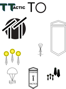
Each figure within the logo is divided into two components, with the airsoft bullet serving as the head and corporate ties symbolizing the bodies all in uniform. This fusion not only bridges the gap between airsoft and corporate aesthetics but also visualizes the unity of diverse elements in a team. The incorporation of a larger circle further reinforces the idea of unity and collective effort. The strategic use of three distinct colours in the conceptual logo adds depth and visual interest. Each colour serves a purpose, contributing to the overall narrative of the brand. The careful selection of shades creates a dynamic interplay that resonates with the dual themes of the Teamwork Tactics project, balancing professionalism and enjoyment.
The font chosen for the logo underwent meticulous editing to infuse uniqueness into the brand. The decision to round off the edges of the font’s top by 0.2 points was intentional, striking a balance between preserving the clean corporate aesthetic and introducing an element of playfulness. This nuanced adjustment aligns with the overarching theme of the event, emphasizing both the serious corporate aspects and the element of fun.
Delving deeper into the symbolism of the logo, the ‘Boss-leader’ figure encapsulates the essence of effective leadership – the ability to navigate and lead from various perspectives. The dual representation aligns seamlessly with the Teamwork Tactics ethos, emphasizing the collaboration between different entities and departments. This holistic approach to logo creation extends beyond mere aesthetics. It serves as a visual manifesto, encapsulating the principles of adaptability, collaboration, and unity that Teamwork Tactics embodies. The careful integration of airsoft and corporate elements in the logo symbolizes the harmonious coexistence of diverse facets within a cohesive team.
In conclusion, the logo design for Teamwork Tactics reflects a thoughtful blend of creativity and strategic thinking. The intentional incorporation of symbolic elements, proportions, positions, colour choices, and font modifications serves to elevate the brand’s identity, embodying the ethos of collaboration and fun inherent in the project. This logo transcends its visual representation; it becomes a narrative, telling the story of a brand that values both the corporate and enjoyable dimensions of teamwork and togetherness.
Website pages
In addressing this segment of the assignment, the logical choice was to develop a website, given the nature and scale of the business – a large company operating year-round. Adhering to the branding guidelines, a mock website was meticulously crafted to embody the essence of the Teamwork Tactics brand. The Home page strategically features the central conceptual logo, accompanied by the company name positioned on the top left. Equally divided tabs for ‘Products,’ ‘Events,’ ‘Reviews,’ and ‘Packages’ provide a streamlined navigation experience.
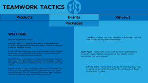
The Home page is intelligently sectioned into two parts, ensuring a harmonious balance of information. On the left, a concise welcome message provides a detailed yet engaging overview of the company’s offerings. The intention is to convey the depth of services without overwhelming the audience with excessive information. On the right, a showcase of top reviews immediately leaves a positive impression, fostering trust and interest from the outset.
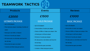
Upon clicking the ‘Packages’ button, the third page unveils a trio of packages catering to different preferences and needs. The ‘Ultimate Package’ stands out as the most comprehensive and cost-effective option, particularly suited for larger companies. The second package, while slightly reduced in offerings compared to the ‘Ultimate Package,’ presents a more budget-friendly alternative. Finally, the ‘Basic Package’ caters to those seeking a more economical choice, albeit with fewer inclusions.
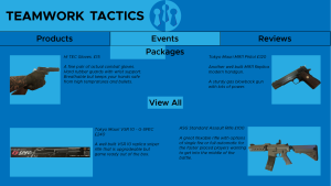
Transitioning to the Product page, continuity is maintained with the same top-of-the-website format seen on the Home page. Here, a visually appealing arrangement of images, accompanied by basic product descriptions and prices, facilitates an efficient understanding of the offerings. Positioned in the centre is a sample button, designed to direct users to a dedicated page listing all available products, ranging from common airsoft items to specialized equipment.
The culminating designed page is dedicated to showcasing upcoming events. This Events page not only features posters for upcoming events but also highlights past ones, emphasizing the longevity and success of the company. Throughout all four pages, a consistent colour scheme, as outlined in the design brief, is adhered to, providing a cohesive visual identity. The fonts, too, remain consistent, establishing a sense of continuity and brand recognition. Despite these similarities, each page introduces slight variations in shapes, adding a touch of diversity without compromising the overall design aesthetic.
In essence, this clean crafted website serves as a dynamic and informative online platform for Teamwork Tactics. From the engaging Home page to the detailed Product and Package pages, culminating in the Events page, every aspect aligns with the brand’s identity and objectives. The use of consistent colours, fonts, and subtle variations in shapes contributes to a visually appealing and user-friendly experience, ensuring the website not only communicates effectively but also resonates with the core values of Teamwork Tactics.
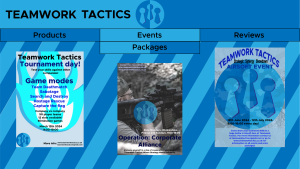
Three posters
In the creation of the three posters for Teamwork Tactics, the primary objective was to ensure clarity, avoiding unnecessary clutter while strategically directing attention towards the corresponding website. Each poster serves as a visual narrative, combining essential brand elements, thematic relevance, and crucial event details.
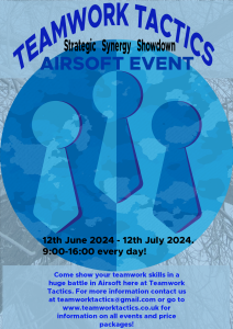
The first poster takes a bold approach by placing the main Teamwork Tactics logo at the centre stage, significantly enlarged. The logo is skilfully faded out with a camouflage background, preventing it from being overly intrusive. Example event dates are intelligently incorporated onto the logo without disrupting the visual hierarchy. The overall design employs the primary three colours from the design brief, supplemented by additional shades to enhance visual appeal and captivate the audience’s attention. A short, informative paragraph at the bottom highlights the event, accompanied by essential contact information. This poster strikes a balance between a strong brand presence and an engaging design, drawing viewers into the world of Teamwork Tactics while encouraging them to seek further details on the website.
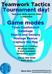
The second poster builds upon the clarity-focused design of the first while introducing an additional layer of information. All essential details from the initial poster are retained, and to enhance relevance, game modes for the day are introduced. A graphic flame serves as a dynamic background element, adding thematic relevance and visual interest. The design philosophy leans towards a cleaner aesthetic, ensuring that essential elements are presented in a streamlined manner. This poster achieves a balance between providing comprehensive information and maintaining an aesthetically pleasing and engaging layout, aligning with the overarching branding guidelines.
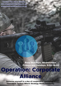
The third and final poster adopts a distinct visual hierarchy by featuring a player immersed in gameplay as the central and largest visual element. The main Teamwork Tactics logo is present with reduced opacity, retaining its visibility for enhanced brand recognition. The event’s essential details, such as dates, are presented in a concise manner, preserving a corporate feel while capturing the dynamic nature of the airsoft events. This poster seamlessly integrates elements of action and brand identity, appealing to the target audience’s interests while reinforcing Teamwork Tactics’ corporate essence.
Consistency is maintained across all three posters with the inclusion of example event dates, strategically aligning with the overarching goal of directing attention towards the comprehensive website. The colour palette remains faithful to the main design brief, fostering a cohesive visual identity across all promotional materials. The strategic use of additional shades underscores the posters’ ability to catch people’s eyes and pique their interest. In conclusion, these meticulously crafted posters extend beyond their role as event announcements. They serve as visual stories, encapsulating the essence of Teamwork Tactics and enticing the audience to explore further on the website. By balancing clarity, corporate aesthetics, and engaging design elements, these posters successfully fulfil their dual role of promoting Teamwork Tactics.