Copy Here
ISO Photography Event

Defining the UX for your Festival
The festival, named ISO, requires meticulous consideration of user experience to ensure its success. The problem space encompasses several areas, including audience engagement, technological integration, logistics, education, accessibility, and feedback. The concept behind ISO is to forge an immersive experience for a diverse group of participants, focusing on their interests and preferences in photography.
Usability goals are closely aligned with the event’s features. Ensuring that the registration process and event scheduling are designed to engage a broad audience is crucial. The integration of innovative technology aims to provide users with a novel and modern photography experience that is unparalleled. Prioritizing accessibility in both the website and app is key to promoting inclusivity.
The problem space differs between the app and the website. The website must offer a user-friendly interface to ensure easy navigation for all users, regardless of any disadvantages they may face. It should also provide quick access to festival details and a straightforward registration process to keep users’ attention focused and prevent it from being diverted by overly complicated or messy design.
For the companion app, prioritizing features such as real-time event updates is essential for those registered for the festival. Interactive maps for on-site navigation and augmented reality elements should be included to enhance the user experience during the festival. When examining similar events on National Geographic’s photography expeditions page, it’s clear that common issues include concerns about price, location, and accessibility. The ISO event, given its scale, must take these problems into account to maintain inclusivity.
While the website is geared towards pre-festival engagement and planning, the companion app will play a crucial role during the event, enhancing on-site experiences. Understanding the problem space is vital for developing tailored usability goals, ensuring that both the website and app effectively contribute to the event’s success and deliver the best possible experience to the user.
Requirements Gathering and Analysis
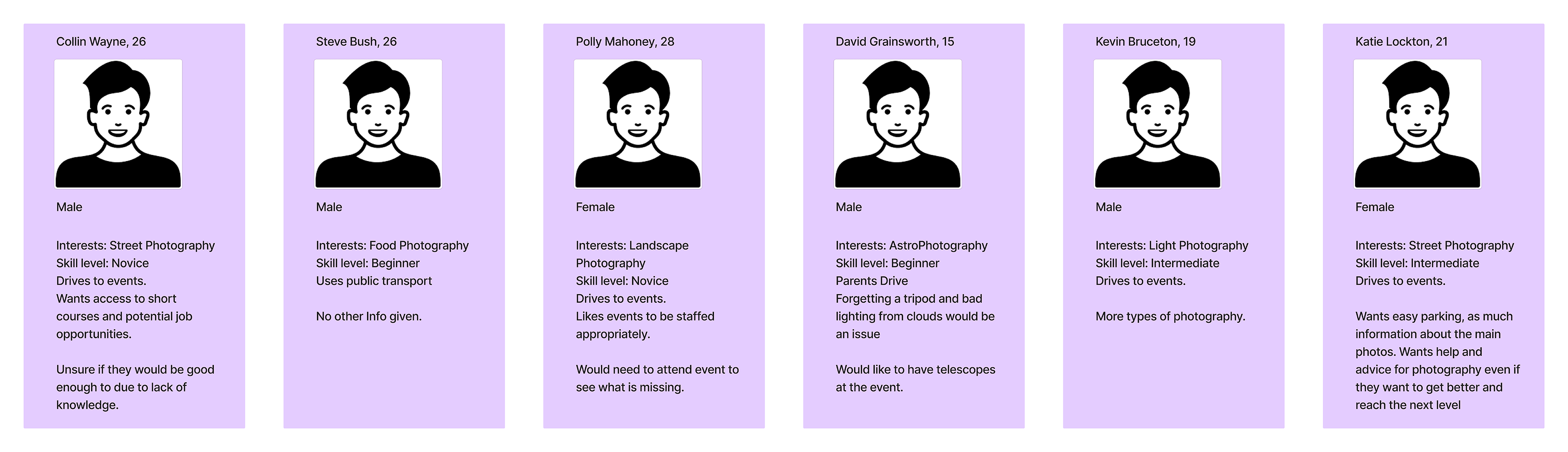
The target audience for this event encompasses a broad spectrum of photography enthusiasts, ranging from novices who may not yet own a camera to professionals equipped with the most advanced gear. Additionally, the event appeals to art appreciators and offers valuable insights for companies seeking to understand consumer preferences regarding their equipment.
The stakeholders involved include prominent companies such as Sony, Canon, Fujifilm, Leica, and Hasselblad. These entities are not only sponsoring the event but will also set up stalls to generate additional revenue and gather insights about their customers. Attendees are also crucial stakeholders; they have invested both time and money to engage with the industry by purchasing tickets and participating in the event. Success will be measured not just by ticket sales but also by attendee feedback, gauging their interest in returning next year and their satisfaction with how the event catered to their individual needs, ensuring there were no incidents.
The event introduces a novel concept, distinguishing itself from smaller, more focused photography events. It aims to unite the community by being more accessible and affordable to a wider audience.
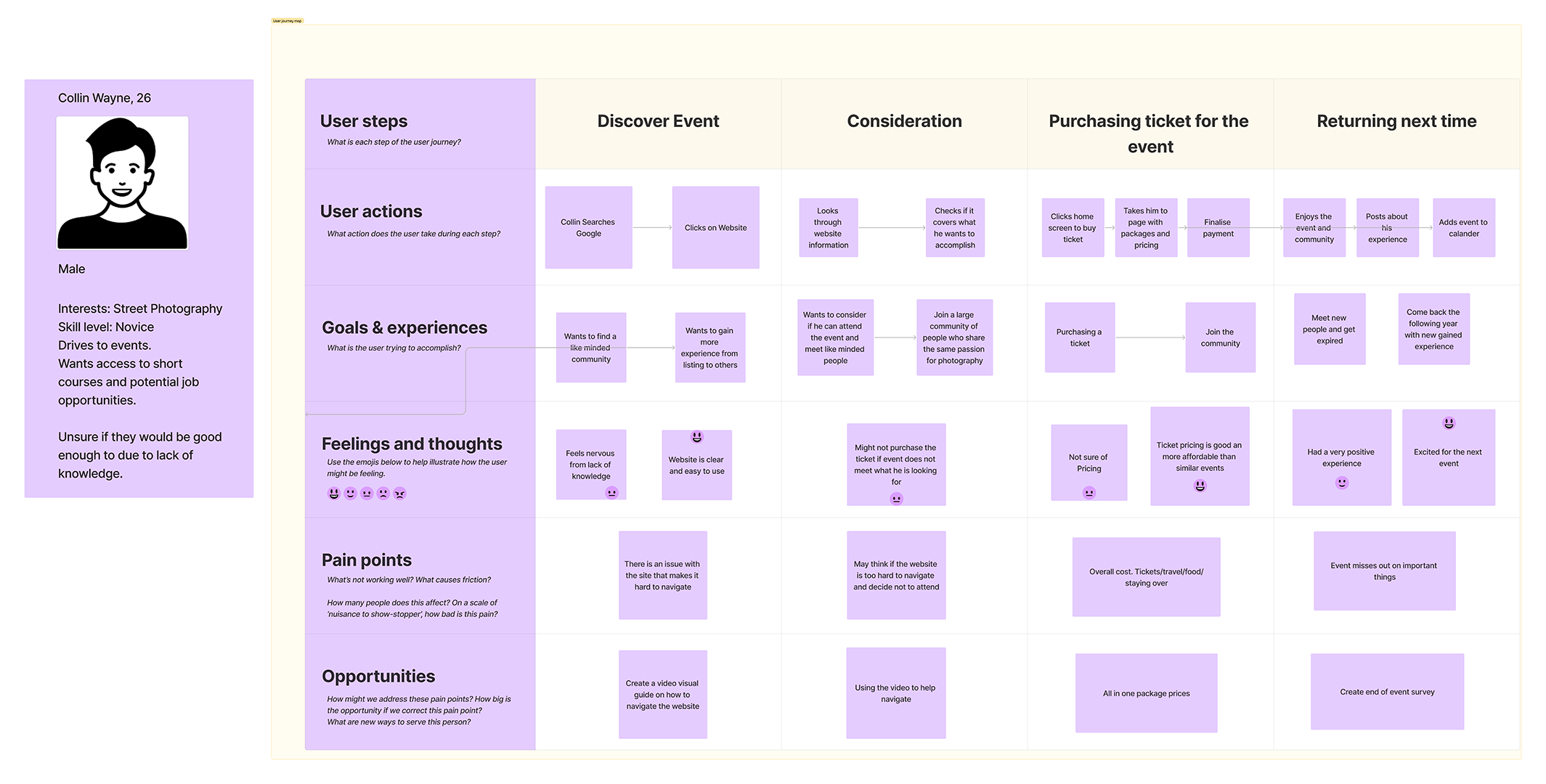
The true success of the event hinges on obtaining valuable feedback for future improvements, aiming to unite an even larger community around the appreciation of photography as an art form. Given the diverse levels of engagement, interests, and preferences among participants, expectations for an event of this caliber are understandably high. As it heavily relies on technology, the smooth functionality and reliability of all components, including the ticketing system, app, and website, are critical to the event’s overall success.
UI principles to be applied to your design
An essential principle to apply is Hick’s Law, which aims to reduce the time it takes for users to make decisions. This can be achieved through methods such as minimizing choices when quick responses are critical, breaking down complex tasks into smaller steps to reduce cognitive load, and reducing feelings of being overwhelmed by highlighting recommended packages or plans.
Ensuring the website and app are clear and concise is crucial for helping users understand their purpose and confirming that their actions are correct. A dedicated section for feedback will be available, ensuring all user input is investigated—this guarantees inclusivity, with no group of people being excluded. Feedback concerning design will be taken into consideration to rectify issues and enhance the experience for the next event.
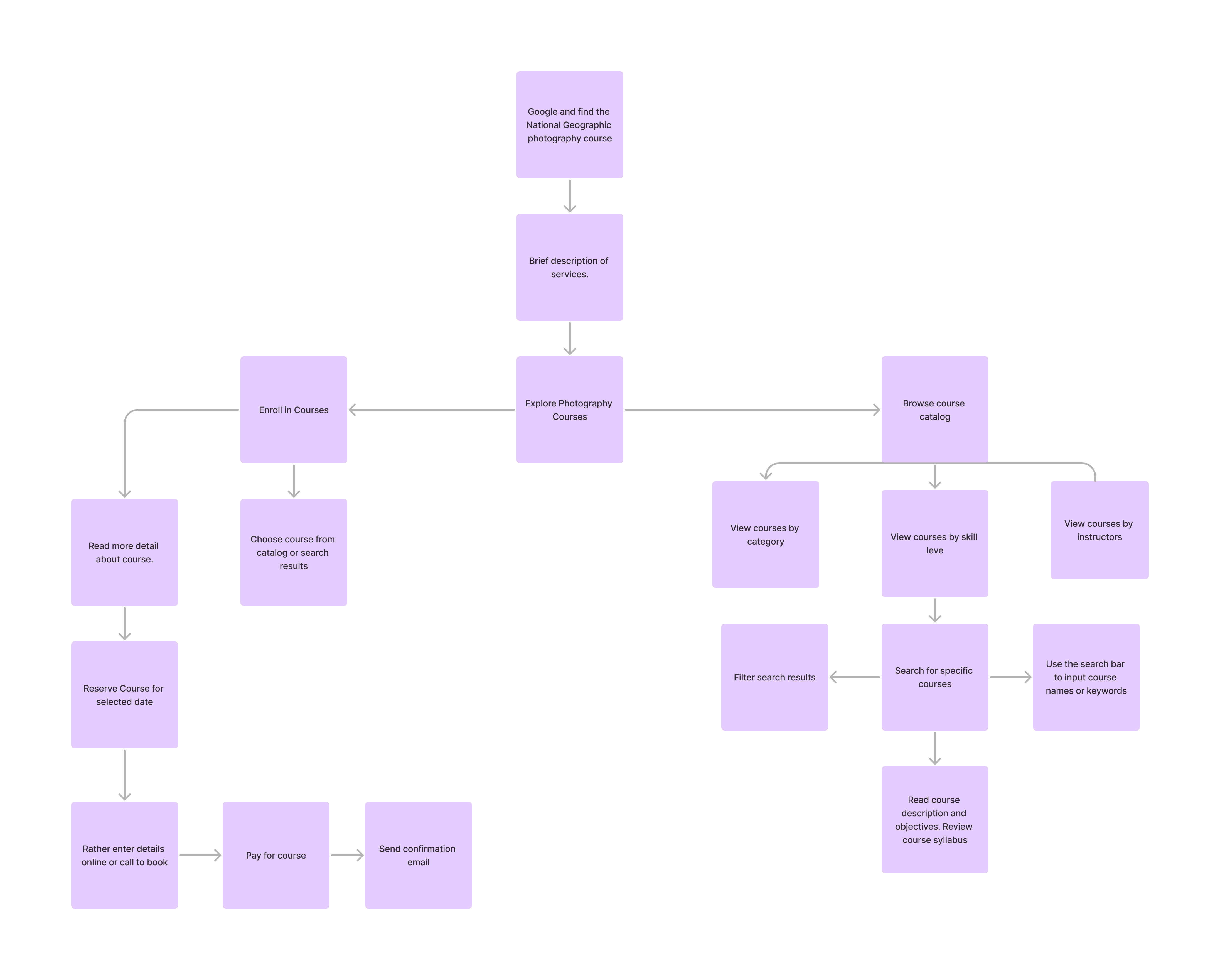
The call to action will be straightforward and helpful, condensed into three short steps. Starting with a central button on the homepage labeled “Buy Tickets!” this primary button leads users to a page displaying available tickets, prominently featuring the recommended option. Subsequently, users are directed to a payment page, followed by a success message confirming their purchase.
Visual consistency across the app and website is crucial for maintaining user engagement. Inconsistencies can create confusion and a sense of disconnect. Therefore, elements such as typography, icons, and colors will remain consistent across both platforms to ensure a unified and aesthetically pleasing experience.
Navigation on both the app and website will be intuitive, with similarity in layout facilitating ease of maintenance from a developer’s standpoint. The design will follow similar guidelines, using consistent element shapes across both platforms for a seamless experience when transitioning between them.
Furthermore, the app and website will feature accessibility options to communicate the festival’s details to people with disabilities, ensuring they are also included as important stakeholders who want to be part of the experience.
Rejected designs
My initial concept for the website design was centered around a block-style layout, where content would be presented as a continuous scroll through various sections, rather than the traditional tab-based navigation. This approach was envisioned to create a more dynamic and immersive experience, encouraging users to explore content in a linear fashion.
However, upon further consideration, I recognized potential drawbacks to this design. The primary concern was the potential for user overload. Navigating from one specific section to another would require users to scroll through content, relying on their memory to locate specific information. This could become particularly cumbersome if users were looking for specific details or wished to quickly switch between sections.
Moreover, I realized that such a design might not only pose a challenge for the average user but could significantly hinder accessibility for individuals with disabilities. Users with cognitive or physical impairments might find it difficult to navigate a site that demands continuous scrolling and spatial memory of content placement. Accessibility is a crucial aspect of web design, ensuring that all users, regardless of their abilities, can access and benefit from the site’s content.
Given these considerations, the decision to move away from a block-style, scroll-through design became clear. It was essential to prioritize a user-friendly interface that accommodated a wide range of users, including those with disabilities. The goal was to create a website that was intuitive, easy to navigate, and inclusive, ensuring that every user could have a positive and engaging experience without the frustration of complex navigation.
Low fidelity UI Prototype
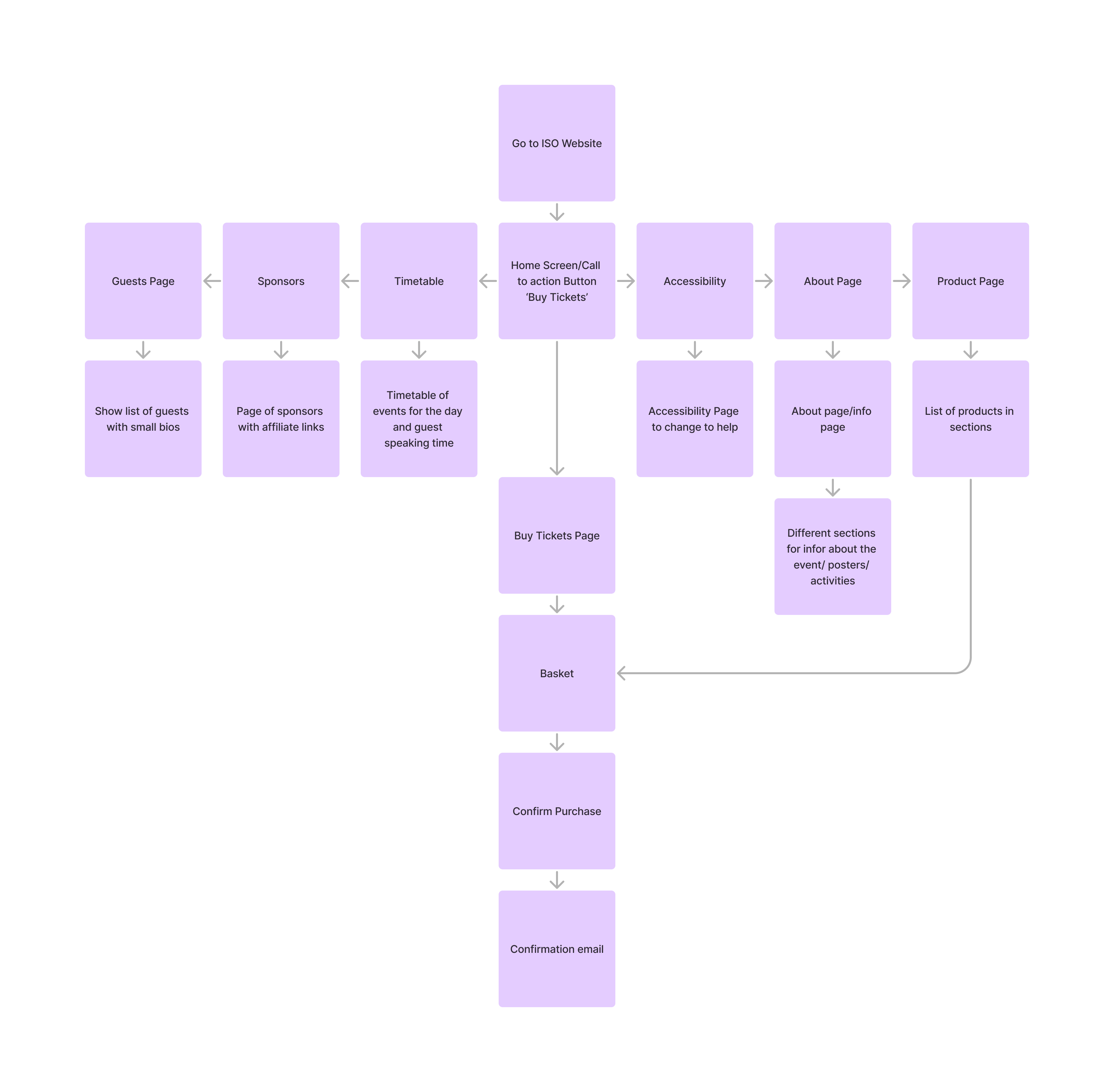
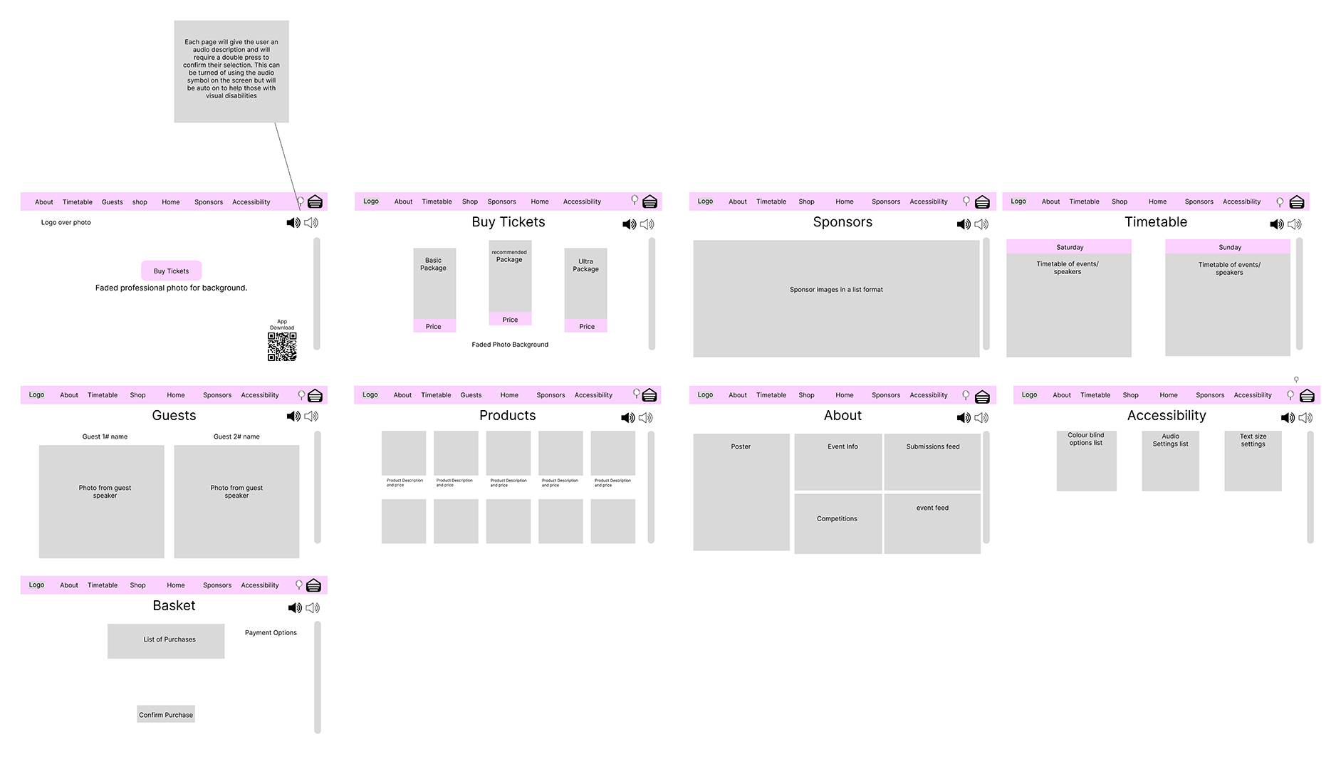
In the Figma low-fidelity UI prototype, the priority was to ensure clarity and ease of readability. The front page prominently features the main call to action, the ‘Buy Tickets’ button, designed for a seamless transition to the ‘Buy Tickets’ page. Here, users encounter three packages with corresponding price points, accompanied by a recommended package. This approach aligns with Hick’s Law, facilitating a simplified decision-making process for users.
The prototype includes a ‘Sponsors’ page, showcasing companies that share the vision of building a larger community. A ‘Timetable’ page efficiently displays the schedule for both event days, detailing activities and their respective timings. The ‘Guest’ page provides preliminary information about event speakers, highlighting various photography styles.
Additionally, a ‘Product’ page allows users to purchase items, ranging from T-shirts and hoodies to professional prints. The ‘About’ page stands out as the most information-rich section, organized in a block configuration to maintain clarity and aid in quick information retrieval.
Lastly, the ‘Accessibility’ page is designed to empower users with customizable features. This includes the ability to change colour modes to assist with colour-blindness, adjust audio settings for volume control and language preferences, and modify text size. All pages are equipped with automatic audio descriptions, toggleable for users who rely on them for navigation assistance