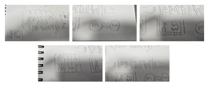
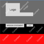
Project Goals and Sketches
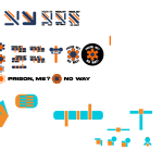
The initial planning phase for this project began with an in-depth brainstorming session to establish the direction and goals. I focused on creating a design that would align with the organization’s mission while addressing its primary audience: schools, parents, and teenagers. To begin, I explored potential visual elements for the logo, including sketches of handcuffs, cell doors, and prison layouts. These early concepts aimed to convey themes of structure and discipline but ultimately felt too limiting for the broader scope of the project. Recognizing the need for a more professional aesthetic, I refined my ideas by integrating shapes and patterns inspired by correctional facilities into designs that could serve multiple purposes. For example, badges or patches were considered to enhance interactivity and provide tangible tools for engagement. These elements could be used to foster partnerships and secure funding for more interactive courses.
A central goal during the planning stage was to prioritize simplicity. This meant designing with a clean, professional aesthetic that could be easily updated by future developers. To achieve this, I planned to create a style guide encompassing colour palettes, typography, and layout principles, all which will be shown in my final piece. Such a guide would ensure consistency in future updates and help maintain the professional tone of the website. For instance, the initial logo attempt explored the use of navy and orange as the primary colours.
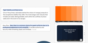
Navy, a colour often associated with correctional officers’ uniforms, exudes professionalism and trustworthiness. Orange, representing inmate jumpsuits, adds a lighter, more playful contrast. Together, these colours strike a balance between seriousness and approachability, which is critical for engaging both teenagers and institutional stakeholders. The choice to move away from using these colours and stick with colours such as blue, white and red made more sense as the orange is more closely related to American colours for the jumpsuits, as these could feel overly predictable and detract from the intended professionalism. keeping this colour scheme relevant to British colours can actual help with the stark contrast of how important this subject is and should be treated with respect and solidarity.
Accessibility and adaptability were key considerations in the initial planning phase. The design needed to function seamlessly across various devices, including desktops, tablets, and smartphones. To achieve this, I incorporated grid systems into the design process, ensuring consistent layouts that adapt fluidly to different screen sizes. Borders were used to maintain balance and prevent the design from becoming cluttered. These measures aimed to create a website that is both visually appealing and user-friendly, catering to a diverse audience.
The design process presented significant challenges, particularly in creating a website that appeals to teenagers while maintaining professionalism. This demographic often responds to bold, dynamic visuals, which prompted a re-evaluation of the initial designs. Early iterations featured clean lines and a navy blue and off-white colour scheme, inspired by correctional officer uniforms. However, feedback indicated that this approach felt too corporate and failed to resonate with the target audience. The seriousness of youth crime, as highlighted by statistics from the Office for National Statistics (ONS), underscores the importance of a thoughtful and impactful design. For instance, ONS data reveals a steady rise in youth crime and violence, emphasizing the need for resources that effectively engage teenagers while maintaining credibility with parents and educators (ONS, 2024).
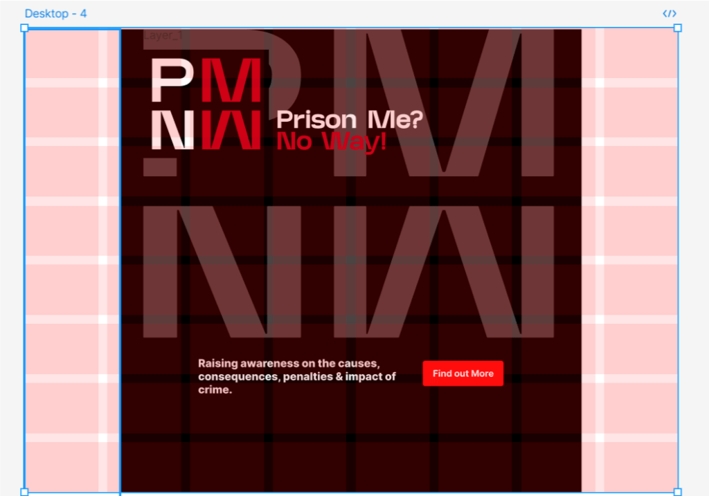
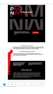
In response to this feedback, I pivoted to a darker colour palette, dominated by black and red. These colours were chosen to reflect the gravity of the subject matter without creating an overly sinister tone. Black conveys seriousness and professionalism, while red adds energy and urgency. This combination helps to capture the attention of teenagers while conveying the importance of the organization’s mission. To further enhance engagement, I want to incorporate motion effects into the website’s structure. For example, scrolling animations guide users through the site, starting with serious content and transitioning to more positive aspects of the organization’s offerings. This approach creates a dynamic user experience that maintains interest while effectively communicating the organization’s message.
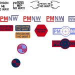
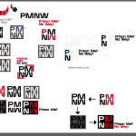
The logo underwent significant changes during the design process. The updated logo features straighter lines that represent prison bars, symbolizing structure and discipline. This design choice aligns with the organization’s mission while maintaining a clean and bold aesthetic. The background typography was subtly faded to ensure it does not detract from the main content, preserving clarity and focus. These changes were informed by feedback from stakeholders, who noted that the initial logo lacked impact and relevance. By addressing these concerns, the updated logo better aligns with the organization’s goals and target audience.
I also decided to alter the letter ‘P’ after noticing it felt out of place. It was also pointed out in feedback as I was worried due to the shape of it that the letters ‘M’ and ‘W’ would be lost in the overall shape but with the ‘P’ helping people see they are letters helps but it should be at least uniform with the other letter with the appropriate spacing and that is why I elongated the upper part of the ‘P’. The design still felt wrong initially which was due to the inconsistent spacing between the letters and the overall shape. I then decided to create a grid system in where the width in between each letter is the same width as the letters to help create the more uniform shape leading me to the final logo.
Mid Fidelity Website
Text alignment issues identified during the feedback process were also addressed. Misaligned text detracts from the overall structure and readability of a website, which can negatively impact user experience. By improving text alignment, the revised design achieves a more cohesive and professional appearance. This change, though subtle, significantly enhances the website’s usability and visual appeal.
The revised colour scheme, primarily black and red, also improved the website’s functionality and visual impact. The original design featured an excessive number of colours and scattered imagery, which created a disorganized appearance. Condensing this information into a streamlined layout improved usability and ensured that the design remained focused and cohesive. For example, redundant pages were eliminated, and essential content can be consolidated into a single document accessible via an action button. This functionality allows users to request a newsletter by entering their email address.

The newsletter design mirrors the website’s visual elements, reinforcing brand identity and ensuring consistency across platforms. This feature provides a seamless way to keep audiences informed while maintaining a professional and polished design.
Grid System
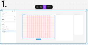
The grid layout underwent significant updates during the redesign process. The initial layout felt basic and failed to accommodate the visual and functional requirements of the project. To address this, I introduced a more robust 8×8 grid system for the desktop variant. This grid system provides a cleaner structure, ensuring that information and imagery are presented in a balanced and visually appealing manner. These adjustments also improved navigation and overall user experience. By creating a consistent framework for content placement, the updated grid layout enhances the website’s functionality and aesthetic appeal.
One of the key issues identified in the organization’s website was the inconsistent use of typography, with three different font types utilized across various sections. This lack of uniformity detracted from the overall cohesion and professionalism of the site, undermining its branding and user experience.
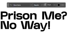
To address this, the number of fonts was reduced to two, aligning with best practices in web design and ensuring a cleaner, more cohesive aesthetic. The primary font chosen for the redesign is Neue Kain, a clean and structured typeface that visually aligns with the theme of prison cells. Its straight, minimalist design effectively conveys the organization’s tone and reinforces its messaging.
For general informational content, Google’s Inter font was selected. Inter is renowned for its readability and modern design, making it an ideal choice for maintaining accessibility and visual appeal. Its clean and straightforward style complements Neue Kain, ensuring a seamless integration that enhances the overall aesthetic of the website.
This deliberate selection and reduction of font types contribute to a more unified and polished branding. By simplifying typography, the website achieves a balance between functionality and design, improving readability and reinforcing the organization’s identity. This approach not only enhances the user experience but also demonstrates the importance of thoughtful design choices in creating a professional and impactful digital presence.
One of the most challenging aspects of the design process was creating a website that resonates with teenagers while maintaining professionalism. Teenagers are often drawn to bold and dynamic visuals, which required a careful balance between creativity and restraint. The end goal is to add a chalk line that when you scroll down it wraps around different important information almost like it’s telling a story, adding a touch of creativity while preserving the gravity of the subject matter. This design choice aligns with the organization’s mission to educate and engage its audience effectively. For instance, the scrolling animations use these lines to connect sections of the website, creating a sense of continuity and flow. This approach not only enhances the user experience but also reinforces the website’s overall theme and message.
Throughout the development process, I relied on tools such as Figma to create wireframes and prototypes. These tools allowed me to experiment with layouts and test various design elements efficiently. For example, early prototypes featured clean, thick lines and a navy blue colour scheme inspired by correctional officer uniforms. However, these designs were ultimately replaced by more dynamic and engaging alternatives. The final design incorporates Google’s Inter font and Neue Kaine, chosen for their consistency and visual impact. Neue Kaine’s uniformity, resembling prison bars, makes it particularly suitable for this project. The use of these fonts ensures readability and reinforces the website’s professional tone.
The Low/Mid/High fidelity wireframes played a crucial role in visualising the site’s evolution. Low-fidelity mock-ups provided a basic framework for layout and content placement, while mid-fidelity mock-ups introduced colour schemes and typography. High-fidelity mock-ups showcased the final design, incorporating all visual and functional elements. These mock-ups served as valuable tools for gathering feedback and making iterative improvements. For instance, stakeholders noted that the initial designs felt too static, prompting the introduction of motion effects and dynamic scrolling features. These changes significantly enhanced the website’s user experience and visual appeal.
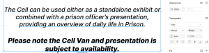
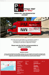
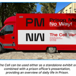
The secondary page focuses on the significance of “The Cell Van,” an integral aspect of the organization’s efforts. This initiative holds substantial importance as it provides children and teenagers with a tangible, immersive experience of what the inside of a prison cell looks like. The Cell Van serves as an effective deterrent by offering a glimpse into the harsh realities of incarceration, thereby fostering awareness and encouraging positive decision-making among young people.
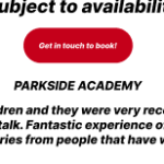
To improve user engagement on the Cell Van page, an additional call-to-action (CTA) was incorporated. This CTA was designed to stand out by using the new branding’s vibrant red colour for the button, set against a clean white background. This deliberate contrast draws the user’s attention, ensuring the CTA is both visually appealing and easy to locate.
The choice of red not only aligns with the updated branding guidelines but also conveys a sense of urgency and importance, which are critical for prompting user interaction. By integrating this element seamlessly into the page, the design maintains its professional and cohesive aesthetic while effectively guiding users toward the desired action.
This strategic addition reinforces the importance of using visually distinct and brand-consistent CTAs in web design to enhance functionality and user engagement. It exemplifies how thoughtful design choices can significantly influence the effectiveness of a webpage in achieving its objectives.
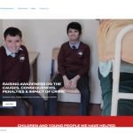
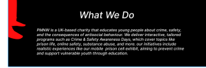
For the homepage redesign, a new section was added featuring a concise yet informative paragraph outlining the organization’s purpose and activities. This addition addresses a critical need for clarity, ensuring that users can quickly and easily understand what the organization does upon visiting the site.
The paragraph was carefully crafted to strike a balance between being detailed. This approach ensures the content provides meaningful insights without overwhelming users with excessive information. By presenting key details in a compact format, the section serves as an engaging entry point that captures the user’s attention and encourages further exploration of the website. This adjustment also enhances the user experience by aligning with modern web design principles, which prioritize clear and accessible content. By immediately communicating the organization’s mission, the homepage establishes a strong connection with users, reinforcing their interest and trust in the organization.
In summary, the addition of this focused introduction on the homepage not only strengthens the organization’s messaging but also supports a more engaging and user-friendly design. It demonstrates the importance of delivering essential information in a way that is both effective and appealing to the audience.
A mockup of the new van exterior has been developed, adhering closely to the updated branding guidelines in terms of color palette, typography, and overall tone. The design process presented challenges, particularly in achieving optimal spacing and balancing the use of negative space. Ensuring that the layout avoided unnecessary information while maintaining clarity and conveying the organization’s key messages was a critical learning opportunity. This iterative process highlights the importance of design refinement in effectively communicating the organization’s mission.
Additionally, the bottom section of the page includes a recent review of the van. This decision addresses a broader issue observed on the organization’s website: the underutilization of dedicated review pages. While the website includes a specific tab containing hundreds of testimonials, these often go unnoticed by users. By integrating select testimonials throughout the site, the organization can streamline its digital presence, enhance user engagement, and optimize server space. This approach also aligns with web functionality best practices by distributing relevant content more effectively, thereby improving accessibility and reinforcing the impact of The Cell Van program.
In conclusion, this design update not only emphasizes the critical role of The Cell Van but also showcases the organization’s commitment to thoughtful and efficient web design. By focusing on meaningful content placement and user experience, the organization can strengthen its outreach efforts while maintaining a cohesive and engaging online presence.
The process of redesigning this organization’s digital presence posed significant challenges, primarily due to the need for a comprehensive overhaul of both the branding and website. The existing logo was outdated and of low quality, necessitating a complete redesign to align with modern standards and convey the organization’s identity more effectively. Similarly, the website was burdened by an excessive number of tabs and an overwhelming volume of information. This created a fragmented user experience, where the core message of the organization was unclear, diminishing the website’s impact and functionality.
Addressing these issues required a structured and iterative design approach. One of the key challenges was simplifying the website’s structure while ensuring that essential information was retained and presented in a more concise and accessible format. By identifying alternative methods of sharing information, such as integrating dynamic sections or condensing content, the redesign aimed to create a more user-friendly interface.
The redesign of the logo presented its own set of challenges, as multiple iterations were required to achieve a final version that met the organization’s branding goals. Each iteration involved critical feedback and adjustments to ensure the logo resonated with the intended audience while maintaining a professional and contemporary aesthetic.
The final design, informed by a cohesive branding guide, represents a significant improvement in the organization’s digital identity. This guide not only streamlines the website redesign process but also serves as a foundational resource for extending the new visual identity across other devices and platforms. The adoption of the branding guide ensures consistency and scalability, which are essential for maintaining a unified organizational image.
In conclusion, the redesign process has addressed critical flaws in the previous website and branding, creating a more effective and modern digital presence. While the project faced numerous challenges, the resulting improvements reflect a commitment to user experience, clarity, and adaptability, positioning the organization for greater engagement and reach.
The final design represents a balance between professionalism and approachability, addressing the needs of both the organization and its target audience. By incorporating feedback, overcoming technical challenges, and adhering to sustainable practices, the project achieved its goals. The website’s updated layout, refined colour palette, and cohesive branding elements ensure that it effectively communicates the organization’s mission while engaging users in a meaningful way.
References
Office for National Statistics (ONS), 2024. Youth crime and violence statistics. [online] Available at: https://aoav.org.uk/2024/knife-crime-on-the-rise-in-the-uk-analysing-the-data-and-exploring-solutions/Anti-Bullying
Alliance, 2020. Prevalence and impact of bullying. [online] Available at: https://anti-bullyingalliance.org.uk/tools-information/all-about-bullying/prevalence-and-impact-bullying/
UK Government, 2024. Serious youth violence: Insights and solutions. [online] Available at: https://www.gov.uk/government/news/serious-youth-violence-more-far-reaching-than-many-realise
Figma Links:
https://www.figma.com/design/SGdnF3RCIi4HZNHX6SN4tW/Untitled?node-id=0-1&t=QMZBpm9JWdzAKZcI-1
https://www.figma.com/board/tKyS1hB8hAPgIkeCSKSWiu/PMNW?t=ZrhEeZuYbsRIeJfr-1