Introduction
After a brief exploration, I have chosen to focus on Prison Me No Way, a non-profit organization dedicated to keeping young people away from crime through awareness and education. Although based in Hull, they are registered in Scotland and have been active since 1993, boasting impressive statistics that demonstrate their positive impact.
Founded by three prison officers from HMP Hull, Prison Me No Way employs an innovative approach by visiting schools with a van designed to replicate a prison environment. During these visits, they provide an in-depth look at what to expect if one were to end up in prison. Occasionally, they collaborate with uniformed police officers to reinforce their message.
The organization addresses a wide range of topics, including peer pressure and the importance of becoming law-abiding citizens. They cater to a broad age group, serving children from 8 to 18 years old. Considering the evolving challenges posed by social media and the internet, Prison Me No Way has adapted its methods to effectively guide young people away from criminal behaviour.
Initial Design Ideas
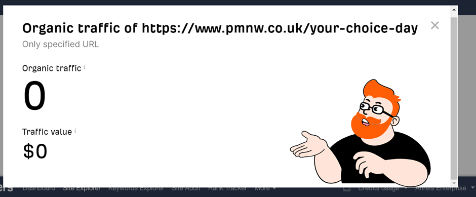
After reviewing the website, it’s clear that the logo needs to be updated, as it is low-resolution and outdated. However, the existing colour scheme is well-suited to the organization’s mission. I plan to explore different ways to slightly alter these colours to bring them into line with contemporary design trends for 2024 and beyond. To enhance the website’s visual appeal, I will introduce tried-and-tested grid layouts that promote a sense of uniformity, reinforcing the organization’s message of guiding young people away from crime. Adding a call-to-action button on the main page will increase the likelihood of engaging schools and colleges in promoting the importance of helping children succeed in life.
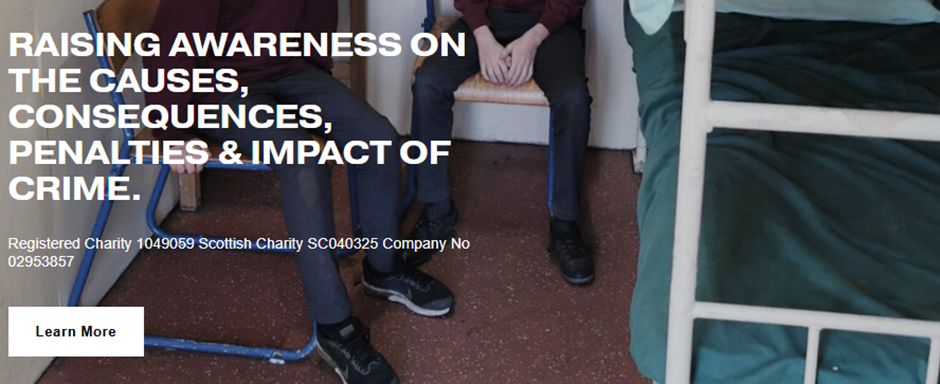
Furthermore, I will improve the typography, as the site currently uses more than three fonts, resulting in a messy and unappealing appearance. A cohesive font strategy will help retain users and lend a more professional look to the site. Additionally, I will streamline the use of space to maintain focus on relevant areas, making it easier for users to navigate, especially on mobile devices.
Target Audience
An organization like Prison Me No Way requires a strategic approach to design, targeting both primary and secondary audiences to ensure its message reaches all who can benefit from it. The primary audience includes school administrators, teachers, and students. For these groups, the website should be clean, direct, and engaging, presenting the organization’s purpose in a way that captures attention and builds trust. A streamlined, intuitive design will emphasize professionalism and make it easy for schools to understand the value of the program, motivating them to bring it into their educational environment.
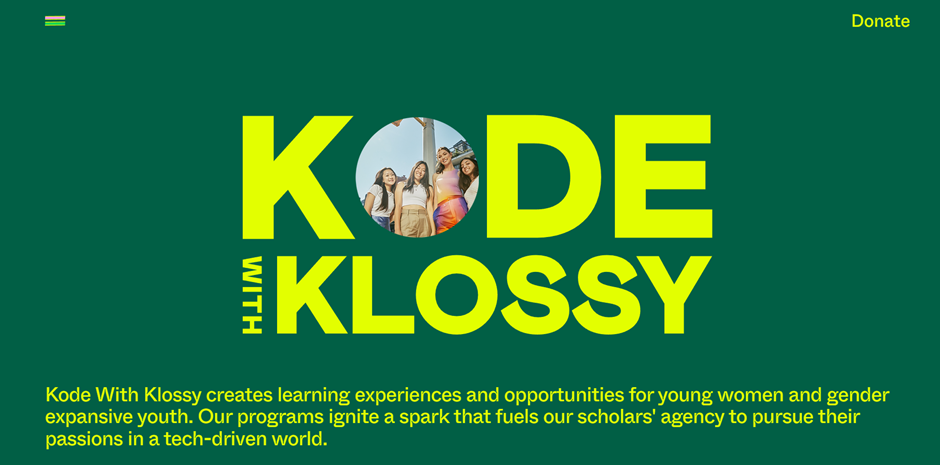
Equally important is the secondary audience, encompassing parents, youth groups, and other community organizations that work to keep young people safe and away from risky paths. These groups play a crucial role in creating a supportive network that reinforces the organization’s efforts beyond the classroom. The design should offer clear, accessible pathways for these visitors, providing resources, success stories, and ways to get involved. By engaging this secondary audience, the website can foster a larger community of support, building awareness and strengthening partnerships with those committed to preventing youth crime. In essence, the design must balance directness with warmth, creating a sense of approachability while highlighting the organization’s credible, impactful mission. Ultimately, a clear and inclusive website will help Prison Me No Way build trust and broaden its reach, empowering both educators and community groups to participate in making a meaningful difference for young people. Here is a fantastic nonprofit website that achieves clear and clean visuals that are uncluttered.
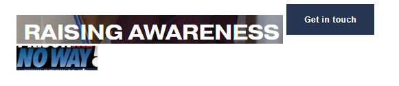
multi-channel marketing strategy
The primary goal of utilizing multiple channels to drive traffic to the site is to increase awareness and broaden the organization’s reach. By employing simple yet impactful marketing campaigns—such as eye-catching posters, informative short videos, and targeted posts across a variety of social media platforms—we can attract attention from a diverse audience. Facebook and X (formerly Twitter) are particularly valuable channels for this purpose, as they not only provide a personal connection with users but are also among the most popular platforms for real-time updates. These platforms are increasingly relied upon as go-to sources for timely information, often surpassing traditional news outlets, making them ideal for raising visibility for the organization and attracting both potential supporters and those who may benefit from its services.
Regular, engaging updates on social media will keep followers informed about upcoming events, programs, and impact stories, helping to maintain ongoing interest and support. This steady stream of timely content will not only build a consistent audience but also drive more sustained site traffic. Utilizing website tracking tools, such as Google Analytics or platform-specific insights, will allow us to monitor the effectiveness of these efforts and gauge the level of traffic driven by each platform. This data will be instrumental in identifying which types of posts resonate most with our audience, helping us fine-tune our strategy over time and establish a reliable benchmark for measuring growth and engagement from a baseline.
Ultimately, this multi-channel approach, combined with consistent performance tracking, will position the organization for enhanced visibility, improved outreach, and a stronger connection with its audience across digital spaces.
Key features and functionalities
A primary feature should be a refreshed logo and essential information, paired with a prominent call-to-action (CTA) button that immediately engages visitors, whether on desktop or mobile. A cohesive colour theme and font style will be applied consistently throughout the site, creating a recognizable brand identity that can extend to social media channels like X and Facebook.
The main CTA button should be clearly displayed under a brief description of the organization’s mission. To keep content relevant and user-friendly, the site will be streamlined to a two-page structure, maximizing efficiency. Given users’ familiarity with scrolling on mobile, using clickable dropdowns instead of traditional tabs will help organize information in a clutter-free, accessible way.
The design will prioritize readability and ease of navigation. A clean, simple layout will keep users engaged and prevent frustration, increasing the time visitors spend on the site and improving overall user experience. Additionally, a monthly newsletter through Mailchimp will help keep interested visitors informed, serving as a gentle reminder of the organization’s offerings and ongoing activities.