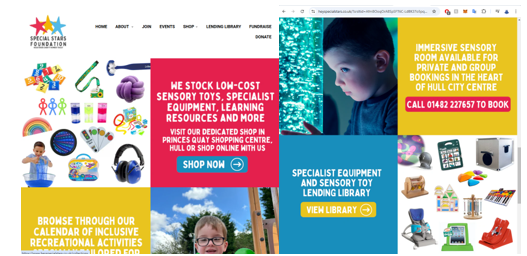
Examining a nonprofit organization like the Special Stars Foundation, it’s clear that their website is well-designed in several aspects, such as the high-contrast colours that enhance readability and the clear, legible font. The site employs a simple two-column grid layout, which aids in organizing information effectively. However, there are areas for improvement, including centralizing the navigation menu and enlarging the font for better accessibility. The first thing users should see is a succinct, clear statement about the charity’s mission, as this establishes an immediate connection and informs visitors about the organization’s purpose.
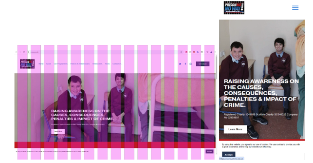
In contrast, another nonprofit, “Prison Me No Way,” suffers from a cluttered design that dilutes its message. The mission statement is not prominently displayed, making it difficult for visitors to understand the organization’s objectives. Additionally, the site fails to leverage modern web technologies that could enhance user engagement, such as interactive elements or multimedia content. Given people’s shorter attention spans, a poorly designed site can lead to frustration and significantly increase the likelihood of users leaving without exploring further. An example of poor design is when a basic grid layout is used, but nothing lines up properly, making it clear that elements were added without much consideration for placement. However, some thought has been given to the mobile version of the site, as it switches from a standard tab system to a hamburger menu, with a basic logo in the top left. You could argue that the website was intentionally designed for mobile, as the messaging is clearer, and the call-to-action button is more noticeable on the mobile site. That said, the site could still benefit from improvements, such as a better grid layout and reducing clutter to enhance the overall user experience.
Here is an example of a company that has taken more care with the layout and visuals of its website: The Salvation Army. The elements are well-aligned in each section as you scroll, keeping the focus on key messages. At the top center, the main message is prominently displayed with a clear call-to-action button, while the left and right sides remain uncluttered, keeping everything central. This design approach is maintained in the mobile version, where a hamburger-style menu is also used.
However, there is room for improvement, such as offering a high-contrast version of the site. The current design uses a lot of white space, which can feel too bright and empty for some users.
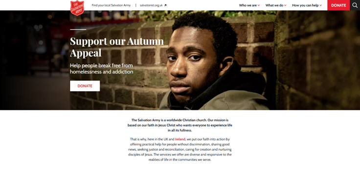
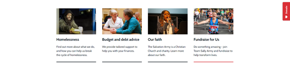
As you scroll down, The Salvation Army’s website makes good use of spacing between each section, employing gutters to clearly separate and distinguish individual sections. This thoughtful use of space helps keep the layout organized and easy to navigate.
When designing a website, clarity and conciseness are crucial to keeping users motivated and engaged. An uncluttered layout enhances usability and encourages visitors to absorb the information presented. Implementing clear typographic standards is essential; using larger, easily readable fonts helps ensure that users can navigate the content without strain. Additionally, incorporating relevant graphics and visuals can make the site more appealing. Using grid systems that are proven to improve clarity and usability allows for a consistent layout that guides users through the content.
There are various grid layouts available that can be adapted to suit different needs, such as the 12-column grid system commonly used in responsive design. Successful websites often apply these techniques to maintain user engagement, ultimately increasing conversion rates. Studies have shown that well-structured layouts can lead to better user experiences, reducing bounce rates and encouraging longer visits.
Research supports these strategies. In the study “Effect of Web Design on the Overall Success of Websites” by Vega. J. et al. (2010), Google Analytics tools were utilized to demonstrate how well-designed websites effectively retain users. This research indicates that elements like responsive design, accessibility features, and intuitive navigation significantly impact user retention and satisfaction.
In my own design approach, I aim to incorporate these principles. By ensuring that my websites are not only visually appealing but also functional and user-friendly, I can create experiences that resonate with visitors. Prioritizing accessibility ensures that a wider audience can engage with the content, while responsive design guarantees that users have a seamless experience across various devices. This commitment to best practices in web design will help my projects achieve their goals, whether they aim to inform, inspire, or drive action.