When embarking on the creation of the companion app, our primary objective was to distill a wealth of information into a user-friendly interface, optimizing it for on-the-go usage, particularly during the event itself. While the app retains functionality for ticket and product purchases, its emphasis shifts towards providing essential event information and facilitating seamless navigation for attendees.
The homepage of the app has undergone significant transformation to align closely with the visual aesthetics of the website, ensuring consistency across platforms. The central focal point remains the event’s logo, serving as a recognizable anchor amidst the interface’s various elements. To enhance visual appeal and engagement, the homepage now features an altered version of the website’s main photo, meticulously adjusted to fit the display dimensions of mobile devices. Despite these modifications, the gradient background synonymous with the event’s branding remains intact, maintaining visual continuity and reinforcing brand identity.
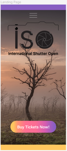
In lieu of traditional tabs, users now access different sections of the app through a tidy list accessible via the three white lines icon. This structural refinement enhances navigational efficiency, ensuring seamless access to all pertinent sections and functionalities. Notable additions to the app’s navigation include dedicated pages for accessibility, search, and basket functionalities, necessitated by space constraints and the imperative to accommodate all relevant information within the compact layout.

Moreover, the introduction of sliders and buttons within the accessibility section empowers users with enhanced control over their browsing experience, catering to diverse user needs and fostering inclusivity. Each feature is thoughtfully integrated, contributing to an intuitive and user-friendly interface that prioritizes accessibility and usability.
Distinct pages within the app serve specific functionalities tailored to enhance the user experience. The accessibility page offers tailored adjustments for users with diverse requirements, while the map page provides geographical orientation to facilitate navigation during the event. The basket page serves as a convenient repository for selected items, optimizing the shopping experience for users.
Additionally, the inclusion of a dedicated search page augments the browsing experience by enabling swift and comprehensive information retrieval, further enhancing efficiency and user satisfaction. Furthermore, a feed page serves as a dynamic repository for real-time updates and announcements, ensuring users remain informed and engaged throughout the event. Lastly, a designated space allows users to submit their work for competitions, posters, and comments, fostering community engagement and creativity. In summary, the revamped homepage of the companion app epitomizes a harmonious blend of aesthetics and functionality. Through meticulous design refinements and thoughtful feature enhancements, users are provided with an immersive and intuitive browsing experience tailored to their needs. From streamlined navigation to enhanced accessibility options, every aspect of the app is designed to cater to diverse user requirements, underscoring our commitment to excellence in user interface design and user experience optimization.