The Live Design Brief
As part of a collaborative live brief, we were partnered with marketing students to support the development of a winter sales campaign for eDecks, a UK-based company specialising in outdoor decking, fencing, and garden structures. The objective of this brief is to conceptualise and produce compelling visual materials that align with the marketing strategy to boost sales during the traditionally slow winter season. Additionally, eDecks is pushing a new product, ModBlocks, which simplifies and accelerates the installation process for garden structures. Our role as design students is to create visuals that effectively communicate these offerings to the target audience.
Background Research: Company & Product
eDecks is known for its comprehensive range of timber products and outdoor living solutions. Their product line includes decking boards, fencing panels, pergolas, garden buildings, and DIY kits. The company’s unique selling point lies in its affordable prices and fast delivery across the UK.
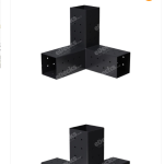
The new ModBlocks system is designed to enhance the speed and ease of assembling garden structures. These modular, durable base blocks offer a no-dig, no-concrete solution—particularly appealing during the winter months when cold weather and frozen ground typically make outdoor projects less attractive.
The primary audience for this campaign includes:
- DIY homeowners and hobbyists: Often middle-aged individuals looking to upgrade or maintain their garden spaces year-round.
- Tradespeople and landscapers: Professionals seeking efficient and reliable installation options, especially during time-sensitive winter jobs.
- Eco-conscious consumers: Customers looking for modern garden solutions that are environmentally friendly, quick to install, and minimise waste.
These groups value time-saving solutions, visual appeal, and cost-effectiveness. Understanding their motivations helped guide our visual design choices—for instance, focusing on clarity, before-and-after comparisons, and showcasing ease of installation.
The key goals of the campaign are:
- Increase winter sales: Overcome seasonal slowdowns by emphasising products that are suitable for colder weather, such as pergolas with covers, log stores, and now ModBlocks.
- Promote ModBlocks: Position this product as a winter-friendly solution that enables outdoor projects to continue regardless of temperature or ground condition.
- Boost brand visibility: Use cohesive, branded visuals across marketing channels (e.g., social media, website banners, print adverts) to reinforce eDecks’ image as innovative and accessible.
The visuals will need to convey functionality, simplicity, and aesthetic value, all while staying true to eDecks’ brand identity. Design work must also consider scalability across different formats and platforms, including mobile viewing, print flyers, and social posts.
Relevant Design History
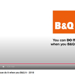
1. B&Q Winter Campaign (2018) – “You Can Do It”
B&Q, one of the UK’s largest DIY retailers, launched a winter campaign in 2017 focusing on empowering homeowners to take on projects despite the cold weather. Their visuals featured bold typography, warm indoor lighting, and layered compositions that showed ‘before-and-after’ home transformations. The marketing strategy helped reframe winter as a productive season for interior and exterior improvements.
This campaign influenced our approach to framing ModBlocks as a winter-friendly innovation. By showcasing the simplicity and speed of ModBlocks in use—even in colder weather—we aim to reduce the psychological barrier that winter is a “non-DIY” season. As part of the 3D animation, it was to communicate the switch from anytime to winter. Additionally, the high-contrast warm tones used in B&Q’s campaign informed our colour choices, helping communicate warmth and usability.
2. IKEA Instructional Visuals (various years)
IKEA’s flat-pack product assembly guides are iconic for their minimalist, highly readable visual language. These visuals are universally understandable without the need for text, relying on clear line work, numbered steps, and visual metaphors like warning signs or tool symbols. IKEA’s visual language is designed for speed and clarity—a concept deeply relevant to how we market ModBlocks.
Inspired by IKEA’s visual clarity, we focused on designing graphics that break down the ModBlocks installation process into simple, step-by-step visuals. This helps reinforce ModBlocks’ “fast install” promise. By using minimal text and emphasizing diagrams or icons, the product feels more accessible to DIYers who may be intimidated by traditional groundwork or concrete setting.
3. Homebase Garden Campaign (2020) – “Make the Most of Your Space”
Homebase’s 2020 garden campaign was driven by the post-COVID DIY boom, showing customers how to creatively reuse garden space during all seasons. The visuals included high-quality photography of finished garden projects, often shot from low angles to increase perceived space and impact. The designs paired aspirational imagery with clear callouts for product bundles or featured items.
This campaign helped guide our composition strategy, particularly in balancing “aspirational” vs. “practical” visual elements. Our goal is to show ModBlocks not just as a product but as an enabler of transformation—where a dull winter garden can become a beautiful, functional space quickly.
These three examples provided strategic insight into how design can be used to shift customer perception, particularly around seasonal limitations. B&Q taught us to reframe the season with warmth and motivation. IKEA showed how to simplify technical visuals to reduce friction in the buyer’s journey. Homebase reminded us of the power of lifestyle imagery in inspiring action.
For our campaign, we’ve taken a hybrid approach: combining clear instructional graphics with aspirational photography and bold typography. We also adopted warm, muted tones with a slight winter blue contrast to balance comfort and clarity.
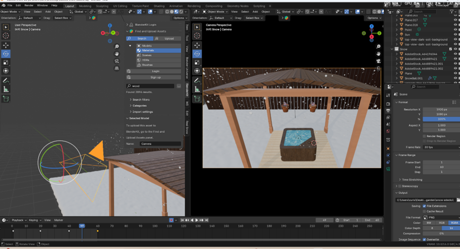
We also looked at using 3D to create video ads that can be used across different social media platforms. Our final presentation integrates these influences to position ModBlocks as a transformative, easy-to-use product suited to winter and beyond. And we also were playing with the idea of creating a 3D garden showing off the pergolas with the winter theme with firepits and hot tubs, which are more suited for the winter. All made in Blender.
Project Development
During the early stages of the project, our collaboration with the marketing students presented some challenges, particularly regarding the lack of initial direction or input from their side. While awaiting their guidance, our design group began internal discussions to ensure progress aligned with the brief provided. We identified two key communication channels that would have the most impact for eDecks’ winter campaign: social media and poster-based advertising. These were selected due to their high visibility and relevance to the identified target audience—DIY homeowners, tradespeople, and online shoppers.
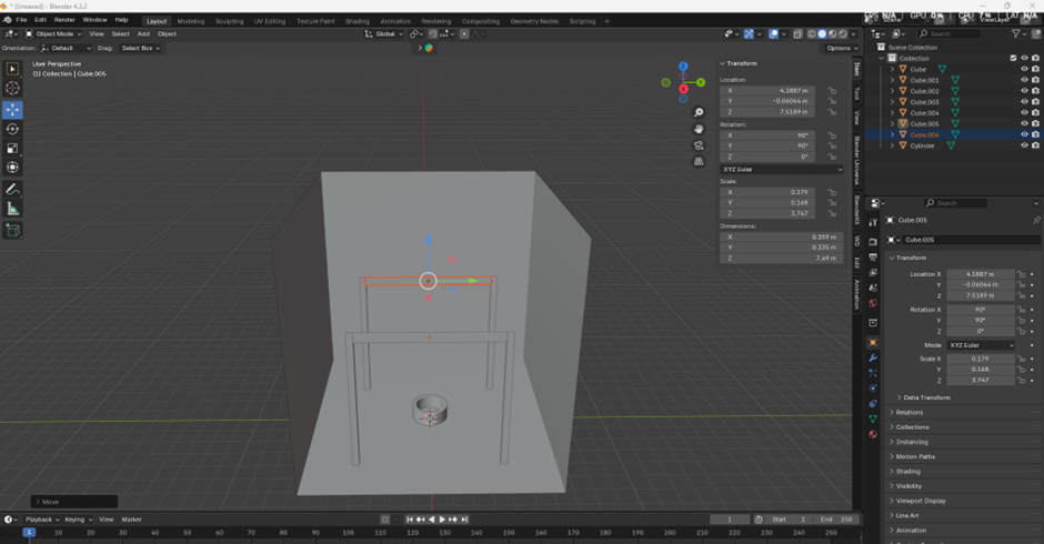
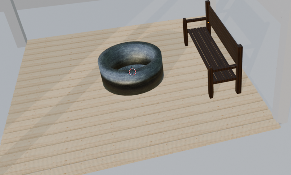
Focusing on these areas, I began developing visuals tailored for a winter setting. I created a basic 3D render of a garden scene that included key eDecks products: a pergola, ModBlocks, and an optional hot tub or fire pit. This visual was conceptualised as part of a proposed ‘Winter Pack’—a bundled offer featuring fast-installation outdoor products that are ideal for year-round use, particularly in colder months. The render helped convey how customers could quickly and easily upgrade their gardens, even in winter, thanks to the ModBlocks system.
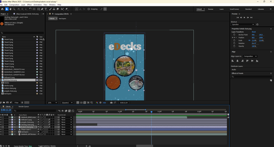
This ‘Winter Pack’ concept was carried forward into a 20-second animated advertisement for social media. The short runtime was suitable for platforms like Instagram, Facebook, and YouTube Shorts, where viewer attention spans are brief. The ad aimed to showcase a warm and aspirational lifestyle scene, counteracting the usual perception of winter as an off-season for garden improvement.
To refine our campaign approach, each team member produced their own version of a visual direction. These concepts were shared within our design group first for peer feedback before being forwarded to the marketing students. The idea was to give them several strong options to choose from and collaboratively finalise the campaign design based on their marketing strategy.
As the campaign deadline approached, the marketing students invited us to a meeting where they presented new ideas, including the use of actors in video advertisements. We clarified the limitations of our resources—such as time constraints and access to talent—but managed to collaboratively agree on a feasible alternative. It was decided that I would source and integrate stock footage into the social media ad to create a polished, realistic campaign video.
The final advertisement I created opens with animated text bouncing onto the screen reading: “Get Ready for Winter”, set against a snowy backdrop. This transitions to stock footage of a father and son in a garden, browsing what could be interpreted as the eDecks website on a tablet. Overlay text introduces the “Quick Install Winter Bundle” concept. The mid-section of the video transitions to a clean background featuring the eDecks logo and three hanging baubles. Each bauble contains imagery of a pergola, decking, and a couple enjoying a hot tub—subtly tinted with a cool blue hue to reinforce the winter theme. A prominent “Buy Now” call-to-action button follows. Finally, the visual elements pull up, and the eDecks logo drops to the centre of the screen, giving the brand clear final emphasis.
This development process demonstrated adaptability, visual storytelling, and strategic design thinking in response to a real-world client scenario.
Teamwork
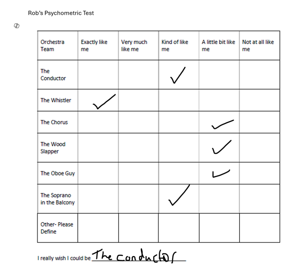
As someone who consistently seeks to grow both personally and professionally, I expressed early interest in taking on a leadership role within our team—specifically as the “Conductor” in this collaborative live brief project. I believed this position would allow me to develop and showcase my leadership skills while also enhancing my ability to facilitate teamwork. However, I also recognise the importance of adaptability in group settings, and I am equally comfortable stepping back and supporting others when required. I view this flexibility as one of my core strengths, as it allows me to approach challenges from multiple perspectives and respond effectively to dynamic situations.
Unsurprisingly, I was selected to lead the group. I accepted this role willingly, seeing it as an opportunity to apply and improve my skills in communication, coordination, and creative decision-making. Fortunately, I was placed in a group with supportive and proactive peers, which made the leadership process significantly more manageable. Early collaboration was productive, and we collectively began aligning our ideas with the brief supplied to us. However, a prolonged illness on my part required me to temporarily delegate the primary communication role to another team member to ensure that progress continued without interruption.
Initially, communication with the marketing students was steady and encouraging. However, over time, this interaction gradually diminished. With less than a week remaining before their client presentation, we were invited to a meeting in which several underdeveloped ideas were presented by the marketing group. Given that I had thoroughly familiarised myself with the original client brief from eDecks, I attempted to guide the conversation back toward the core objectives of the campaign—focusing on winter sales and the promotion of their new ModBlocks product. This situation, although stressful due to the time constraints, allowed me to demonstrate critical problem-solving and leadership under pressure. These are valuable skills in the field of graphic design, where responding quickly and professionally to client needs is essential.
Following this meeting, our team consolidated our efforts and produced a range of marketing materials within a tight timeframe. These included social media advertisements, posters, and other campaign visuals developed to a mid-to-high fidelity standard. We submitted these to the marketing students to provide them with a variety of options for their client presentation. Although the materials were received positively, none of our content was ultimately used in their final pitch. This outcome was disappointing and somewhat unexpected, especially considering the time and effort invested. It also highlighted a noticeable contrast in professionalism and project commitment between the two groups.
Despite the challenges, the experience was extremely valuable. It highlighted the realities of interdisciplinary collaboration and the potential friction points when different creative sectors—such as graphic design and marketing—come together. Most importantly, it encouraged me to consider alternative viewpoints and approaches. Engaging with the marketing students and listening to their ideas broadened my understanding of how creative solutions are conceived and executed across disciplines. This project has reinforced the importance of clear communication, adaptability, and resilience—traits that I will carry forward in both academic and professional settings.