Early design prototyping
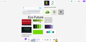
Eco Future
For the Eco Future brand mood board, I explored how a website’s design can influence power consumption, particularly as OLED monitors become increasingly prevalent. OLED displays consume less energy when rendering darker colours, making them a sustainable choice in web design. This insight led me to consider how strategic colour choices and fonts can directly reduce a website’s carbon footprint, as darker designs can minimize the energy required to display them. Additionally, servers that host websites contribute significantly to global carbon emissions, as every visit requires computational power. Recognising this, I focused on developing a design that would mitigate these effects through careful aesthetic decisions.
To achieve this, I selected a darker, softer colour palette composed primarily of greens and dark blues. These colours not only align with the sustainable ethos of Eco Future but also reduce energy use on modern displays. For typography, I researched fonts that complement the eco-conscious narrative. Two fonts, Ryman Eco and Times New Eco, stood out for their unique properties: when printed, they require significantly less ink due to their design. This aspect aligns with the brand’s environmentally friendly focus, creating coherence between the visual design and the company’s goals. Furthermore, I analysed the design elements used by similar eco-conscious brands, particularly the shapes and patterns they employed. This analysis provided insights into how geometric and organic shapes can effectively communicate sustainability, helping me refine the mood board for Eco Future.
https://www.figma.com/board/eDTfsUEqO967COsDEJfgsi
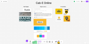
Cab-E Online
For Cab-E Online, I investigated design elements that reflect the concept of journeys and transportation. The colour palette played a pivotal role in this exploration. Colours commonly associated with travel, such as sky blue and yellow, emerged as central choices. Yellow, in particular, is synonymous with the traditional colour of taxis globally and resonates well with audiences seeking transportation services. Sky blue was chosen for its calming and modern connotations, representing clarity and efficiency in journeys.
To modernise the logo further, I considered sans serif fonts that convey simplicity and contemporary design. Rubik, Eurostile, and Bank Gothic stood out as potential candidates due to their clean lines and versatility. These fonts offer a light yet professional feel, aligning with the functional and modern nature of a digital taxi service. Additionally, I examined the logos of competitors to understand how they incorporated shapes and symbols. This analysis revealed trends in minimalistic and geometric forms, which informed my approach to creating a sleek and contemporary logo design for Cab-E Online.
https://www.figma.com/board/hHIw8iYAjTyjinXSB63UkE?node-id=0-1
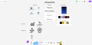
InfluentHull
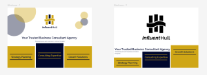
The mood board for InfluentHull required a slightly different approach, given its position as a business consultancy. To reflect the professional and authoritative nature of the company, I incorporated elements associated with trust and premium services. This led me to adopt a navy blue and gold colour palette. Navy blue communicates stability and reliability, while gold adds a sense of luxury and value. Together, these colours evoke a professional and trustworthy brand identity.
For typography, I focused on sans serif fonts. The clean and modern aesthetic of these fonts complements the business-oriented nature of InfluentHull, reinforcing its image as a forward-thinking consultancy. Additionally, I included icons that symbolise core aspects of business consultancy, such as growth, networking, and innovation. These icons served as inspiration for potential logo shapes. Analysing competitors in the same sector revealed a wide variety of logo styles, from abstract symbols to typography-driven designs. This analysis encouraged me to explore the integration of icons with clean typography, creating a versatile logo that is both functional and visually engaging.
https://www.figma.com/board/pRE4mxbopZADi9GjZgjeMC?node-id=0-1
Logos
Brand Development Process for InfluentHull
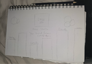
After careful consideration, I decided to proceed with the InfluentHull design as my primary brand. This decision was driven by its alignment with the professional and trustworthy qualities required for a business consultancy firm. The design process began with sketching initial ideas in my notebook, drawing inspiration from the icons I had previously identified. These icons included symbols associated with strategy, growth, and professionalism, such as chess pieces, graph bars, and the hand symbol. Each symbol was chosen for its ability to visually convey the values and services offered by InfluentHull. My goal was to combine these elements into a cohesive and meaningful logo.
The font selection had already been finalised early in the process, as it perfectly complemented the vision I had for the brand. The clean and modern sans serif typeface communicated professionalism and contemporary appeal, aligning with InfluentHull’s positioning as a forward-thinking consultancy. With the typography established, I concentrated on experimenting with the main shapes that would form the foundation of the logo. These included chess pieces to represent strategy, graph bars symbolising growth and progress, and the curved hand shape to evoke the idea of guidance and collaboration.
After completing my sketches, I photographed the notebook pages and imported them into Adobe Illustrator to begin the vectorisation process. My initial attempts focused on combining multiple visual elements to create a layered design. For example, one iteration featured graph bars leading up to a giving hand, which was then topped with a chess piece. This design aimed to visually encapsulate the concepts of growth, guidance, and strategic thinking. Another version integrated a chess piece with graph bars, using the bars to fill negative space within the chess piece. To create visual harmony, I experimented with splitting the chess piece and aligning it with the typography, ensuring a seamless connection between the logo and the text.
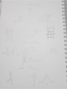
One of the more abstract concepts involved playing with text shapes. Here, I utilised the letters “I” and “h” from “InfluentHull” as core design elements. The “I” was given a visual hierarchy to resemble a chart bar, symbolising progress and success. Meanwhile, the middle section of the “h” was curved to represent the Humber Bridge in Hull, further reinforcing the brand’s geographical connection. The top half of the chess piece was integrated into the “I” to add an element of strategy. This design was refined iteratively, ultimately resulting in a clean and visually compelling icon.
The final stage involved narrowing down three potential logo designs. The first featured a chess piece strategically placed between “In” and “fluentHull,” symbolising forward motion. The second encapsulated a chess piece within a circular shape, representing collaboration and teamwork. The third and primary design was the improved type icon, which merged the “I” and “h” into a unified, meaningful symbol.


For the colour palette, I opted for gold as the primary colour to convey a sense of premium quality and professionalism, paired with navy blue as the secondary colour to signify trust and reliability. Additionally, I tested the logo in monochrome to ensure its versatility in various applications, creating black-and-white variants for maximum usability. These tests confirmed the logo’s adaptability across different mediums and contexts, reinforcing its strength as a cohesive and impactful brand identity.
Wireframe prototyping
Wireframe prototyping Continuing with the thematic integration of graph bars, I aimed to incorporate a sense of elevation into the website’s design. The concept of elevation not only enhances the visual appeal by addressing blank spaces but also creates an impression of depth and interactivity, which are essential for user engagement. For instance, one initial idea involved animating the graph bars on the website. When the page loads, these graph bars could rise smoothly, revealing navigation buttons or key content sections. This animation would not only draw the user’s attention but also establish a visual connection with the brand’s emphasis on growth and progress, as symbolised in the logo design.
Incorporating keywords into the website’s design was another critical aspect of this process. Keywords such as “trust,” “professionalism,” and “growth” guided the visual decisions to ensure that the website effectively communicates the brand values. Trust is essential for a business consultancy, and every design choice needed to reinforce this perception. Professionalism was addressed through clean layouts, structured elements, and the consistent use of the sans serif font selected for the logo. These visual cues were carefully crafted to create a cohesive and trustworthy digital experience for users.
To begin developing these ideas, I created low-fidelity mockups in Figma. These mockups allowed me to test various design elements, layouts, and interactions. For example, the initial designs featured graph bars integrated as part of the background or as a visual separator between sections. However, during this process, I found that the inclusion of graph bars in the website design could overcomplicate the visual layout. While the concept was thematically aligned with the logo, it began to detract from the simplicity and clarity that are essential for an effective website. As a result, I decided to remove the graph bars from the final design.
Simplicity became a key focus of the design process. By streamlining the layout and reducing unnecessary elements, I was able to ensure that the website maintained a professional and user-friendly interface. This decision was further supported by the need to keep the design scalable and adaptable. A clean and minimalistic approach ensures that the website is easy to navigate and can perform effectively across various devices and screen sizes, which is critical in today’s digital landscape.
Maintaining consistency with the brand’s established colour scheme was another priority. The use of gold as the primary colour and navy blue as the secondary colour remained central to the website’s aesthetic. This consistency ensures seamless migration from the logo and marketing materials to the digital platform, reinforcing brand identity and recognition. The cohesive use of colours across all touchpoints fosters trust and professionalism, further aligning with InfluentHull’s core values.
In summary, while the initial designs explored dynamic and thematic elements such as graph bars, the final website design prioritised simplicity, usability, and consistency. By removing unnecessary elements and maintaining the brand’s colour scheme, the website successfully reflects InfluentHull’s core values and ensures a professional and engaging user experience. This process highlights the importance of iterative design and the balance between thematic representation and functional clarity.

https://www.figma.com/design/TX7TYHIIE5c43KxZz84dyA?node-id=0-1
Banners
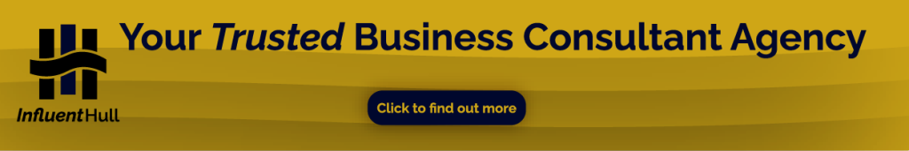
The development of banner designs for InfluentHull required careful consideration of functionality, aesthetics, and consistency with the brand identity. I created three distinct banners: a wide skyscraper banner, a mobile banner, and a rectangular banner. Each of these designs served a specific purpose while adhering to the overarching principles of simplicity, clarity, and brand cohesion.
For the wide skyscraper banner, the primary objective was to create a clean and professional design that facilitates user interaction. Recognising the increasing prevalence of QR codes in modern marketing, I incorporated a scannable QR code into the banner. This feature directs customers to the main website, offering a seamless transition from advertisement to action. To ensure the banner remained readable from a distance, I used thick variations of the chosen font, which enhanced legibility and reinforced the professionalism of the brand. Additionally, I minimised white space in the layout, focusing attention on the logo and the QR code. By reducing unnecessary distractions, the design maintains clarity and ensures that its core message is easily understood by viewers, even at a glance.

For the mobile banner, the design aimed to mimic the appearance of an advertisement, prioritising visual engagement and interactivity. Recognising the smaller dimensions of mobile screens, I introduced dynamic shapes with drop shadows to create depth and capture the viewer’s attention. These elements add a sense of energy and modernity to the design, aligning with InfluentHull’s forward-thinking brand identity. Consistent padding throughout the layout ensured visual balance, enhancing the overall usability and aesthetic appeal of the banner. A prominent call-to-action button was also included, inviting users to visit the website. This theoretical functionality supports the brand’s goal of converting potential customers through engaging digital touchpoints. Additionally, the logo was strategically positioned to the far left of the banner. This subtle placement avoids overpowering the design while maintaining brand presence and recognisability.
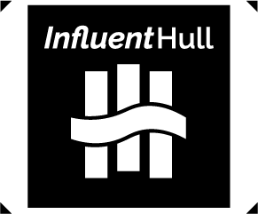
Finally, the rectangular banner focused on showcasing the logo in its monochrome variant. The decision to use a black background with white typography and logo elements ensured maximum contrast, making the design visually striking and easily recognisable. This minimalist approach highlighted the versatility of the logo in different applications, reinforcing its effectiveness across various mediums. To add a dynamic element, I incorporated arrow accents on the edges of the banner. These subtle details guide the viewer’s eye toward the central elements while adding a sense of movement to the otherwise simple design. The monochrome aesthetic reflects the brand’s adaptability and professionalism, demonstrating how the logo can maintain its impact even in stripped-down forms.
In summary, the banner designs for InfluentHull were developed with a focus on functionality, visual engagement, and brand consistency. The wide skyscraper banner prioritised readability and interaction through its clean layout and QR code feature. The mobile banner introduced dynamic visual elements and a clear call-to-action to enhance engagement. The rectangular banner showcased the logo’s monochrome versatility in a minimalist yet impactful design. Together, these banners exemplify the importance of tailoring designs to specific contexts while maintaining a cohesive brand identity.
Online video advertising
Online video advertising Designing Instagram Reels for InfluentHull
To create effective Instagram reels for InfluentHull, I utilised Adobe After Effects due to its intuitive interface and advanced capabilities for keyframe editing. This software provided the flexibility to design dynamic and visually appealing content while ensuring streamlined workflows. The primary aim of the reels was to engage viewers with concise yet impactful advertisements that reflect the professionalism and values of the brand. Two distinct video concepts were developed, each tailored to achieve specific communication goals.
For the first video, the focus was on delivering a direct call to action in a short advertisement format. To achieve this, I began by sourcing a suitable stock video from Adobe Stock. The selected footage featured moving subjects, providing a dynamic background that complemented the brand’s modern and professional identity. This background served as a foundation for the text and other graphic elements. To ensure the message remained clear and engaging, I incorporated a typewriter text effect for the information. This effect was chosen for its ability to simulate real-time typing, which draws the viewer’s attention and creates a sense of immediacy.
The information was kept concise to maintain viewer interest, adhering to the principle that shorter advertisements are more effective on platforms like Instagram. A fade-in call-to-action button was added toward the end of the reel, directing users to take further action, such as visiting the website. The simplicity of this approach ensured that the video was visually engaging without overwhelming the audience. By combining the dynamic background, typewriter text effect, and a clear call-to-action, the first reel successfully communicated the brand’s core message in a sleek and professional manner.
For the second video, the aim was to create a more interactive experience that engaged viewers on a deeper level. While the typewriter text effect was retained for consistency, additional elements were introduced to enhance the visual appeal and narrative structure. Specifically, I incorporated moving shapes that transitioned in and out of the frame, serving as a mechanism to clear and replace the text step by step. This approach created a rhythm in the video, keeping the viewer engaged as each new piece of information was revealed.
The use of shapes also allowed for a dynamic transition of colours, aligning with InfluentHull’s brand palette of navy blue and gold. These transitions added a layer of sophistication and reinforced the brand’s visual identity. As the video progressed, the shapes fell away to reveal a monochrome version of the InfluentHull logo. This design decision was deliberate, as the monochrome logo provided a striking visual contrast, ensuring it left a lasting impression on the viewer. The clean and minimalist presentation of the logo at the conclusion of the reel reinforced the brand’s professionalism and adaptability across different media formats.
In conclusion, the two Instagram reels were designed with distinct purposes while maintaining consistency in branding and visual style. The first reel delivered a clear call to action in a concise format, while the second offered a more dynamic and interactive experience. Both reels effectively leveraged the capabilities of Adobe After Effects to create visually engaging and professional advertisements, reflecting InfluentHull’s core values and brand identity.
Adobe Stock Video Links Accessed (08/01/2025)