In the process of transitioning from a low-fidelity to a mid-fidelity website design, I actively sought feedback from the community, leveraging platforms like Reddit to gather insights and perspectives on the initial design iteration. One recurring theme that emerged from the feedback was the need for uniformity across the website’s design elements. In response, I implemented several design enhancements to ensure consistency and coherence throughout the user interface.
One key improvement involved refining the navigation tabs to promote visual consistency and clarity. I introduced a stylized line between each tab and ensured uniform spacing to create a cohesive visual structure. Additionally, I incorporated a subtle white underline beneath the active tab to provide visual feedback and aid navigation, addressing concerns raised by users regarding navigation clarity.
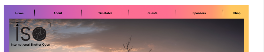
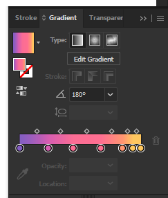
Another aspect of the design that received attention was the colour scheme. Recognizing the importance of colour in photography and visual communication, I opted to enhance the website’s visual appeal by introducing a high-contrast multicolour overlay. This addition not only adds vibrancy and dynamism to the design but also symbolizes the diversity of colours and creativity inherent in photography. Furthermore, I strategically positioned the ‘ISO’ logo on each page for easy brand recognition, ensuring it complements rather than overshadows important content.
The ‘About’ page underwent significant revisions to accommodate a wealth of information about the event, including active feeds for community feedback and sharing of work. This page serves as a comprehensive resource for attendees, offering insights into event details and fostering community engagement.
Similarly, the timetable page was redesigned to prioritize clarity and conciseness, aiding festival participants in organizing their day effectively. By presenting event schedules in a clear and structured format, users can navigate the program seamlessly, enhancing their overall event experience.
On the ticket page, emphasis was placed on simplicity and ease of use. A clear layout and descriptive ticket options streamline the ticket purchasing process, ensuring users can quickly select their preferred ticket type and proceed with their purchase without hassle.
The guest speakers page underwent enhancements to showcase the award-winning work of guest speakers, providing users with insights into their specialties and areas of expertise. This allows attendees to make informed decisions about which sessions to attend based on their interests and aspirations in photography.
Highlighting event sponsors on a dedicated page adds value by showcasing their involvement and providing users with opportunities to engage directly with manufacturers and advisors at the event.
Finally, the shop page features a straightforward layout, with product images, prices, and brief descriptions presented in a clear and organized manner. Additionally, dedicated buttons for accessibility features, such as contrast adjustment and audio descriptions, cater to users with accessibility needs, ensuring inclusivity and usability for all attendees. A search button facilitates quick and easy navigation, allowing users to find specific products or information effortlessly.
Overall, each page of the mid-fidelity website underwent careful refinement to optimize user experience, promote engagement, and align with the event’s objectives and values. By incorporating user feedback and implementing design enhancements, the website aims to deliver a seamless and immersive experience for attendees, enhancing their overall event experience and fostering a sense of community and connection within the photography industry.