Font Selection:
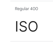
The deliberate choice of the Inter font for the event’s branding reflects a strategic decision rooted in both aesthetic considerations and practical functionality. Inter’s selection was based on its renowned versatility, making it an ideal choice for conveying information across a variety of digital platforms while maintaining readability and visual coherence. Moreover, its availability as a commercially free font from Google aligns with the event’s commitment to accessibility and inclusivity, ensuring that attendees from diverse backgrounds can engage with event materials without barriers to access. This font selection process highlights the importance of typography in brand identity and underscores the significance of choosing typefaces that not only communicate the desired message but also resonate with the target audience on a visual and emotional level.

Colour Palette:
The meticulous curation of the event’s colour palette represents a nuanced approach to visual communication, where each colour is selected not only for its aesthetic appeal but also for its ability to convey specific emotions, associations, and brand attributes. Drawing from a broad spectrum of hues, the palette is designed to evoke a range of feelings and responses, from excitement and energy to trust and professionalism. By harmonizing disparate shades into a unified palette, the event’s branding achieves visual coherence and consistency across various touchpoints, reinforcing its identity and values. Additionally, the strategic application of colour psychology underscores the importance of understanding how colour influences perception and behaviour, highlighting the role of design in shaping user experiences and fostering meaningful connections with audiences.
