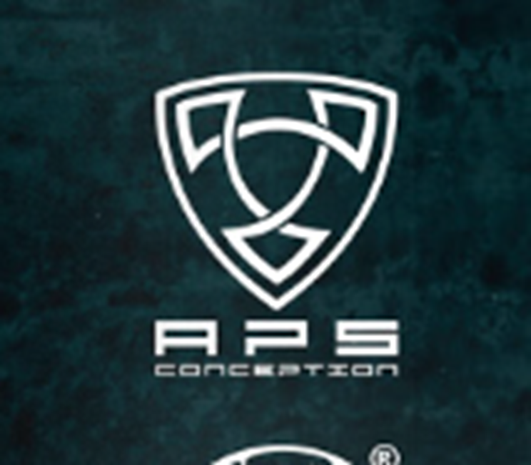
The APS Concentration logo for airsoft is a striking example of conceptual design that embodies the spirit of the sport. At the heart of the logo lies a well-defined shield, a universal symbol of defence and protection. This shield transcends its physical representation, embodying the mental fortitude required in airsoft battles. Its robust form signifies resilience and strategic depth, encapsulating the essence of the game.
Within the shield, strategically positioned arrows stretch outward, symbolizing precision, agility, and the dynamic nature of airsoft gameplay. Each arrow embodies a player’s journey, navigating the field with calculated movements and tactical acumen. The arrowheads, sharp and pointed, represent the focus and determination essential in airsoft competitions. These elements coalesce to depict not only physical skill but also mental sharpness, emphasizing the strategic thinking paramount in airsoft.
The colour palette chosen for the logo is significant. A harmonious blend of bold black and vibrant red dominates the design. Black signifies strength, power, and authority, reflecting the players’ confidence and prowess on the field. Red, on the other hand, embodies passion, energy, and intensity, capturing the adrenaline-fueled spirit of airsoft matches. The contrast between these colours creates a visually compelling impact, symbolizing the competitive nature of the sport while evoking a sense of excitement and determination.
Typography in the APS Concentration logo is sleek and modern, employing a bold sans-serif font. The clean lines and sharp edges of the letters convey professionalism and clarity, mirroring the precision required in airsoft tactics. The choice of font ensures readability and visual appeal, enhancing the logo’s overall design aesthetic.
In essence, the APS Concentration logo for airsoft transcends its visual appeal, encapsulating the mental and physical aspects of the sport. Through thoughtful conceptual design, it communicates the essence of airsoft—strategy, precision, intensity, and skill—making it a powerful emblem that resonates with players and enthusiasts alike.
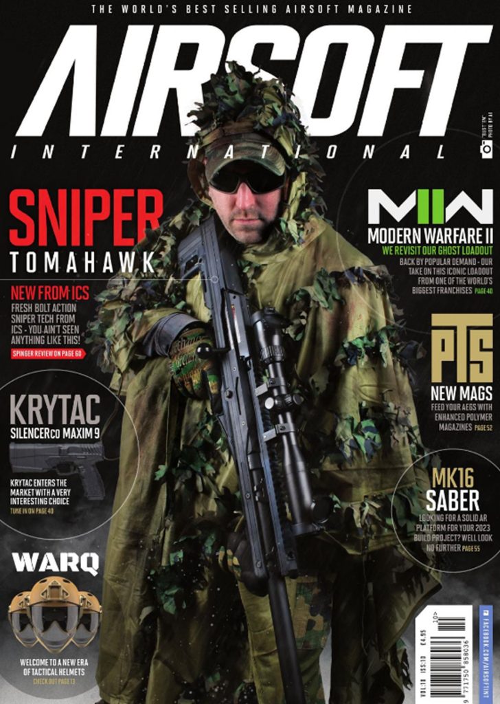
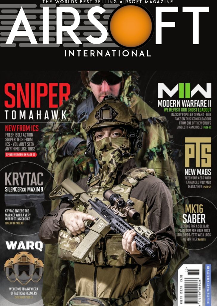
In this example, the transformation of the ‘Airsoft International’ logo involved a meticulous process of design refinement and thoughtful symbolism. The initial type style, which lacked clarity due to italics and an ambiguous ‘A,’ was reimagined to enhance readability and brand recognition. The chosen font, ‘ADAM.CG PRO,’ provided a modern and sleek appearance, with special attention given to the letter ‘A’ to ensure it resembled a distinctive and precise letterform.
A pivotal aspect of the redesign involved substituting the letter ‘O’ with a striking symbol. This hybrid design, resembling a standard airsoft pellet with propulsion lines, was meticulously created using Illustrator. The incorporation of a 3D effect not only provided depth but also imparted a dynamic quality to the logo, enhancing its visual appeal and memorability.
To seamlessly incorporate the logo into the existing image, a complex integration process was employed. The text ‘International’ underwent a complementary font change to maintain consistency and harmony within the design. When the player’s head intersected with the text, a high level of precision was required. Using advanced masking techniques in Photoshop, the head was isolated from the background, ensuring a seamless blend with the newly designed logo.
The logo’s symbolism was thoughtfully crafted, fusing elements to convey depth. The airsoft pellet, representing precision, speed, and strategy in the sport, took centre stage. The choice of yellow for the pellets was intentional, mirroring the common colour in airsoft, injecting vibrant energy into the design. This composition captures the dynamic spirit of the sport, emphasizing its core values and energetic essence.
The result is a harmonious fusion of typography and symbolism, creating a visually striking and meaningful logo. The refined font exudes professionalism, while the symbolic elements convey the essence of ‘Airsoft International’ with clarity and impact.
References/links:
Paul (No surname) Date published (17th January 2023)
https://www.020mag.com/magazine/50/page/2 [Accessed 25th October 2023]
https://www.ai-mag.com/new-issue-out-2/ [Accessed 25th October 2023]