
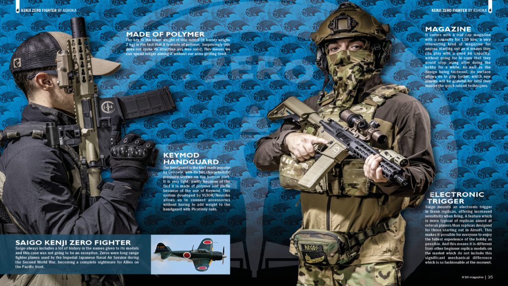
Within the pages of Airsoft Action magazine’s issue 152, on page 30, lies an exemplary display of composition principles. The layout features a high-resolution image occupying two-thirds of the page, showcasing an airsoft player with a prominently displayed item for sale. Adjacent to this, in the remaining one-third space, are two hats presented with minimal yet adequate information. The composition includes a modestly sized type logo at the top middle, ensuring visibility without overshadowing the content.
A noteworthy aspect of this composition is the subtle and effective use of colours. Earthy tones complement the products, allowing the white text and informational boxes to stand out. This colour scheme avoids visual clutter and enhances readability. This is why its important to the composition of this piece to help with the readability.
One of the distinctive features of this composition lies in its ability to provide a practical context for the showcased products. By positioning the hats on the airsoft player, the layout transcends mere visual appeal. It allows readers to envision themselves wearing the products, making an emotional connection that enhances their engagement and interest. It is very clear to see what product they are selling based on all of these points, with the composition of the main image showing the product with its hierarchic positioning.
In conclusion, the composition used exemplifies the art of balanced and purposeful design. Through its strategic arrangement of elements, thoughtful use of space, and mindful colour selection, this layout captivates readers, inviting them to explore the world of airsoft with both intellectual curiosity and emotional resonance. It stands as a testament to the power of effective composition in conveying information and evoking meaningful reader experiences. The simple layout of the page, with it’s clean images and writing draws the reader in and makes it easier for the reader to understand.
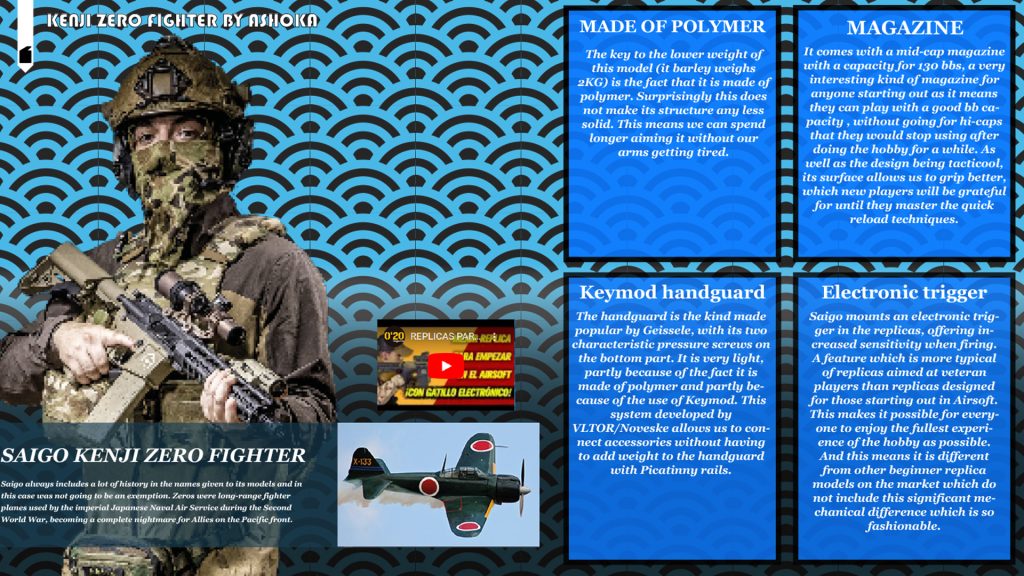
In the redesigned composition, a conscientious effort has been made to enhance the visual coherence and readability of the content. The removal of redundant elements, particularly one of the airsoft players, exemplifies the principle of visual economy, ensuring that every component serves a purpose in conveying the intended message. This decision not only eliminates distractions but also allows the remaining elements to occupy a more prominent and balanced position within the composition.
Moreover, the transformation of the background design signifies a thoughtful integration of artistic elements. The inspiration drawn from Japanese waves, a motif rich in cultural symbolism, has been retained. However, the complex details have been simplified into bold, thick lines. This adaptation preserves the essence of the original concept while significantly reducing visual noise, allowing the audience to focus on the core content without being overwhelmed by intricate patterns. This strategic simplification aligns with the principles of visual hierarchy, guiding the viewer’s attention to the primary elements of the composition—the text and the remaining airsoft player.
Furthermore, the meticulous arrangement of text into individual boxes on the right side of the page is a pivotal aspect of the redesign. This deliberate structuring not only imparts a sense of orderliness but also establishes a clear visual hierarchy. Each box acts as a discrete unit, housing specific information, thereby preventing textual clutter. The use of boxes creates a structured flow, guiding the readers’ eyes from one piece of information to the next in a logical sequence. This approach embodies the principle of proximity, emphasizing the relationship between related content and facilitating a seamless reading experience.
The resulting composition exemplifies a harmonious balance between aesthetics and functionality. By adhering to fundamental design principles, such as visual economy, hierarchy, and proximity, the redesigned illustration achieves a delicate equilibrium. The visual elements are purposefully arranged to create a cohesive narrative, ensuring that the audience can engage with the content effortlessly.
References: No author found.
Online Links here:
https://www.airsoftaction.net/issue-152-august-2023/ page 30. [Accessed 23rd October]
https://www.020mag.com/magazine/50/page/18 [Accessed 24rd October]