
In the context of this magazine page, the meticulous choice of colours plays a pivotal role in enhancing the overall visual impact, aligning seamlessly with the theme of military products being advertised. The strategic selection of hues resonates deeply with the military aesthetic, reflecting the environments where these products are predominantly utilized. Predominantly, green tones dominate the visual palette, mirroring the natural hues of military landscapes, such as forests and fields. The incorporation of rocky terrains and camouflage patterns further strengthens the military association, evoking a sense of authenticity.
The careful juxtaposition of these green shades against a soft white background is noteworthy. The use of white not only adds a touch of sophistication but also ensures that the layout remains unobtrusive, allowing the colours to take centre stage. This deliberate choice of a white background creates a visual breathing space, preventing any overwhelming sensory experience while still maintaining visual interest.
Moreover, the harmony achieved among the diverse textures of colours is commendable. The rugged, harsh textures of the simulated military environment are skilfully replicated, infusing the imagery with a sense of realism. This attention to detail underscores the authenticity of the products being promoted, fostering a stronger connection with the audience.
Furthermore, the consistent tonal balance across the photographs reinforces the cohesion of the layout. The images harmonize with the overall colour scheme, ensuring that each element complements the others seamlessly. This synchronization of colours and textures not only conveys a sense of uniformity but also enhances the page’s visual appeal, capturing the reader’s attention effectively.
In essence, the astute use of colours on this magazine page demonstrates a deep understanding of the subject matter. By carefully aligning the colour palette with the military theme and maintaining consistency in tones and textures, the page achieves a compelling visual narrative. The result is a visually engaging layout that effectively communicates the essence of the military products, captivating the audience’s attention and creating a lasting impression.
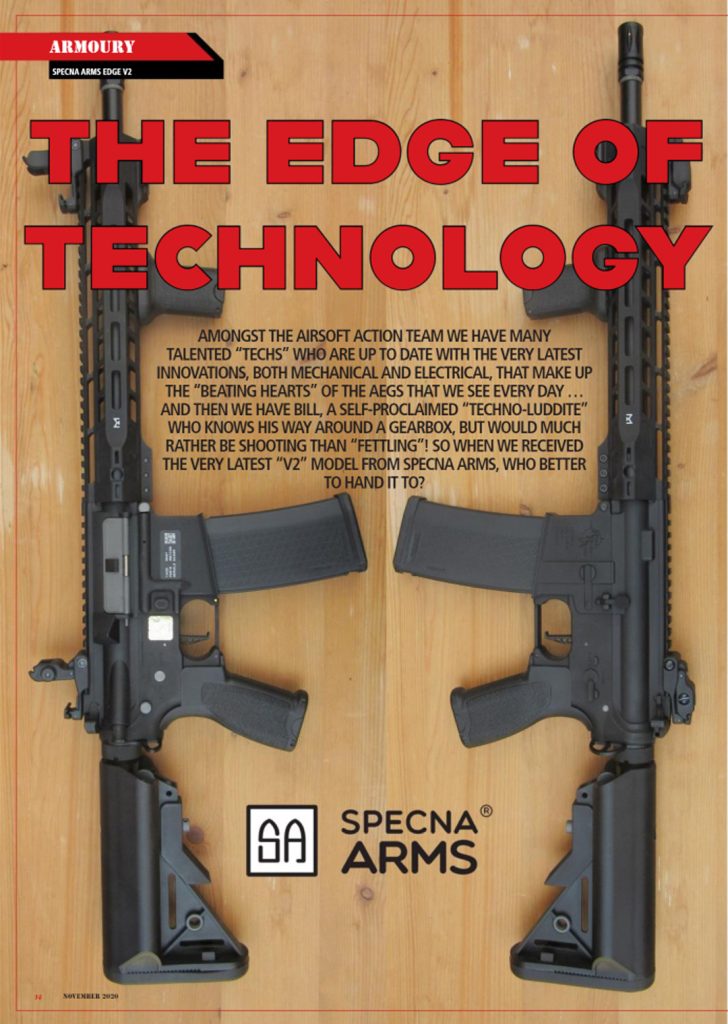
Upon scrutinising the deficiencies within the magazine page’s colour scheme, it becomes evident that the improper use of colours disrupts the overall visual harmony. The juxtaposition of wooden flooring with unrelated gun imagery creates a discordant visual dissonance, intensified by the addition of red font that clashes sharply with the brown flooring and gun images. To address this disparity, a strategic reduction in the colour palette is crucial, enhancing the page’s aesthetic appeal and cohesiveness.
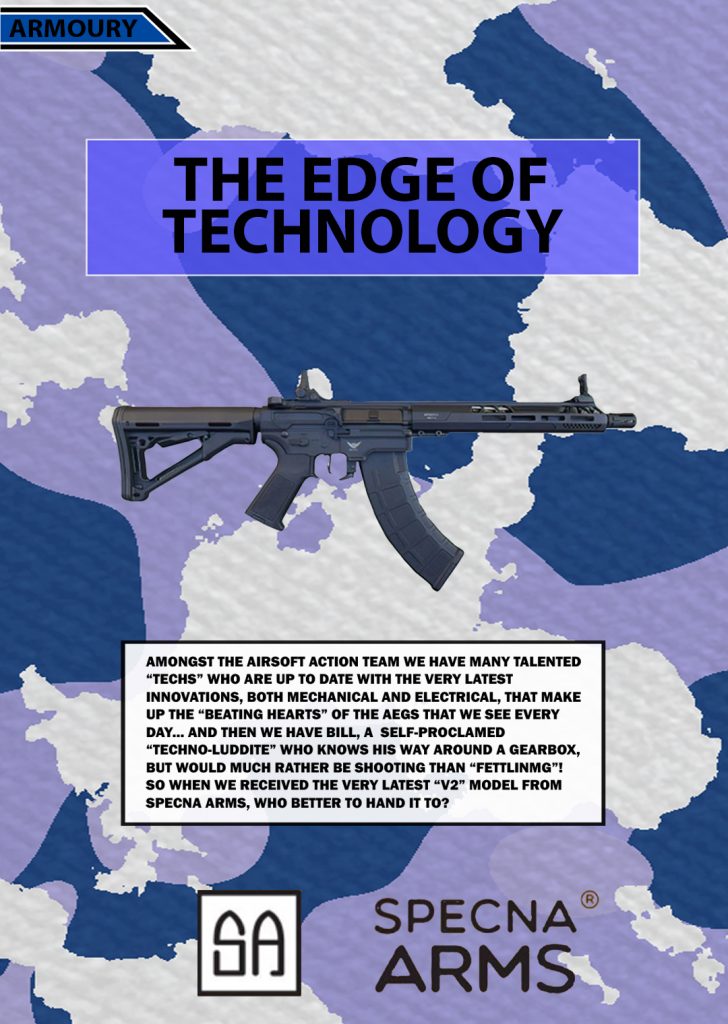
In the reimagined version, a relevant background is introduced to rectify the visual disarray. A subtle blue and white textured camouflage background is seamlessly incorporated, expertly faded to prevent overshadowing the gun imagery and accompanying text. The colour scheme is meticulously streamlined to encompass black, white, and various shades of blue, ensuring thematic consistency and visual unity. To optimise readability, a white box is adeptly added to encapsulate the smaller black text, enhancing contrast and accessibility for readers.
This thoughtful approach aligns seamlessly with the findings of a comprehensive study conducted by Anja Zorko, Snjezana Ivancic Valenko, Mario Tomisa, Damira Kecek, and Darijo Cerepinko, titled ‘The Impact of Text and Background Colour on the Screen Reading Experience.’ As illustrated in Figure One, their research establishes that the optimal colour combination for printed materials involves black text on a white background. By adhering to these established colour principles, the redesigned page achieves a harmonious balance. This meticulous attention to colour ensures that both visual and textual elements synergise cohesively, creating a polished and reader-friendly layout that captures the audience’s attention and facilitates a seamless reading experience.
The choice of colours in reading materials significantly impacts readability and engagement. Thoughtfully selected colours enhance comprehension, emphasize key points, and create a memorable reading experience. Understanding the psychological effects of colour is crucial for designing visually appealing and effective reading materials, fostering a strong connection between readers and content.
References:
Zorko, A. and Cerepinko, D. (2017) (PDF) the impact of demographic and academic … – researchgate, THE IMPACT OF THE TEXT AND BACKGROUND COLOR ON THE SCREEN READING EXPERIENCE. Available at: https://www.researchgate.net/publication/314914494_The_Impact_of_Demographic_and_Academic_Characteristics_on_Academic_Performance (Accessed: 04 November 2023).
No authors for magazines
Websites used:
https://issuu.com/ebconpublishing/docs/ai_free_sampler pages 4-5 [Accessed 29th October]
https://www.airsoftaction.net/issue-119-november-2020-2/ Page 14 [Accessed 31st October]